If you’re looking to cast a wider net in the pool of global consumers, then a multilingual digital product is a must. This post includes tips on how to create one.
Unless you’ve built a website or app that’s only available to local customers, chances are good you’ll have visitors from other places around the world who speak other languages. So does that mean your site needs to be translated for a multilingual audience? Or is it safe to assume that everyone knows your native language?
In this post, we’ll look at when you need to create a multilingual website or app as well as some tips for creating one.
When Should You Create a Multilingual Website or App?
Some websites don’t need to be translated or localized. For instance, your favorite local Italian restaurant probably won’t need a multilingual website. But you know who might? Your local medical clinic. In the U.S., for example, it’s common to see medical websites with a Spanish alternative available.
So how do you decide when it’s worth turning your website or app into a multilingual one? Here are some reasons:
- Your digital product already has a multinational or global presence. However, retention and conversion rates in countries outside your own are low.
- Your business is about to expand into new markets where your native language isn’t spoken.
- Your website ranks well for search terms in your native language. Now you want to improve how it ranks for others.
- While your users might have browser tools or apps that can auto-translate any site or app into their target language, you know they’re not getting the most accurate translation that way.
- You’re also concerned about the overall user experience as it’s not just text that needs to be localized, but images, layout, microcopy and more.
- You’re working on improving the inclusivity and accessibility of your product. And a poor user experience with auto-translations and uncustomized designs is compromising that.
According to Babbel, 1.35 billion people speak English. Most aren’t even native speakers. If you want your digital product to be useful and usable to people from around the world, then it needs to be available to more than the 17% of people who speak English (or the portion of the population that speaks your native tongue).
Tips for Creating a Multilingual Digital Product
There are plugins and extensions that promise an easy solution to turning a single-language website or app into a multilingual one. But it’s not as simple as that.
Here are some things to consider as you localize your website:
1. Figure Out Which Languages Are Needed
When choosing which languages to translate your website or app into, take a look at your target audience.
Is there one language that everyone speaks? Is there a common secondary language? If not, which languages seem to be the most prevalent among your target users and/or current website visitors?
For example, the National Cancer Institute provides just two language options: English and Spanish.
Users that click the Español button in the top-right corner see the Spanish website. The text changes as does some of the information and graphics.
Other sites have a more robust selection of languages to choose from, like TransUnion. The Global Locations page has links to various multilingual domains that users can visit.
For example, in the GIF below, you can see how the Business tab looks for the following locations:
- South Africa
- Mexico
- Mumbai
- Hong Kong
- Brazil
The South Africa and Mumbai location sites remain in English. However, the graphics are different as are the listed features and information.
So when considering if you need a multilingual website, don’t just focus on the language itself. Sometimes it’s the dialect, graphics and product features that need to be localized instead of or in addition to the language.
2. Use Multilingual Fonts
When choosing fonts, in general, you want ones that complement and contrast with one another well. You also have to consider browser and device compatibility. That way, the fonts that match your design and branding will remain intact regardless of where users view your site or app from.
Multilingual design adds another layer of complexity to font selection.
For example, let’s say you want to translate a website like FAGE from English to Greek.
In order to keep the branding consistent for all users, you’d need a font that has a Latin and Greek alphabet available.
Google Fonts is a useful tool for this. While there are more than 1,600 fonts available, you can pare down the list to show only fonts with characters, glyphs and directionality for languages and alphabets like:
- Arabic
- Bengali
- Chinese
- Cyrillic
- Hebrew
- Japanese
- Khmer
- Tamil
- Thai
The number of fonts that support Greek, for instance, is only 85.
Also, don’t forget about numbers and symbols (like for different currencies). Inspect your preferred font’s glyphs to ensure you have all your bases covered.
3. Design Your Space for Different Languages
Multilingual design really is a lot like responsive design. Even if you start by filling the empty page with content for the desktop view, you eventually have to make adjustments to ensure that the content looks great and the page remains usable as the screen size gets smaller.
Translated text doesn’t always come out the same way as the original text. Some translations expand, like when going from English to German. Here’s how that looks on the BlackLine homepage:
The headline goes from being a single line to a double line of text. The description also takes up three lines instead of two. You can see how this text expansion affects the size of the hero section design behind it.
Some translations cause text shrinkage, like when going from German to Chinese.
In this example, we see how the subheadline disappears in the Chinese translation. The description also goes from three lines in German to only one in Chinese. In addition, the background design changes along with the formatting of the text, which has gone from centered to left-aligned.
When designing the space for your sections, you also have to consider language directionality. For instance, translating a website from English to Hebrew or Arabic will invert everything from a left-to-right format to right-to-left.
So just as you do cross-browser design and testing for different devices, you’re going to need to do the same for languages. You’ll first need to figure out how much space you want to devote to each section. When you receive the translated text, you may need to make changes to font size, line length, spacing and more to make languages of different sizes fit the given space.
4. Decide How Much of the User Experience Needs to Be Localized
If you scroll through some of the multilingual website examples above, you’ll see that translated websites aren’t always fully localized. The main text on the page is. However, elements like images, logos, footer content, contact forms, search bars and so on remain in the primary language.
You’ll need to decide for yourself how much localization is needed for your own site or app.
The United Nations website, for instance, is fully localized for each of the six languages it appears in. Everything from the logo to the search bar and even the content selected for each page has been localized.
One thing that may determine how extensive your localization is, is the tool you use to translate your site.
Some plugins and extensions promise fully automated translation of your content, though it’s likely limited to the main content of your pages. So anything that comes from a third-party integration—like AJAX search results, contact forms, ecommerce checkouts, podcast playlists and more—won’t get translated.
The only way to ensure total localization is to hire someone to translate the text. This goes for every bit of microcopy on your site as well as what sits behind the scenes in terms of metadata and SEO. You’ll then have to pair the translations with custom graphics and layouts.
It’s possible to do this, but it does take much more time and a bigger budget. So this is something to think about before committing to turning your site or app into a total multilingual and multicultural experience.
5. Come Up with a User-Friendly Language Switcher
There are a number of things to think about when designing the language switcher for your website.
For starters, where should it go? The most common places it appears are in the header—usually off to the right of the navigation—as well as the footer.
If your goal is to encourage users to explore the website in the language of their choice, though, then the header is the ideal placement for it.
The Nestlé website is a good example of where to place the language switcher as well as how to design it if you’re including dozens of localized sites to choose from.
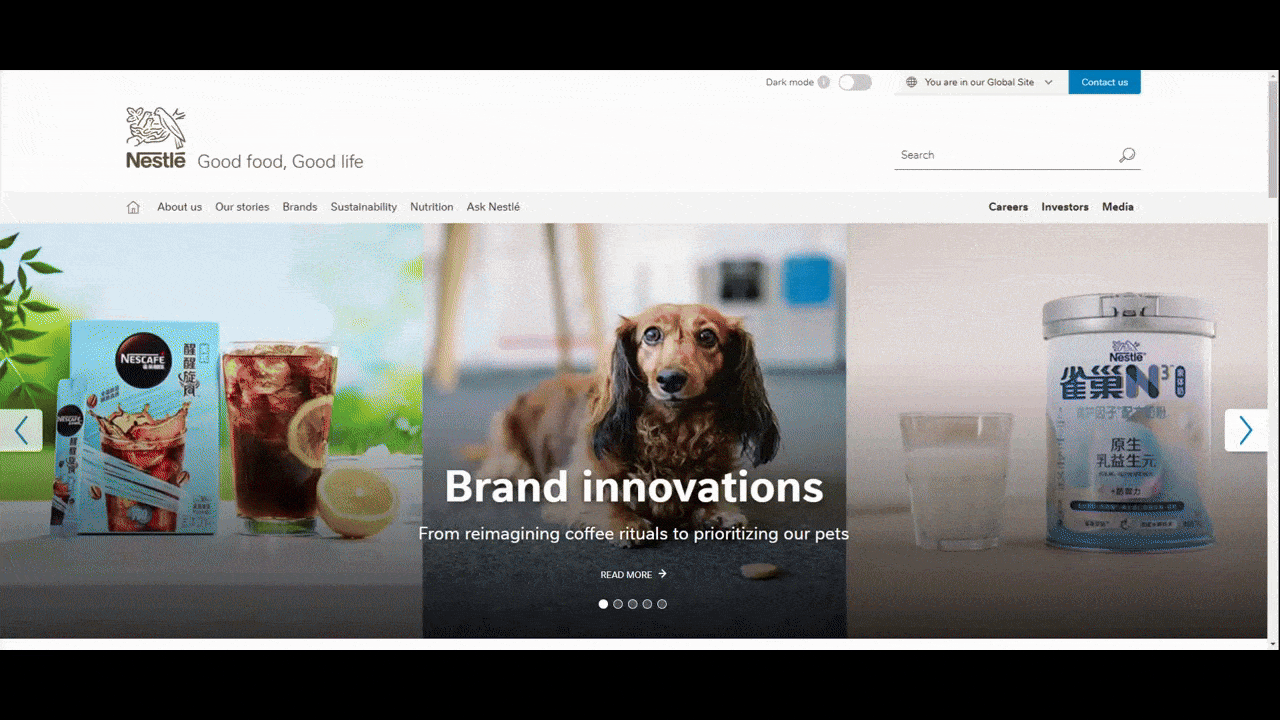
The design of the language switcher is well done. For starters, it’s not just a flag or globe icon. While many people might recognize what those symbols mean, that might not be true for everyone. The only time to use an icon on its own in design is when it’s universally recognizable.
A small icon is also more difficult to spot. The Nestlé language switcher appears against a light gray background, includes a dropdown arrow symbol and a label, so there’s no question about what function this part of the header serves.
One thing that you might want to do differently from this example is the display of languages. Rather than leave them all written in English, consider using the translated form of them so it’s easy for speakers to recognize.
This is how it’s done on the Enfusion website.
When someone clicks the English dropdown button, four translated language names appear for French, German, Chinese and Portuguese.
This will be easy to do with a limited set of languages (i.e., 10 or fewer). If you’re dealing with dozens, though, you may want to stick with your site’s native language.
6. Use a CMS That Supports Multilingual Web Design
The last thing to think about when building a multilingual website is if your content management system (CMS) can handle it.
Some website builders and CMS promise that their platforms are multilingual-friendly. Those that aren’t inherently set up for multilingual capabilities have extensions or plugins you can use to translate your content. But are they truly up to the task?
Progress Sitefinity CMS, for instance, comes with built-in multi-language functionality. This includes the ability to:
- Localize content and digital assets.
- Get support for more than 50 languages.
- Translate your content into left-to-right as well as right-to-left languages.
- Create localized URLs and metadata.
- Manage your translation projects within Sitefinity.
- Leverage partner translation services for professional-grade localizations.
- Alternatively, use the machine translation API to automatically translate your content.
What’s more, Sitefinity allows you to convert your administration UI into more than 10 languages. So if you’re working with an international team, this will allow team members to use Sitefinity in the language of their choice.
Wrap-up
Multilingual websites and apps can be very good for business. But only if the translations, localized content and designs are handled properly.
Before working on a new multilingual digital product, keep in mind the tips above. In addition to offering different language options, the user experience can be enhanced by the right design choices when it comes to things like fonts, spacing, visual content and the language switcher.
Suzanne Scacca
A former project manager and web design agency manager, Suzanne Scacca now writes about the changing landscape of design, development and software.