Bringing Responsive Web Design to Sitefinity CMS

The content you're reading is getting on in years.
This post is on the older side and its content may be out of date.
Be sure to visit our blogs homepage for our latest news, updates and information.
Recently, the Boston Globe has received a lot of praise for their redesigned web site. With this redesign they used a technique known as responsive web design. This technique builds a single template/layout that dynamically adapts to any resolution or device. If you haven’t already, I encourage you to give it a look.
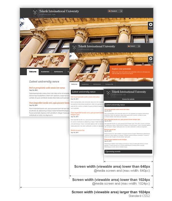
Making Sitefinity’s Education Template Responsive
Jordan Angelov is an extremely talented designer who works on the Sitefinity team. I was bragging about the Boston Globe’s web site internally and Jordan responded rapidly with a redesigned prototype of our Education Starter kit.
Our plan is now to ship this new responsive template as part of our next Sitefinity SDK release. However, for now you can download an early preview of this template here. For anyone interested in a mobile-friendly adaptive layout, this will be a great resource.
How is this done?
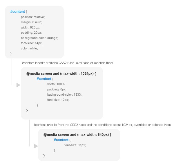
At it’s core, responsive design relies on media queries to define different styles for different resolutions. Media queries are supported by all WebKit-based browsers (Safari, Firefox, Chrome) and in IE via some jQuery plug-in’s.

There is already a wonderful primer on responsive web design. As well as a some reasons to be wary of it. Be sure to give these a look if interested.
Testing these responsive web templates
As mentioned, these templates are still a work in progress. They will be officially released through the next version of the Sitefinity SDK. In the meantime, preview versions of this responsive design can be downloaded here.
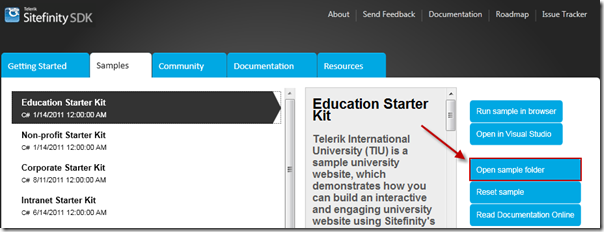
Add the templates & themes to the Education Starter Kit found in the Sitefinity SDK.

Once added to the project folder, the templates & themes also need added to Sitefinity (template docs, theme docs) and then populated with widgets. Setup isn’t easy, so it might be better to simply use the downloaded stylesheets as a reference for your own responsive design.
As mentioned, this will come in a nicer package in the next release of the Sitefinity SDK. For now, this is just a heads up. This is a trend worth experimenting with and potentially a great solution for targeting mobile & tablet devices.

