Non-Rectangular Headers in Sitefinity

Concepts
There are several ways to implement an unorthodox-shaped header/container element on a website and here is another blog post with examples of the different ways to do it. The below sample will stick to the SVG implementation, because scalable vector graphics fit all resolutions without additional configurations. With Sitefinity 10 the support of SVGs comes out of the box and it makes our job easier by uploading and reusing existing SVG files. The approach is great for responsive design and the fun comes when you can have many different shapes to your element that you can control with the polygon coordinates. Of course, the way you go will always depend on the requirements of the project and you should do your own research on what best suits your needs, but the idea stays the same no matter the way it is accomplished.Hands on
To create the container background that gives its non-rectangular shape, use an SVG element in the HTML. Place it in the header element of the Page template by dragging and dropping the widget you want to use – to interact directly with the HTML you can choose either the Embed code or the Content block widgets in HTML mode (both options work equally well). The SVG element code looks like this:
<svg preserveAspectRatio="none" viewBox="0 0 100 100" xmlns="http://www.w3.org/2000/svg">
<polygon class="svg--sm" fill="white" points="0,0 30,100 65,21 90,100 100,75 100,100 0,100"></polygon>
<polygon class="svg--lg" fill="white" points="0,0 9,100 23,21 30,100 45,20 55,100 72,20 85,100 95,50 100,80 100,100 0,100"></polygon>
</svg>
With the coordinate points of the polygon we can control the shape of the header and have the power to make it as complex as we want. Here’s also the CSS to style the element as we want:
.header-container{
    background-image: linear-gradient(#FFF, #CEF, #00b4c9);
    position: relative;
    min-height: 275px;
}

svg {
  position: absolute;
  bottom: 0;
  left: 0;
  width: 100%;
  height: 100px;
}

@media (max-width: 699px) {
  .svg--lg {
    display: none;
  }
}

@media (min-width: 700px) {
  .svg--sm {
    display: none;
  }
}
The result looks like this:
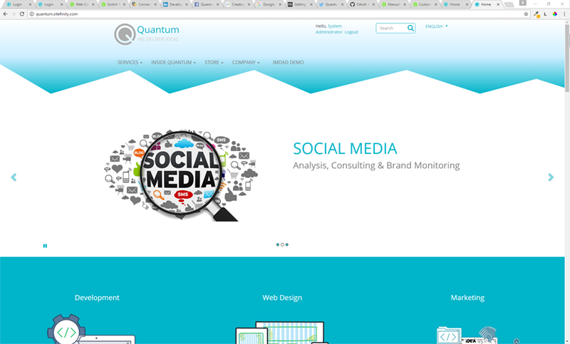
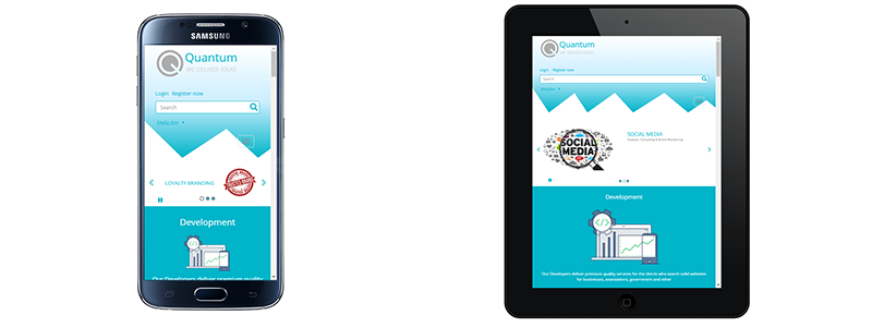
The SVG and Media query combination makes the header look good on mobile and tablet as well as on a desktop device.
Notice that we created our own SVG element, but with Sitefinity 10 you can upload one as an image and use it for a background of the container. This is one of the cool new features of the CMS.
Caveats
When you create header elements like this or others that have an unorthodox behavior (for example, sticky headers that pin to the top of the page), you could have trouble with the content management in the Backend as they can block content and make it unavailable for editing.
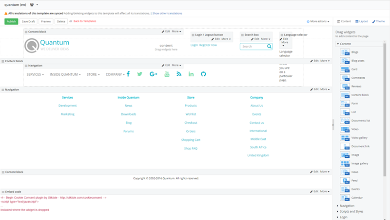
A nice trick to sort out this is to detect if you are viewing the page on the frontend or the backend and change its style depending on this. Here’s how you do this:
@{var classes = @SystemManager.IsDesignMode ? "designMode" : ""; }
<header class="@classes">
The variable is declared in the cshml file of your Page Template. The if/else condition checks if you are viewing the page on the Front or the Backend and adds a CSS class depending on that.
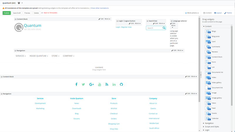
With it you can hide or style the elements that can make your content unavailable for editing in the Backend and still have the design that you want on the Frontend.
Conclusion
Creating spectacular non-rectangular Headers that catch the eye of the customer right away is easy and straightforward in Sitefinity. With the support of SVG images that comes with Sitefinity 10, you have one more “superpower” you can utilize to your advantage.

