UX Crash Course: Personas

When personas are informed by research, they can be powerful tools … but when they’re created based on assumptions or guesses, they can set you back quite a ways. Learn how to create useful and data-based personas!
Personas have a somewhat mixed reputation: some folks love ’em, others hate ’em. This difference in opinion actually stems from the same source: brevity.
By nature, a user persona is intended to capture high-level data about a user type into one sheet of skimmable, quickly parsable information. For example, we if we’re creating a meal-planning app, we might have a persona for Linda, the busy mom.
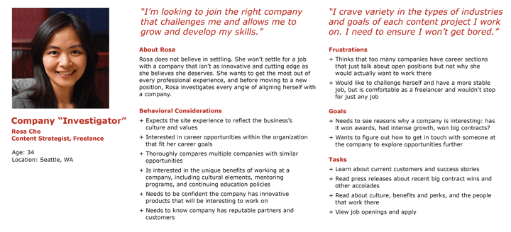
Personas generally include a photo, an age, an occupation, a short bio and relevant information about how or why they use the product. It’s important to note that personas aren’t real user profiles—they’re fictional characters meant to represent a common user type. By giving them names, backstories and motivations, we can more easily empathize with them—and talk about them in context during the design and development of the product.

An example persona, from the Nielsen Norman group blog Personas Make Users Memorable for Product Team Members.
Why to Use Personas
Personas are created to represent all the different high-level sub-types of users. How you differentiate them will depend on the purpose of your app. Maybe you have personas for new vs. experienced users, or users focused on one feature type as opposed to another.
For our meal-planning app, we might add a persona for Steve, the young single professional. By thinking about how a young man living alone might use the app, as opposed to a middle-aged woman with a family, we can more easily identify shortcomings or pain points. “Linda” might not be very tech savvy, while “Steve” is a digital native. “Linda” needs to plan out every meal for the next week, while “Steve” only wants to plan dinners for the next two or three nights.
By giving these personas names, it not only helps us to visualize that user type, but it also makes it easy to discuss in meetings. When someone proposes an idea, you can say, “I like it, but do you think it would make sense to Linda?” It’s a great way to introduce a shared language and shorthand for communicating complex ideas—especially with non-UX folks who might not be familiar with all the various industry-specific terms and concepts. Personas are a highly approachable and easily understandable tool for talking about your users.
When we first sit down to design something, we almost always design for ourselves—it’s just human nature. We imagine what we would want if we were using this app, and that’s our starting point. I’d also say that there’s actually nothing wrong with using ourselves as a starting point … as long as it’s not also our ending point. When we think about how different users with different goals and priorities will experience our app, it forces us to get outside our comfort zone and innovate.
Personas are a tool for helping us “walk that mile” in someone else’s shoes. We know how the app is meant to be used, and often we build products with a very specific end goal in mind. That makes all the sense in the world … until someone wants to do something a little different with what we’ve built. It’s also fair to say, “No, that action is outside the scope of what we’re building for,” and choose not to support it. But figuring that out, defining those lines and boundaries, is in and of itself a crucial part of the product design process.
Potential Pitfalls
The flip side of this—and the part that some folks dislike—is that by nature this process reduces users to stereotypes. As with any kind of shorthand, over-simplification is just part of the process. While that does speed things up and help us talk about users at a high level, it also runs the risk of overlooking your users who don’t perfectly fit into those generalizations. Remember, just because a user isn’t in the majority does not mean they are an “edge case.”
Furthermore, when personas are created by just one person (or a homogenous group of people), they can unintentionally reflect the subconscious biases of that person or group—just one of many reasons why diverse teams are important. All of this is especially risky if there hasn’t been any information-gathering process first. When teams jump right to creating personas without any actual data to back them up—just their own, unvalidated assumptions about the user—they absolutely won’t reap any of the benefits. For personas to be valuable, they need to reflect real data gathered by talking to real users.
It’s also worth noting that personas are not a required part of the UX design process. If you think there’s a chance they’ll do more harm than good, or if they just don’t sound particularly worthwhile for your specific project—skip &'squo;em! There’s no persona police. Personas are simply one of a great many tools you can use to make the challenging task of UX design a little easier. If they’re making things harder, don’t stress it.
Creating Personas
As you might have gathered, the first step to persona creation actually isn’t related to personas, specifically. You need a strong basis of user research that you can draw on to populate those personas. If you don’t have that yet, then that needs to be step number one.
Once you have that data, it’s time to start looking for patterns. If you notice that most users between the age of 50 and 60 favor one particular feature, express a similar goal or had something else in common, that’s a good thing to include in a persona for a user in that age group. Other demographics or descriptions you want to include in your personas will probably be dependent on the type of app or website that you’re building.
For example, if you’re making a university website, your personas might be for an undergraduate student, graduate student and parent of a student. Similarly, if you’re making an app for tracking workouts, maybe your personas reflect different common health goals: getting stronger, losing weight, improving flexibility, recovering from an injury, etc.
There’s no “one-fits-all” template for personas because (by nature) they need to reflect the different things that are important to your user group. What you’d need to include in the university persona would be significantly different than the content in the workout persona. Ask people about their primary goals and tasks within the app, listen to their pain points and challenges, look for recurring information or patterns in your research data and use that to create customized personas relevant to your specific product.
When personas are informed by research, they can be powerful tools … but when they’re created based on assumptions or guesses, they can set you back quite a ways. If you choose to use them, they can be helpful for high-level planning and thinking about your product from a different perspective—just make sure you’re drawing from real data and keeping in mind that there will still be some users who aren’t represented.

Kathryn Grayson Nanz
Kathryn Grayson Nanz is a developer advocate at Progress with a passion for React, UI and design and sharing with the community. She started her career as a graphic designer and was told by her Creative Director to never let anyone find out she could code because she’d be stuck doing it forever. She ignored his warning and has never been happier. You can find her writing, blogging, streaming and tweeting about React, design, UI and more. You can find her at @kathryngrayson on Twitter.
