Autogenerated field types
Out of the box, you get enhanced field editors for the following property types:
String
The string property displays an input field.
It looks in the following way:

To insert a string, use the following code sample:
This file contains bidirectional Unicode text that may be interpreted or compiled differently than what appears below. To review, open the file in an editor that reveals hidden Unicode characters.
Learn more about bidirectional Unicode characters
|
import { FileTypes, NumericRange } from '@progress/sitefinity-nextjs-sdk/widgets/forms'; |
|
import { Browsable, Category, Choice, ChoiceItem, ChoiceWithText, Range, ColorPalette, ComplexType, ConditionalVisibility, Content, ContentContainer, ContentSection, ContentSectionTitles, Copy, DataModel, DataType, DateSettings, DecimalPlaces, DefaultValue, Description, DescriptionExtended, DisplayName, DisplaySettings, DynamicLinksContainer, FallbackToDefaultValueWhenEmpty, Group, KeysValues, KnownContentTypes, KnownFieldTypes, LengthDependsOn, LinkModel, MaxLength, MinLength, Mirror, MixedContentContext, Placeholder, PropertyCategory, Readonly, Required, SectionsOrder, StringLength, StylingConfig, Suffix, TableView, TaxonomyContent, Url, ViewSelector, WidgetEntity, WidgetLabel } from '@progress/sitefinity-widget-designers-sdk'; |
|
import { BigComplexObject, ComplexObject, ComplexObjectNoDefaults, ComplexObjectWithContent, ComplexObjectWithLinks, ComplexWithNesting, ComplexWithNestingTable, ComplexWithNestingTableTable, MultiLevelComplexObject } from './models'; |
|
|
|
@StringLength(6, 'Value should be between {1} and {2} symbols.', 2) |
|
@DisplayName('String length validation') |
|
@DataType('string') |
|
public StringLengthValidation: string | null = null; |
|
|
|
@MinLength(2, 'The message length must be at least {1} symbols.') |
|
@MaxLength(10, 'The message must be less than {1} symbols.') |
|
@DataType('string') |
|
public StringValidation: string | null = null; |
|
|
|
@Required('This is required string {0}.') |
|
@DataType('string') |
|
public StringFieldRequired: string | null = null; |
|
|
|
@DefaultValue('custom') |
|
@ContentSection(FirstBasicSection, 0) |
|
@DataType('string') |
|
public DefaultValueString: string | null = null; |
|
|
|
@DefaultValue('custom') |
|
@FallbackToDefaultValueWhenEmpty() |
|
@ContentSection(FirstBasicSection, 1) |
|
@DataType('string') |
|
public DefaultValueStringWithFallback: string | null = null; |
|
|
|
@ContentSection(FirstBasicSection, 0) |
|
@DataType('string') |
|
public PlainString: string | null = null; |
|
|
|
@Mirror('PlainString') |
|
@ContentSection(SecondBasicSection, 2) |
|
@DataType('string') |
|
public MirroredField: string | null = null; |
|
} |
Boolean
The Boolean property displays a Yes/No or a checkbox option.
The Boolean field can look either like a radio button or like a single checkbox.
Radio button
Checkbox

To insert a Boolean field, use the following code sample:
This file contains bidirectional Unicode text that may be interpreted or compiled differently than what appears below. To review, open the file in an editor that reveals hidden Unicode characters.
Learn more about bidirectional Unicode characters
|
import { FileTypes, NumericRange } from '@progress/sitefinity-nextjs-sdk/widgets/forms'; |
|
import { Browsable, Category, Choice, ChoiceItem, ChoiceWithText, Range, ColorPalette, ComplexType, ConditionalVisibility, Content, ContentContainer, ContentSection, ContentSectionTitles, Copy, DataModel, DataType, DateSettings, DecimalPlaces, DefaultValue, Description, DescriptionExtended, DisplayName, DisplaySettings, DynamicLinksContainer, FallbackToDefaultValueWhenEmpty, Group, KeysValues, KnownContentTypes, KnownFieldTypes, LengthDependsOn, LinkModel, MaxLength, MinLength, Mirror, MixedContentContext, Placeholder, PropertyCategory, Readonly, Required, SectionsOrder, StringLength, StylingConfig, Suffix, TableView, TaxonomyContent, Url, ViewSelector, WidgetEntity, WidgetLabel } from '@progress/sitefinity-widget-designers-sdk'; |
|
import { BigComplexObject, ComplexObject, ComplexObjectNoDefaults, ComplexObjectWithContent, ComplexObjectWithLinks, ComplexWithNesting, ComplexWithNestingTable, ComplexWithNestingTableTable, MultiLevelComplexObject } from './models'; |
|
|
|
@Required('This is required bool.') |
|
@DataType('bool') |
|
public BoolFieldRequired: boolean | null = false; |
|
|
|
@ConditionalVisibility('{"conditions":[{"fieldName":"BoolFieldRequired","operator":"Equals","value":"true"}]}') |
|
@DataType('bool') |
|
public ConditionalProp: boolean | null = false; |
|
|
|
@DefaultValue(true) |
|
@DataType('bool') |
|
public BoolDefaultValue: boolean | null = null; |
|
|
|
@DataType('bool') |
|
public PlainBool: boolean | null = false; |
|
|
|
@DataType('bool') |
|
public NullableBool?: boolean | null = null; |
|
|
|
@DefaultValue(true) |
|
@DataType('bool') |
|
public NullableBoolWithDefault?: boolean | null = null; |
|
|
|
@Group('Options') |
|
@DisplayName('Checkbox field') |
|
@DefaultValue(true) |
|
@DataType(KnownFieldTypes.CheckBox) |
|
public CheckboxField: boolean | null = null; |
|
|
|
@Group('Options') |
|
@DisplayName('Checkbox field') |
|
@DefaultValue(true) |
|
@DataType(KnownFieldTypes.CheckBox) |
|
public CheckboxField2: boolean | null = null; |
|
} |
Enum
The property displays a selector with all available options for the enumerator.
The selector can allow single or multiple values to be selected.
The multiple option selector looks in the following ways:

The single option selector looks in the following ways:


To insert an enumerator field, use the following code sample:
This file contains bidirectional Unicode text that may be interpreted or compiled differently than what appears below. To review, open the file in an editor that reveals hidden Unicode characters.
Learn more about bidirectional Unicode characters
|
import { FileTypes, NumericRange } from '@progress/sitefinity-nextjs-sdk/widgets/forms'; |
|
import { Browsable, Category, Choice, ChoiceItem, ChoiceWithText, Range, ColorPalette, ComplexType, ConditionalVisibility, Content, ContentContainer, ContentSection, ContentSectionTitles, Copy, DataModel, DataType, DateSettings, DecimalPlaces, DefaultValue, Description, DescriptionExtended, DisplayName, DisplaySettings, DynamicLinksContainer, FallbackToDefaultValueWhenEmpty, Group, KeysValues, KnownContentTypes, KnownFieldTypes, LengthDependsOn, LinkModel, MaxLength, MinLength, Mirror, MixedContentContext, Placeholder, PropertyCategory, Readonly, Required, SectionsOrder, StringLength, StylingConfig, Suffix, TableView, TaxonomyContent, Url, ViewSelector, WidgetEntity, WidgetLabel } from '@progress/sitefinity-widget-designers-sdk'; |
|
import { BigComplexObject, ComplexObject, ComplexObjectNoDefaults, ComplexObjectWithContent, ComplexObjectWithLinks, ComplexWithNesting, ComplexWithNestingTable, ComplexWithNestingTableTable, MultiLevelComplexObject } from './models'; |
|
|
|
@Model() |
|
export class NumericRange { |
|
@DefaultValue(null) |
|
@DataType('number') |
|
Min?: number; |
|
|
|
@DefaultValue(null) |
|
@DataType('number') |
|
Max?: number; |
|
} |
|
|
|
@Model() |
|
export class FileTypes { |
|
@DataType('string') |
|
Type?: string; |
|
|
|
@DataType('string') |
|
Other?: string; |
|
} |
|
|
|
enum EnumSingle { |
|
Value1 = 'Value1', |
|
Value2 = 'Value2', |
|
Value3 = 'Value3', |
|
} |
|
|
|
const EnumSingleChoices: ChoiceItem[] = [ |
|
{Value: EnumSingle.Value1}, |
|
{Value: EnumSingle.Value2}, |
|
{Value: EnumSingle.Value3} |
|
]; |
|
|
|
const FirstBasicSection = 'First basic section'; |
|
const SecondBasicSection = 'Second basic section'; |
|
const FirstAdvancedSection = 'First advanced section'; |
|
const SecondAdvancedSection = 'Second advanced section'; |
|
const stylingConfig: StylingConfig = { |
|
ColorPalettes: { |
|
Default: { |
|
Colors: ['#FFADAD', '#FFA4E1', '#F59AFF', '#8BF4FF', '#92FFFB', '#9EFFC9', '#FFFFAE', '#FFEB8D', '#E4CFC5', '#DCECF5', '#FFFFFF', '#FF7A7B', '#FF71AD', '#C267DC', '#57C1FF', '#5FD0C8', '#6BDE96', '#FFFF7B', '#FFB85A', '#B19D92', '#A9B9C2', '#cccccc', '#FF4848', '#DC3E7B', '#8F34A9', '#238EFC', '#2C9D95', '#38AB63', '#FFE048', '#ED8527', '#7E6A5F', '#76868F', '#000000'], |
|
DefaultColor: '#DCECF5' |
|
} |
|
} |
|
}; |
|
|
|
@WidgetEntity('AllProperties', 'AllProperties') |
|
@SectionsOrder([FirstBasicSection, SecondBasicSection, FirstAdvancedSection, SecondAdvancedSection]) |
|
|
|
@DefaultValue(EnumSingle.Value2) |
|
@Choice(EnumSingleChoices) |
|
public EnumDefaultValue: EnumSingle | null = null; |
|
|
|
@DefaultValue(EnumSingle.Value2) |
|
@Choice(EnumSingleChoices) |
|
public NullableEnumDefaultValue: EnumSingle | null = null; |
|
|
|
@DefaultValue('Vaal') |
|
@Choice(EnumSingleChoices) |
|
public EnumDefaultValueInvalid: EnumSingle | null = null; |
|
|
|
@DataType('string') |
|
@Choice(EnumSingleChoices) |
|
public EnumNoDefaultValue: EnumSingle = EnumSingle.Value1; |
|
|
|
@DataType(KnownFieldTypes.ChipChoice) |
|
@Choice(EnumSingleChoices) |
|
public EnumChipChoice: EnumSingle = EnumSingle.Value1; |
|
@DefaultValue(1) |
|
@DisplayName('Integer as choice field') |
|
@DataType(KnownFieldTypes.ChipChoice) |
|
@Choice({ Choices: [{'Title':'1 level','Name':'1','Value':1,'Icon':null},{'Title':'2 levels','Name':'2','Value':2,'Icon':null},{'Title':'3 levels','Name':'3','Value':3,'Icon':null}] }) |
|
public IntAsChoice: number | null = null; |
|
|
|
@DefaultValue(1) |
|
@DisplayName('Integer as dropdown field') |
|
@DataType(KnownFieldTypes.Choices) |
|
@Choice({ Choices: [{'Title':'1 level','Name':'1','Value':1,'Icon':null},{'Title':'2 levels','Name':'2','Value':2,'Icon':null},{'Title':'3 levels','Name':'3','Value':3,'Icon':null}] }) |
|
public IntAsDropdownChoice: number | null = null; |
|
} |
Group
This attribute groups separate checkbox fields visually into a single field. The group name is displayed as a label for the composite field. This attribute can be used when you do not want to use an enum
type to display a multiple option selector.
The attribute looks in the following way:

To add this attribute, use the following code:
This file contains bidirectional Unicode text that may be interpreted or compiled differently than what appears below. To review, open the file in an editor that reveals hidden Unicode characters.
Learn more about bidirectional Unicode characters
|
import { FileTypes, NumericRange } from '@progress/sitefinity-nextjs-sdk/widgets/forms'; |
|
import { Browsable, Category, Choice, ChoiceItem, ChoiceWithText, Range, ColorPalette, ComplexType, ConditionalVisibility, Content, ContentContainer, ContentSection, ContentSectionTitles, Copy, DataModel, DataType, DateSettings, DecimalPlaces, DefaultValue, Description, DescriptionExtended, DisplayName, DisplaySettings, DynamicLinksContainer, FallbackToDefaultValueWhenEmpty, Group, KeysValues, KnownContentTypes, KnownFieldTypes, LengthDependsOn, LinkModel, MaxLength, MinLength, Mirror, MixedContentContext, Placeholder, PropertyCategory, Readonly, Required, SectionsOrder, StringLength, StylingConfig, Suffix, TableView, TaxonomyContent, Url, ViewSelector, WidgetEntity, WidgetLabel } from '@progress/sitefinity-widget-designers-sdk'; |
|
import { BigComplexObject, ComplexObject, ComplexObjectNoDefaults, ComplexObjectWithContent, ComplexObjectWithLinks, ComplexWithNesting, ComplexWithNestingTable, ComplexWithNestingTableTable, MultiLevelComplexObject } from './models'; |
|
|
|
@Group('Options') |
|
@DisplayName('Checkbox field') |
|
@DefaultValue(true) |
|
@DataType(KnownFieldTypes.CheckBox) |
|
public CheckboxField: boolean | null = null; |
|
|
|
@Group('Options') |
|
@DisplayName('Checkbox field') |
|
@DefaultValue(true) |
|
@DataType(KnownFieldTypes.CheckBox) |
|
public CheckboxField2: boolean | null = null; |
|
} |
Int, double
This property displays a number field that can be an integer or a floating number.
It looks in the following way:

To insert it, use the following code sample:
This file contains bidirectional Unicode text that may be interpreted or compiled differently than what appears below. To review, open the file in an editor that reveals hidden Unicode characters.
Learn more about bidirectional Unicode characters
|
import { FileTypes, NumericRange } from '@progress/sitefinity-nextjs-sdk/widgets/forms'; |
|
import { Browsable, Category, Choice, ChoiceItem, ChoiceWithText, Range, ColorPalette, ComplexType, ConditionalVisibility, Content, ContentContainer, ContentSection, ContentSectionTitles, Copy, DataModel, DataType, DateSettings, DecimalPlaces, DefaultValue, Description, DescriptionExtended, DisplayName, DisplaySettings, DynamicLinksContainer, FallbackToDefaultValueWhenEmpty, Group, KeysValues, KnownContentTypes, KnownFieldTypes, LengthDependsOn, LinkModel, MaxLength, MinLength, Mirror, MixedContentContext, Placeholder, PropertyCategory, Readonly, Required, SectionsOrder, StringLength, StylingConfig, Suffix, TableView, TaxonomyContent, Url, ViewSelector, WidgetEntity, WidgetLabel } from '@progress/sitefinity-widget-designers-sdk'; |
|
import { BigComplexObject, ComplexObject, ComplexObjectNoDefaults, ComplexObjectWithContent, ComplexObjectWithLinks, ComplexWithNesting, ComplexWithNestingTable, ComplexWithNestingTableTable, MultiLevelComplexObject } from './models'; |
|
|
|
|
|
@Required('This is required int.') |
|
@DataType('number') |
|
public IntFieldRequired: number | null = 0; |
|
|
|
@Range(1, 20, 'Value should be between {1} and {2}.') |
|
@DataType('number') |
|
public IntegerValidation: number | null = 0; |
|
|
|
@DefaultValue(42) |
|
@DataType('number') |
|
public IntDefaultValue: number | null = 0; |
|
|
|
@DataType('number') |
|
public PlainInt: number | null = 0; |
|
|
|
@DataType('number') |
|
public NullableInt?: number | null = null; |
|
|
|
@DefaultValue(42) |
|
@DataType('number') |
|
public NullableIntWithDefault?: number | null = null; |
|
|
|
//double number |
|
@DecimalPlaces(2) |
|
@DataType('number') |
|
public DoubleWithTwoDecimalPlaces: number | null = 0.0; |
|
} |
DateTime
This property displays a date-time picker.
It looks in the following way:

To insert it, use the following code sample:
This file contains bidirectional Unicode text that may be interpreted or compiled differently than what appears below. To review, open the file in an editor that reveals hidden Unicode characters.
Learn more about bidirectional Unicode characters
|
import { FileTypes, NumericRange } from '@progress/sitefinity-nextjs-sdk/widgets/forms'; |
|
import { Browsable, Category, Choice, ChoiceItem, ChoiceWithText, Range, ColorPalette, ComplexType, ConditionalVisibility, Content, ContentContainer, ContentSection, ContentSectionTitles, Copy, DataModel, DataType, DateSettings, DecimalPlaces, DefaultValue, Description, DescriptionExtended, DisplayName, DisplaySettings, DynamicLinksContainer, FallbackToDefaultValueWhenEmpty, Group, KeysValues, KnownContentTypes, KnownFieldTypes, LengthDependsOn, LinkModel, MaxLength, MinLength, Mirror, MixedContentContext, Placeholder, PropertyCategory, Readonly, Required, SectionsOrder, StringLength, StylingConfig, Suffix, TableView, TaxonomyContent, Url, ViewSelector, WidgetEntity, WidgetLabel } from '@progress/sitefinity-widget-designers-sdk'; |
|
import { BigComplexObject, ComplexObject, ComplexObjectNoDefaults, ComplexObjectWithContent, ComplexObjectWithLinks, ComplexWithNesting, ComplexWithNestingTable, ComplexWithNestingTableTable, MultiLevelComplexObject } from './models'; |
|
|
|
|
|
@Required('This is required date.') |
|
@DataType('datetime') |
|
public DateFieldRequired: Date | null = null; |
|
|
|
@DefaultValue('2020-09-11T06:38:11.170Z') |
|
@ContentSection(SecondBasicSection, 3) |
|
@DataType(KnownFieldTypes.DateTime) |
|
public NullableDateWithDefault?: Date | null = null; |
|
|
|
@DataType(KnownFieldTypes.DateTime) |
|
public NullableDate: Date | null = null; |
|
|
|
@DataType(KnownFieldTypes.DateTime) |
|
@DefaultValue('2020-09-11T06:38:11.170Z') |
|
public DefaultValueDateTimeFromString: Date | null = null; |
|
|
|
@DataType(KnownFieldTypes.DateTime) |
|
@DefaultValue('2020-09-11T06:38:11.170Z') |
|
public DefaultValueDateTimeFromDate: Date | null = null; |
|
|
|
@DefaultValue('2020-13-09T06:38:11.170Z') |
|
@DataType(KnownFieldTypes.DateTime) |
|
public DefaultValueDateTimeInvalid: Date | null = null; |
|
|
|
@DateSettings(false) |
|
@DataType(KnownFieldTypes.DateTime) |
|
public DateFieldWithoutTime: Date | null = null; |
|
} |
LinkModel
This property displays a link selector. You can use it to select external links or link to a specific Sitefinity CMS page or content item.
To insert a link selector field, use the following code example:
This file contains bidirectional Unicode text that may be interpreted or compiled differently than what appears below. To review, open the file in an editor that reveals hidden Unicode characters.
Learn more about bidirectional Unicode characters
|
import { FileTypes, NumericRange } from '@progress/sitefinity-nextjs-sdk/widgets/forms'; |
|
import { Browsable, Category, Choice, ChoiceItem, ChoiceWithText, Range, ColorPalette, ComplexType, ConditionalVisibility, Content, ContentContainer, ContentSection, ContentSectionTitles, Copy, DataModel, DataType, DateSettings, DecimalPlaces, DefaultValue, Description, DescriptionExtended, DisplayName, DisplaySettings, DynamicLinksContainer, FallbackToDefaultValueWhenEmpty, Group, KeysValues, KnownContentTypes, KnownFieldTypes, LengthDependsOn, LinkModel, MaxLength, MinLength, Mirror, MixedContentContext, Placeholder, PropertyCategory, Readonly, Required, SectionsOrder, StringLength, StylingConfig, Suffix, TableView, TaxonomyContent, Url, ViewSelector, WidgetEntity, WidgetLabel } from '@progress/sitefinity-widget-designers-sdk'; |
|
import { BigComplexObject, ComplexObject, ComplexObjectNoDefaults, ComplexObjectWithContent, ComplexObjectWithLinks, ComplexWithNesting, ComplexWithNestingTable, ComplexWithNestingTableTable, MultiLevelComplexObject } from './models'; |
|
|
|
@DynamicLinksContainer() |
|
@DataModel(ComplexObjectWithLinks) |
|
@DataType(ComplexType.Complex) |
|
public ObjectWithLinks: ComplexObjectWithLinks | null = null; |
|
|
|
@DynamicLinksContainer() |
|
@DataModel(ComplexObjectWithLinks) |
|
@DataType(ComplexType.Enumerable) |
|
public ArrayOfObjectWithLinks: ComplexObjectWithLinks[] | null = null; |
|
|
|
@DataType('linkInsert') |
|
public Link: LinkModel | null = null; |
|
|
|
@Required() |
|
@DataType('linkInsert') |
|
public LinkRequired: LinkModel | null = null; |
|
|
|
@DataType('linkSelector') |
|
public LinkModel: LinkModel | null = null; |
|
|
|
@DataType('linkSelector') |
|
public LinkModelMultiple: LinkModel[] | null = null; |
|
} |
MixedContentContext
You use this property to select content, such as news or pages.
This selector can work with different types of providers and you can configure it to display live or draft data.
NOTE: Except for libraries, this selector supports selection of items from multiple providers, in case, you have more than one provider for the type in the current site.
You can use the MixedContentContext
to create a selector for the following:
- Pages
- Content items
- Media items
- Libraries and folders
- Dynamic content items
- Taxonomies
- Custom taxonomies
-
All content items
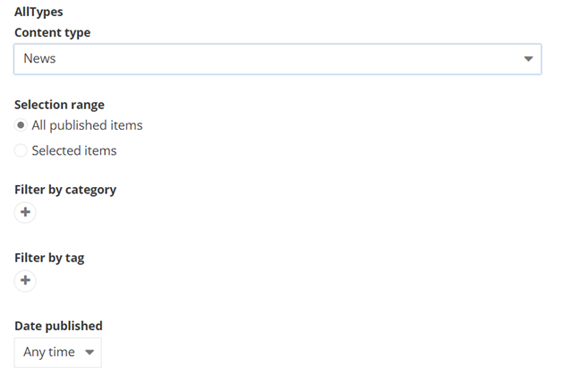
You use this selector to display items from any content type - static or dynamic, except for pages and media items.
When you select a content type, you can further filter the content or preselect existing items. The selector provides options for filtering content taxa or time periods, as well as sorting options.
You can also:
- Control whether single or multiple selection is allowed
-
Control whether to display live or draft data in the selectors.
You cannot do this for pages, media items, and libraries.
- Control whether a site selector should appear in the show all dialog in order to be able to select content from different sites.
You cannot do this for taxonomies and libraries
- Control whether the selected items can be previewed.
The following are examples of how some content selectors look like:
Pages selector

Images selector

Libraries selector
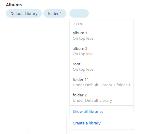
All content types selector
To insert a content selector, use the following code sample:
This file contains bidirectional Unicode text that may be interpreted or compiled differently than what appears below. To review, open the file in an editor that reveals hidden Unicode characters.
Learn more about bidirectional Unicode characters
|
import { FileTypes, NumericRange } from '@progress/sitefinity-nextjs-sdk/widgets/forms'; |
|
import { Browsable, Category, Choice, ChoiceItem, ChoiceWithText, Range, ColorPalette, ComplexType, ConditionalVisibility, Content, ContentContainer, ContentSection, ContentSectionTitles, Copy, DataModel, DataType, DateSettings, DecimalPlaces, DefaultValue, Description, DescriptionExtended, DisplayName, DisplaySettings, DynamicLinksContainer, FallbackToDefaultValueWhenEmpty, Group, KeysValues, KnownContentTypes, KnownFieldTypes, LengthDependsOn, LinkModel, MaxLength, MinLength, Mirror, MixedContentContext, Placeholder, PropertyCategory, Readonly, Required, SectionsOrder, StringLength, StylingConfig, Suffix, TableView, TaxonomyContent, Url, ViewSelector, WidgetEntity, WidgetLabel } from '@progress/sitefinity-widget-designers-sdk'; |
|
import { BigComplexObject, ComplexObject, ComplexObjectNoDefaults, ComplexObjectWithContent, ComplexObjectWithLinks, ComplexWithNesting, ComplexWithNestingTable, ComplexWithNestingTableTable, MultiLevelComplexObject } from './models'; |
|
|
|
@Content({Type: KnownContentTypes.Images, AllowMultipleItemsSelection: true}) |
|
public Images: MixedContentContext | null = null; |
|
|
|
@Content({Type: KnownContentTypes.Pages}) |
|
public Pages: MixedContentContext | null = null; |
|
|
|
@Content({Type: KnownContentTypes.News}) |
|
public News: MixedContentContext | null = null; |
|
|
|
@Content({Type: KnownContentTypes.News, LiveData: true}) |
|
public NewsLive: MixedContentContext | null = null; |
|
|
|
@Content({Type: KnownContentTypes.Pages, AllowMultipleItemsSelection: false, DisableInteraction: true, ShowSiteSelector: true}) |
|
public Page: MixedContentContext | null = null; |
|
|
|
@Content({Type: 'Telerik.Sitefinity.DynamicTypes.Model.Pressreleases.PressRelease'}) |
|
public PressReleases: MixedContentContext | null = null; |
|
|
|
@Content({Type: KnownContentTypes.Albums}) |
|
public Albums: MixedContentContext | null = null; |
|
|
|
@Content({Type: KnownContentTypes.DocumentLibraries, AllowMultipleItemsSelection: false, AllowCreate: false, Provider: 'secondlibraries'}) |
|
public DocumentLibrary: MixedContentContext | null = null; |
|
|
|
@TaxonomyContent({Type: KnownContentTypes.Tags}) |
|
public Tags: MixedContentContext | null = null; |
|
|
|
@TaxonomyContent({Type: KnownContentTypes.Categories}) |
|
public Categories: MixedContentContext | null = null; |
|
|
|
@TaxonomyContent({Type: 'geographical-regions'}) |
|
public CustomTaxonomy: MixedContentContext | null = null; |
|
@Content() |
|
public AllTypesSelector: MixedContentContext | null = null; |
|
} |
Complex objects
A complex object is a property that consists of simpler properties. Sitefinity CMS automatically generates editors for the them, depending on their types, and displays them in a row. If the properties constructing the complex object are four or less, they are displayed in one row.
The following screenshot displays a complex object with two properties of types string
and int
:

The following screenshot displays a complex object that has one property and another complex object, which in turn, has two properties:
To insert a complex object, use the following code sample:
This file contains bidirectional Unicode text that may be interpreted or compiled differently than what appears below. To review, open the file in an editor that reveals hidden Unicode characters.
Learn more about bidirectional Unicode characters
|
import { FileTypes, NumericRange } from '@progress/sitefinity-nextjs-sdk/widgets/forms'; |
|
import { Browsable, Category, Choice, ChoiceItem, ChoiceWithText, Range, ColorPalette, ComplexType, ConditionalVisibility, Content, ContentContainer, ContentSection, ContentSectionTitles, Copy, DataModel, DataType, DateSettings, DecimalPlaces, DefaultValue, Description, DescriptionExtended, DisplayName, DisplaySettings, DynamicLinksContainer, FallbackToDefaultValueWhenEmpty, Group, KeysValues, KnownContentTypes, KnownFieldTypes, LengthDependsOn, LinkModel, MaxLength, MinLength, Mirror, MixedContentContext, Placeholder, PropertyCategory, Readonly, Required, SectionsOrder, StringLength, StylingConfig, Suffix, TableView, TaxonomyContent, Url, ViewSelector, WidgetEntity, WidgetLabel } from '@progress/sitefinity-widget-designers-sdk'; |
|
import { BigComplexObject, ComplexObject, ComplexObjectNoDefaults, ComplexObjectWithContent, ComplexObjectWithLinks, ComplexWithNesting, ComplexWithNestingTable, ComplexWithNestingTableTable, MultiLevelComplexObject } from './models'; |
|
|
|
@DataModel(ComplexWithNesting) |
|
// @DataType(ComplexType.Complex) |
|
public ComplexWithNesting: ComplexWithNesting | null = null; |
|
|
|
@DataType(ComplexType.Enumerable, 'number') |
|
public IntList: number[] | null = null; |
|
|
|
@DataType(ComplexType.Enumerable, 'boolean') |
|
public BoolList: boolean[] | null = null; |
|
|
|
@DataType(ComplexType.Dictionary, 'string') |
|
public StringDict: {[key: string]: string} | null = null; |
|
|
|
@DataType(ComplexType.Dictionary, 'number') |
|
public IntDict: {[key: string]: number} | null = null; |
|
|
|
@DataType(ComplexType.Dictionary, 'boolean') |
|
public BoolDict: {[key: string]: boolean} | null = null; |
|
|
|
@TableView() |
|
@DataModel(ComplexWithNesting) |
|
@DataType(ComplexType.Complex) |
|
public ComplexWithNestingTable: ComplexWithNesting | null = null; |
|
|
|
@TableView() |
|
@DataModel(ComplexWithNestingTable) |
|
public ComplexWithNestingTableTable: ComplexWithNestingTable | null = null; |
|
|
|
@DataModel(ComplexWithNesting) |
|
@DataType(ComplexType.Enumerable) |
|
public ComplexWithNestingList: ComplexWithNesting[] | null = null; |
|
|
|
@DataModel(ComplexWithNestingTableTable) |
|
@DataType(ComplexType.Enumerable) |
|
public ComplexWithNestingTableTableTable: ComplexWithNestingTableTable[] | null = null; |
|
} |
List
To use a list field in a Sitefinity widget designer with React, you define the property in the TypeScript model file as an array (string[] or Array<string>). Sitefinity will automatically generate the appropriate UI editor for the list.
The following screenshot displays a list of strings:

To insert a list, use the following code sample:
This file contains bidirectional Unicode text that may be interpreted or compiled differently than what appears below. To review, open the file in an editor that reveals hidden Unicode characters.
Learn more about bidirectional Unicode characters
|
import { FileTypes, NumericRange } from '@progress/sitefinity-nextjs-sdk/widgets/forms'; |
|
import { Browsable, Category, Choice, ChoiceItem, ChoiceWithText, Range, ColorPalette, ComplexType, ConditionalVisibility, Content, ContentContainer, ContentSection, ContentSectionTitles, Copy, DataModel, DataType, DateSettings, DecimalPlaces, DefaultValue, Description, DescriptionExtended, DisplayName, DisplaySettings, DynamicLinksContainer, FallbackToDefaultValueWhenEmpty, Group, KeysValues, KnownContentTypes, KnownFieldTypes, LengthDependsOn, LinkModel, MaxLength, MinLength, Mirror, MixedContentContext, Placeholder, PropertyCategory, Readonly, Required, SectionsOrder, StringLength, StylingConfig, Suffix, TableView, TaxonomyContent, Url, ViewSelector, WidgetEntity, WidgetLabel } from '@progress/sitefinity-widget-designers-sdk'; |
|
import { BigComplexObject, ComplexObject, ComplexObjectNoDefaults, ComplexObjectWithContent, ComplexObjectWithLinks, ComplexWithNesting, ComplexWithNestingTable, ComplexWithNestingTableTable, MultiLevelComplexObject } from './models'; |
|
|
|
@DataType(ComplexType.Enumerable, 'string') |
|
public List: string[] | null = null; |
|
|
|
@DataType(ComplexType.Enumerable, 'boolean') |
|
public ListBool: boolean[] | null = null; |
|
|
|
@DataModel(ComplexObject) |
|
@DataType(ComplexType.Enumerable) |
|
public ListComplexObject: ComplexObject[] | null = null; |
|
|
|
@TableView({Reorderable: true, Selectable: true, MultipleSelect: true}) |
|
@DataModel(ComplexObject) |
|
// @DataType(ComplexType.Enumerable) |
|
public ListTableView: ComplexObject[] | null = null; |
|
|
|
@DataType(ComplexType.Enumerable) |
|
@DataModel(ComplexObjectNoDefaults) |
|
public ListComplexObjectNoDefaults: ComplexObjectNoDefaults[] | null = null; |
|
|
|
@DataModel(MultiLevelComplexObject) |
|
@DataType(ComplexType.Enumerable) |
|
public ListMultiLevelComplexObject: MultiLevelComplexObject[] | null = null; |
|
} |
Other types
All other types are displayed using a text field where you can type your values.