Build a Sample Sitefinity Page on .NET Core

The introduction of the .NET Core Renderer was the first step in a long-term project of migrating Sitefinity to the .NET Core framework.
This self-contained presentation layer, which can be hosted, developed and deployed independently from the content management UI and operational backend, ushers in a whole new set of page editing concepts and capabilities.
In this blog post, we’ll follow the steps it took to create a sample .NET Core page. The page was built using the new editor and one of the best things about it is the excellent WYSIWYG experience. Just see for yourself.
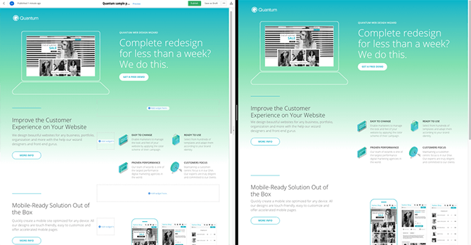
Interested? Let's dig right in...
Sitefinity Setup
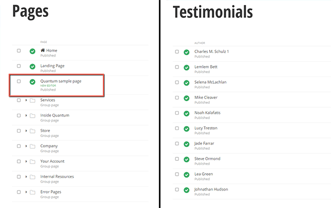
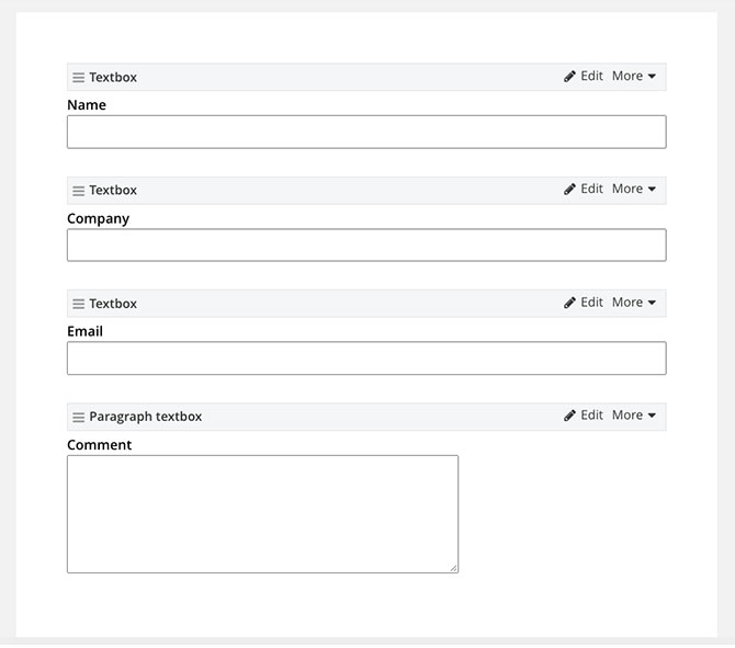
First, we need to set up the Sitefinity instance, to which we are going to connect our .NET Core renderer. Download the solution and follow the steps outlined in this repository of Sitefinity samples. Once you have set up the project, you should have a page—Quantum Sample Page—marked with a “new editor” label, a Testimonial content type and a Register Form (make sure you precisely follow all the steps in the readme files).
Next up, follow the instructions of connecting Sitefinity to a standalone ASP.NET Core application to configure your instance to work with the .NET Core renderer.
.NET Core Renderer Project
Let’s begin setting up our .NET Core renderer project. You can opt for the starter template provided by the Sitefinity team or you can follow the instructions in this documentation article to create a blank .NET Core application. In this demo, I’ll be using the starter template.
This is where you can find the complete starter template. All you need to do is change the URL in the appsettings.json to match that of the Quantum sample project, which we set up early on.
Once the template is downloaded, open it with the IDE of choice and change the URL of the Sitefinity instance under appsetings.json “Sitefinity” -> “URL”.
"Sitefinity": {
    "Url": "http://nstefano.com:8080",
    "WebServicePath": "api/default"
  }
In case the out-of-the-box widgets just don’t suit your design needs, you can go ahead and create custom ones inside the .NET Core project. For the sake of the demo, the widgets we need would be:
- Static section widget [Layout widget]
- Testimonials widget [Content widget]
- Demo request form widget [Content widget]
Note that the Layout widget is used as a placeholder for other widgets. The Content widget is used to present content, static or dynamic.
Static Section
Let’s start with the Static section widget. It’s there for you to insert a section widget with specific markup. You can get this widget straight from the sample page repository. Just copy the following files to their corresponding directories:
- StaticSectionEntity.cs to [Entities/StaticSection]
- StaticSectionViewComponent.cs to [ViewComponent]
- ViewImports.cshtml to [Views]
All *.cshtml files to [Views/Shared/Components/StaticSection]
Testimonial Widget
Now, we can focus on creating the Testimonial widget. Following the steps in the create a custom .NET Core widget article, we need to create the following files into the relevant directories, as follows:
- TestimonialItem.cs and Item.cs in [DTO]. DTO (Data transfer object) is the corresponding class of the Testimonial Dynamic type. A list of all the available types can be found here.
- Default.cshtml in [Views/Shared/Components/Testimonial]. The cshtml view contains all the necessary markup for the widget.
- ItemViewModel.cs in [ViewModels/Testimonial]. It’s the data, which the cshtml view binds to.
- TestimonialsEntity.cs in [Entities/Testimonial]. Here you can list the fields that will be visible in the widget designer. For example MixedContentContext Testimonials will display a selector field from which we can select the Testimonial items for the widget to display. All the available types can be found here.
- ITestimonialModel.cs and TestimonialModel.cs in [Models/Testimonial]. This contains the logic of getting data from Sitefinity.
- TestimonialViewComponent.cs in [ViewComponents]. Obtains the view models and provides them to the view.
Startup Configuration
After all the files have been created, we need to add the following line `services.AddScoped<ITestimonialModel, TestimonialModel>();` to the method `ConfigureServices()` in `Startup.cs`. The AddScoped method registers the service with a scoped lifetime—that of a single request.
public void ConfigureServices(IServiceCollection services)
{
    // add sitefinity related services
    services.AddScoped<ITestimonialModel, TestimonialModel>();
    services.AddSitefinity();
    services.AddViewComponentModels();
}
Form Widget
Lastly, we need the “Demo request form” widget.
- FormValuesController.cs in [Controllers]
- DemoRequestFormViewComponent.cs in [ViewComponents]
- DemoRequestModel.cs in [Models]
- Default.cshtml in [Views/Shared/Components/DemoRequestForm]
Once we are done with the development of widgets, we can start preparing to style the page. First off, we need to tell the .NET Core project to use static files. We can do that by adding `app.UseStaticFiles();` to `ConfigureServices()` method in `Startup.cs.
public void Configure(IApplicationBuilder app, IWebHostEnvironment env)
{
    if (env.IsDevelopment())
    {
        app.UseDeveloperExceptionPage();
    }
    app.UseStaticFiles();
    app.UseRouting();
    app.UseSitefinity();
    app.UseEndpoints(endpoints =>
    {
        endpoints.MapControllerRoute(
            name: "default",
        pattern: "{controller=Home}/{action=Index}/{id?}");

        endpoints.MapSitefinityEndpoints();
    });
}
Styles, Scripts and Fonts
Now we need some styles, scripts and fonts. All of the source files used for the styling of the page will be placed in “client-src” directory. Just get all the files from the sample client-src folder and place them into your project. In order to “play” with them you need to install NodeJS (version 14.15.1) and run “npm i" and “npm start”.
This will precompile all the SCSS file to CSS, copy all the needed assets (fonts) and minify the sample's JavaScript file, placing them all into the “wwwroot” directory. We then link the files in Layout.cshtml which is located in Views/Shared.
- If you opted for the starter template, then all you need to do is change the file name for the css and js files, add some CDNs for fonts and remove the out-of-the-box bootstrap.css as we are using a custom one from the project. Overall the file should look like this.
- If you started with a newly created project, then create Layout.cshtml inside the Views/Shared folder and paste this content.
Starting the Project
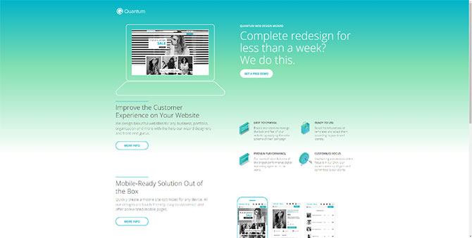
Build and start the .NET Core project and navigate to Sitefinity through localhost:5000/sitefinity (5000 is the default .NET Core project port). Open Pages and select “View” for Quantum sample page or navigate directly to localhost:5000/netcore-renderer/quantum-sample-page. Looks good, doesn’t it?
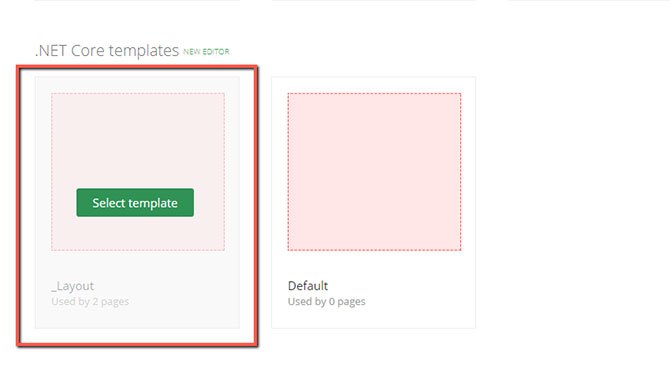
Now let me go over the steps we need to take implementing the design of the page. For the purpose of the demo, we are going to create another .NET Core page and call it “Quantum sample page 2”. Next up, we select “_Layout.cshtml” (.NET Core templates) for the page template.
Styling of the Page
I will break down the styling into the three major components: Layout, Main and Footer.
Layout
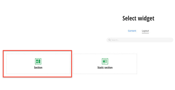
For the Layout section, we’ll create the foundation of the page. Starting with an empty page, we need to add two section widgets one after another.
- Choose Add widget here and select Section widget
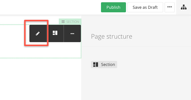
- Then hit Edit.
- Edit section widget styles with Padding Bottom set to S and Margin Bottom set to L.
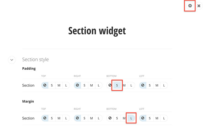
The display settings for Padding and Margins represent CSS classes. These classes can be changed by modifying the corresponding properties in “OffsetClassess” in “appsettings.json”. By default, they represent Bootstrap 4 spacing utilities classes.
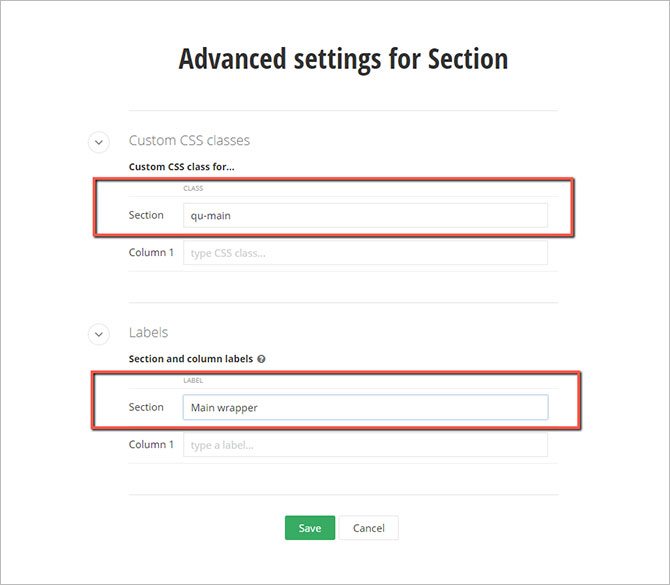
- Now, switch to advanced settings and set the Section custom CSS class to “qu-main” and the Label Section to Main wrapper. Although the change of section label is not a must, it’s a good way to have a visual separation of the page structure. Setting Section and Column Style Padding and Margin can be done using the UI field controls.
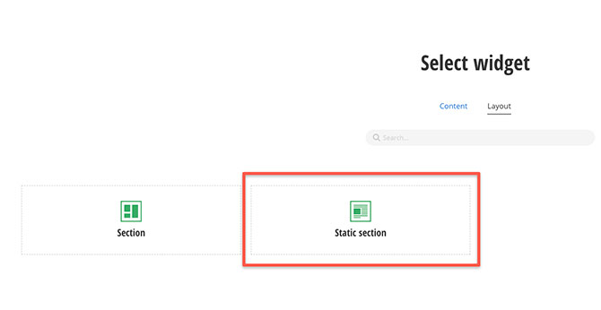
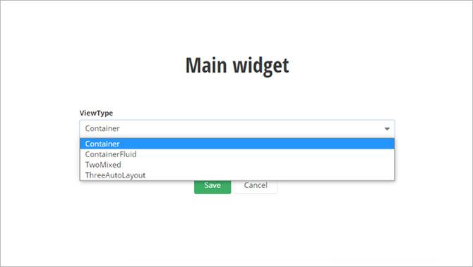
- Next up, place a Static section widget by selecting the “Add widget here...” link. Edit it and select ViewType = Container (check out all the available options for Static section here).
- Go to Advanced settings and set label to Main.
- After the Main wrapper section add a Section widget. Edit it and set the Section Padding top to L. Switch to Advanced settings, rename it as Footer wrapper and add a custom CSS class for Section “qu-footer”.

- In the next section, add a Static section widget, edit it and select ViewType = Container. Then, switch to Advanced settings and rename it as Form.
There you go, we are done with the Layout of the page and it should look like this.

Main
Let’s continue with the Main section. This one will need a bit of extra work:
- Add a Section widget to the Main section and edit it. Set label to Logo wrapper and update the Section styles as follows: Padding top S, Margin top M, Bottom L.
- Now, in this Logo wrapper place an Image widget. Select the logo image from the Quantum sample page library. Set the label of this widget to Logo.
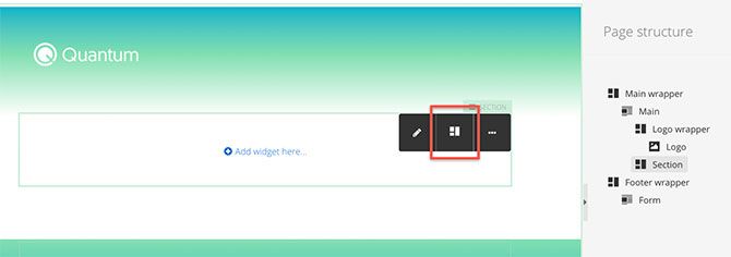
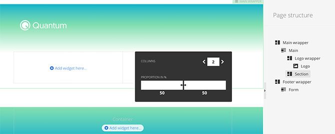
- Add a Section widget after the Logo wrapper. Split it into 2 columns [50%, 50%].
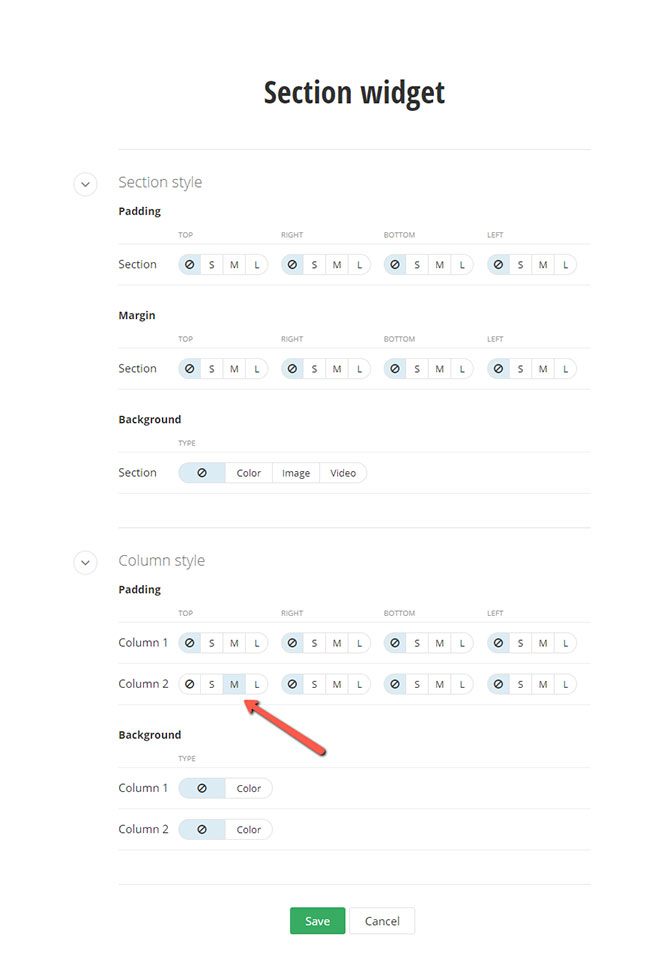
Edit this section and in the Column styles set Column 2 Padding top M. Switch to Advanced settings and set section label to Main heading, then set the custom CSS classes for Column 1 to “col-lg-6 col-md-12" and Column 2 to “col-lg-6 col-md-12 pl-xl-5".
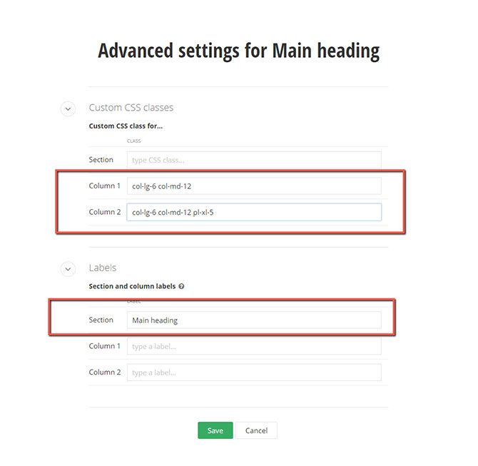
As we are using Bootstrap, we can take advantage of the responsive grid system they provide us with. So basically, we are saying that these columns should be side-by-side if the screen size is wider than a certain value, and should otherwise wrap. Click here to learn more about the Bootstrap Grid system.
- Inside Column 1 place an Image widget and select the laptop image from the library.
- Inside Column 2 place a Content block widget, followed by a Call to action (CTA) widget. Edit the Content block, switch to “View HTML” and insert the following:
<h4 class="qu-txt-white mb-2">QUANTUM WEB DESIGN WIZARD</h4>
<h1 class="qu-txt-white">Complete redesign for less than a week? We do this.</h1>
In order to switch to View HTML simply select the markup button shown below.
Edit the CTA widget and type “Get a free demo” in the Primary action field under Action label. In Display settings, change the value from Primary action to Secondary action. Set Margin top to M.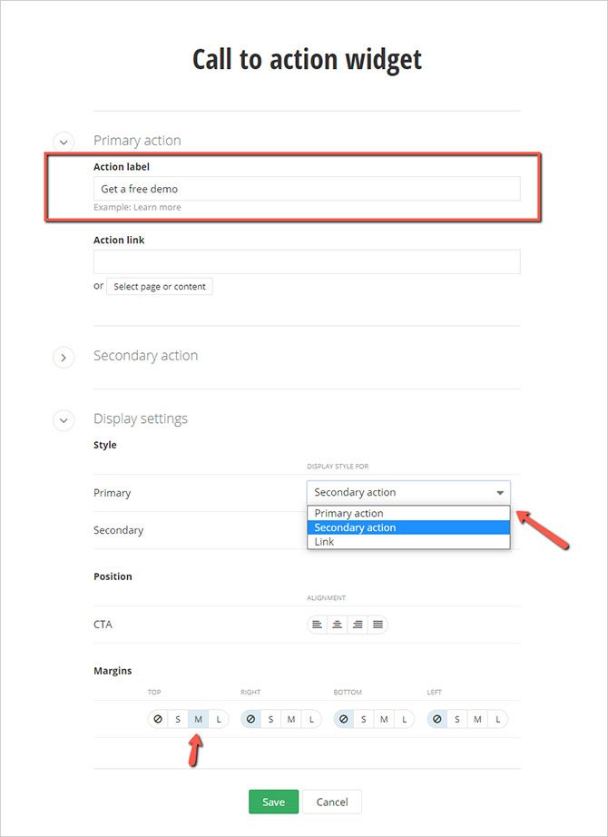
- Add a Section widget after the Main heading section and rename it. By that I mean navigate to Advanced settings and change Label to Conversion points. Set Section Margin bottom to S.
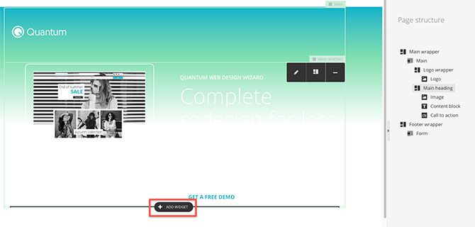
- Place a Section widget in the Conversion points section. Navigate to Advanced settings and rename it to Conversion heading. Remember to set the CSS class to Column 1 “col-lg-5".
- Add two Content block widgets inside Conversion heading. Edit the top one, and insert a horizontal rule, then choose Advanced settings and add set Margin top to L and bottom to M. You can insert a horizontal rule by pressing the button shown below.

Edit the second Content block, switch to View Html and insert the following:
<h2>Improve the Customer Experience on Your Website</h2>
- After the Conversion heading section, place another Section widget. Split it across 3 columns [42%, 8%, 50%]. Then rename it to Info and points. Go on and set Custom CSS classes as follows:
Column 1 = “col-lg-5 col-md-12"
Column 2 = “col-lg-1 col-md-12"
Column 3 = “col-lg-6 col-md-12 mt-lg-0 mt-5 pl-xl-5"
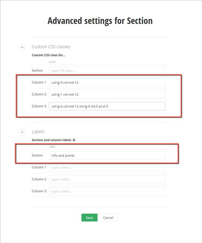
- Add two widgets in column 1: a Content block and a CTA. Edit the Content block and switch to HTML, then add this:
<p class="qu-txt-gray qu-txt-medium">We design beautiful websites for any business, portfolio, organization and more with the help our wizard designers and front-end gurus.</p>- Edit the CTA widget, set its Primary action label to be “More info” and choose Margin top M.
- In Column 3, add two sections. Rename them to Points 1 and Points 2 (So smart, right?). Split both sections into 2 columns [50%, 50%]. Now, in each Points section column (total of 4) we need to add a Content block widget. Edit the Points 1 section and add CSS class “mt-md-0 mt-3" to Column 2. Edit Points 2 section, set Section Margin top L and add CSS class “mt-md-0 mt-3” to Column 2.

- Edit the first Content block widget. In the toolbar, choose Insert image and select the a1 image from the Quantum sample page library.
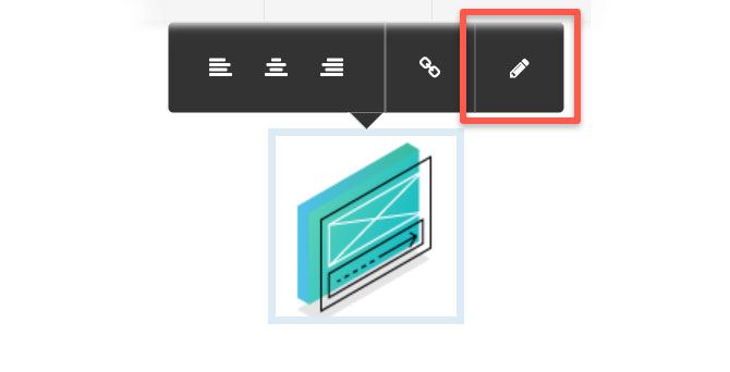
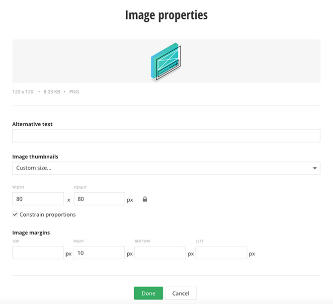
- Edit the image, change the Image thumbnails to Custom size and set both Width and Height to 80. Set Image margins right to 10.
Switch to HTML view and paste the following:
<div class="media">
  {{image markup}}
  <div class="media-body">
    <h4>EASY TO CHANGE</h4>
    <p class="qu-txt-gray">Enable marketers to manage the look and feel of your website
by applying the color scheme of their campaign.</p>
  </div>
</div>
Now replace {{image markup}} with the actual markup from the previously inserted image. At the end all should like something like this:
<div class="media">
<img sf-custom-thumbnail="true" src="http://localhost:5000/images/default-source/quantum-sample-page/a1.png?Status=Master&sfvrsn=43fbcc09_0" style="margin-right:10px;" sf-size="8218" width="80" alt="..." sf-constrain-proportions="true" sfref="[images%7COpenAccessDataProvider]b9038a2f-59f8-46a8-b9c5-a310aa9c758e"
/ data-sf-ec-immutable="">
<div class="media-body">
<h4>EASY TO CHANGE</h4>
<p class="qu-txt-gray">Enable marketers to manage the look and feel of your website by applying the color scheme of their campaign.</p>
</div>
</div>
- Do the same with the other three Content blocks and use the proper text and image for them.
- Now let's complete the last component in the Main section. Add a Section widget after the Conversion points section, rename it to Responsive and set Section Margin bottom to S via the Display section settings.
- Place a Section widget inside the Responsive section and rename it to Responsive heading. Edit it and set CSS class “col-lg-5" to Column 1.
- Add two Content block widgets inside Responsive heading. Edit the top one, and insert a horizontal rule, then choose Advanced settings and add Margin top L and bottom M.
Edit the second Content block, switch to View Html and insert the following:
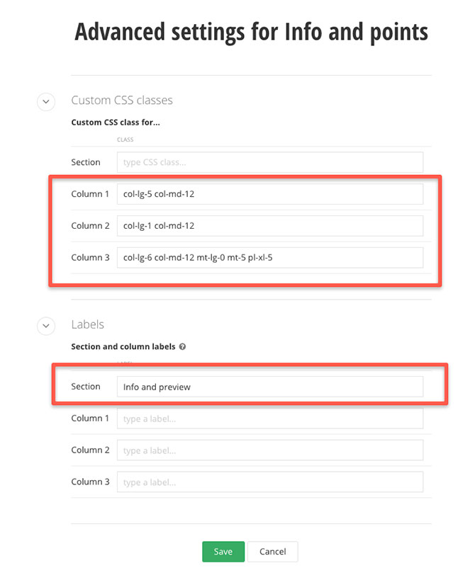
<h2>Mobile-Ready Solution Out of the Box</h2>- After the Responsive heading section, add another section. Split this section into three columns [42%, 8%, 50%]. Edit it and switch to Advanced settings, change its label to Info and preview and add Custom CSS classes, as follows:
Column 1 = “col-lg-5 col-md-12"
Column 2 = “col-lg-1 col-md-12"
Column 3 = “col-lg-6 col-md-12 mt-lg-0 mt-5 pl-xl-5"
- In Column 1, add a Content block and a CTA widget. Edit the Content block and paste the following:
<p class="qu-txt-gray qu-txt-medium">Quickly create a mobile site optimized for any device. All our designs are touch-friendly, easy to customize and offer accelerated mobile pages.</p> - Edit the CTA widget and change its Primary action label to “More info” and set Margin top to M.
- In Column 2, add an Image widget and choose the mobile image from the library.
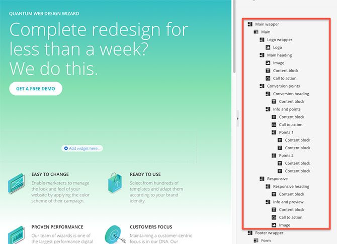
And that’s that, we are ready with the Main section. Just make sure you check out the Page structure as well, as we changed section labels in order to be more visible in the structure.
Footer
One more section left, and here is how we are going to go about it:
- Add a Static section widget into the Footer section, edit it and select ViewType = Container, switch to Advanced settings and rename it to Form.
- Add a Section widget to the Form section and rename it to Form heading. Set Section style Padding top S and Margin top S.
- Add a Content block widget to it, edit the widget and switch to View HTML. Now paste the following
<h2 id="get-free-demo" class="qu-txt-white">Get a Free Demo</h2> - Place a Section widget after the Form heading section and split it into 3 columns [33%, 17%, 50%]. Edit this section and set Section style Padding top to S and Margin top to S. Set Column 3 Padding top to M.Switch to Advanced settings, change its label to Form and testimonials and add Custom CSS classes as follows:
Column 1 = “col-lg-5 col-md-12"
Column 2 = “col-lg-1 col-md-12"
Column 3 = “col-lg-6 col-md-12 mt-lg-0 mt-5 pl-xl-5"
- In Column 1, add a DemoRequestForm widget.
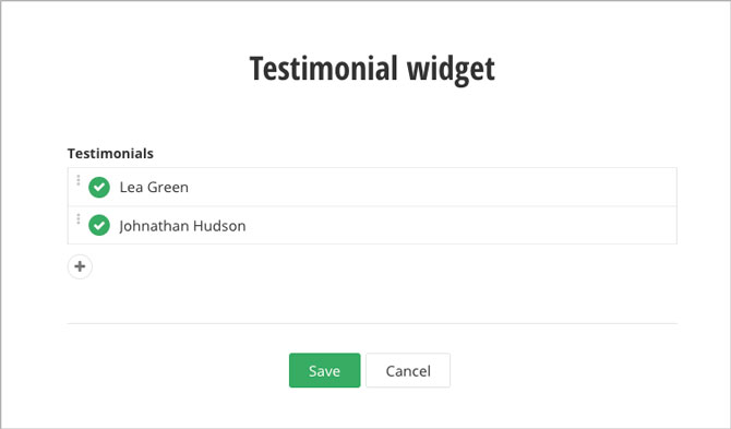
- In Column 3 drop a Testimonial widget. Edit it and select the testimonials to show.
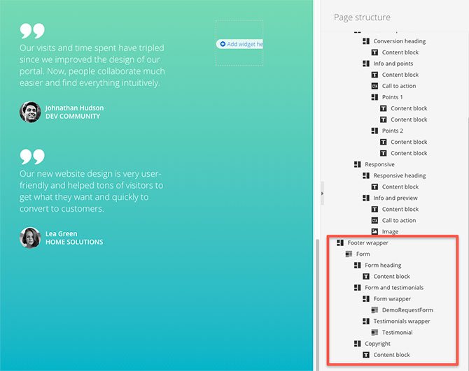
- Now add a Section widget below the Form and testimonials section and change its label to Copyright. Set Section style Padding top and bottom to S and Margin top to L. That would be our final section.
- In the Copyright section, add a Content block widget, edit it, switch to HTML view and paste the following:
<hr class="-white" /> <p class="qu-txt-white qu-txt-small">Copyright © 2020 Quantum. All rights reserved.</p>
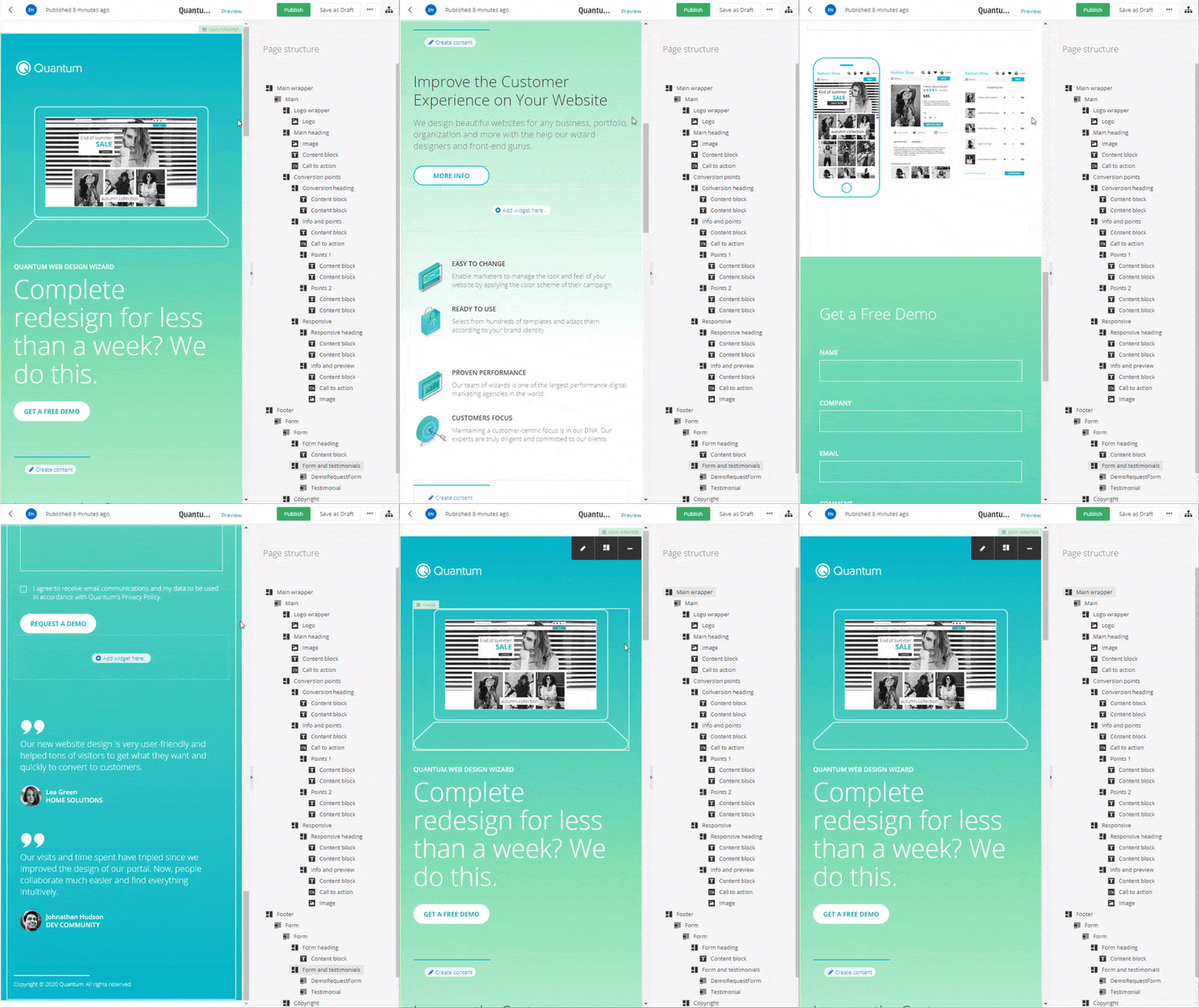
And, we are done with the last section of our page. Doesn’t look bad, does it?
And because we are using Bootstrap, we get a mobile friendly, responsive design as well, right out-of-the-box.
Wrap-up
Feel free to give it a try and follow the conversation in our dedicated community thread. There, you can mix with like-minded people and keep up with the latest on Sitefinity and .NET Core. You’re most welcome to join our dedicated .NET Core webinar and discover how the new 3-tier architecture helps you future-proof your projects. Hit the link below to reserve your seat.
Register For a Live .NET Core Webinar

