Designing for Higher Education: Trends and Best Practices

When designing higher education websites, certain things are a must: an accessible and responsive design, a segmented navigation, inclusive imagery, high-tech features. These and other best practices will help your university website connect with students, their parents and other visitors.
When considering colleges and universities to apply to, students and parents are likely focused on the majors offered, student life options and other perks like study-abroad programs and Greek organizations. But in order to learn all of this about your institute of higher learning, they need to find it on your website.
Are your website design, features or content going to prevent this from happening?
Below, we’re going to look at some higher education web design trends and best practices that will allow your site to provide a strong first impression and overall great experience. This way, your visitors won’t get hung up on difficult-to-use or outdated interfaces and can focus on reading through the available information to decide if your institute is right for them.
Higher Education Web Design Trends and Best Practices
Designing websites for higher education institutions can be challenging. Not only do you need to design something that digital natives like Gen Z appreciate, but they need to be just as usable and intuitive for other users.
Here are five best practices that will allow you to do this:
Modern UIs
Higher education websites attract all kinds of users—prospective students, parents of those students, alumni, media and others. But, let’s face it, there are two segments of users you really need to impress with your site: the students and their parents.
Unless you’re building a site for a school that serves adult learners or non-traditional students, the vast majority of your target audience will fall into the Generation Z and Millennial categories. Which means your website will need to meet some really high expectations in terms of design.
Outdated layouts, unengaging designs and bland, unoriginal palettes just won’t cut it. Here are some examples of higher education websites that do meet the grade:
Here is the homepage for Flagler College:
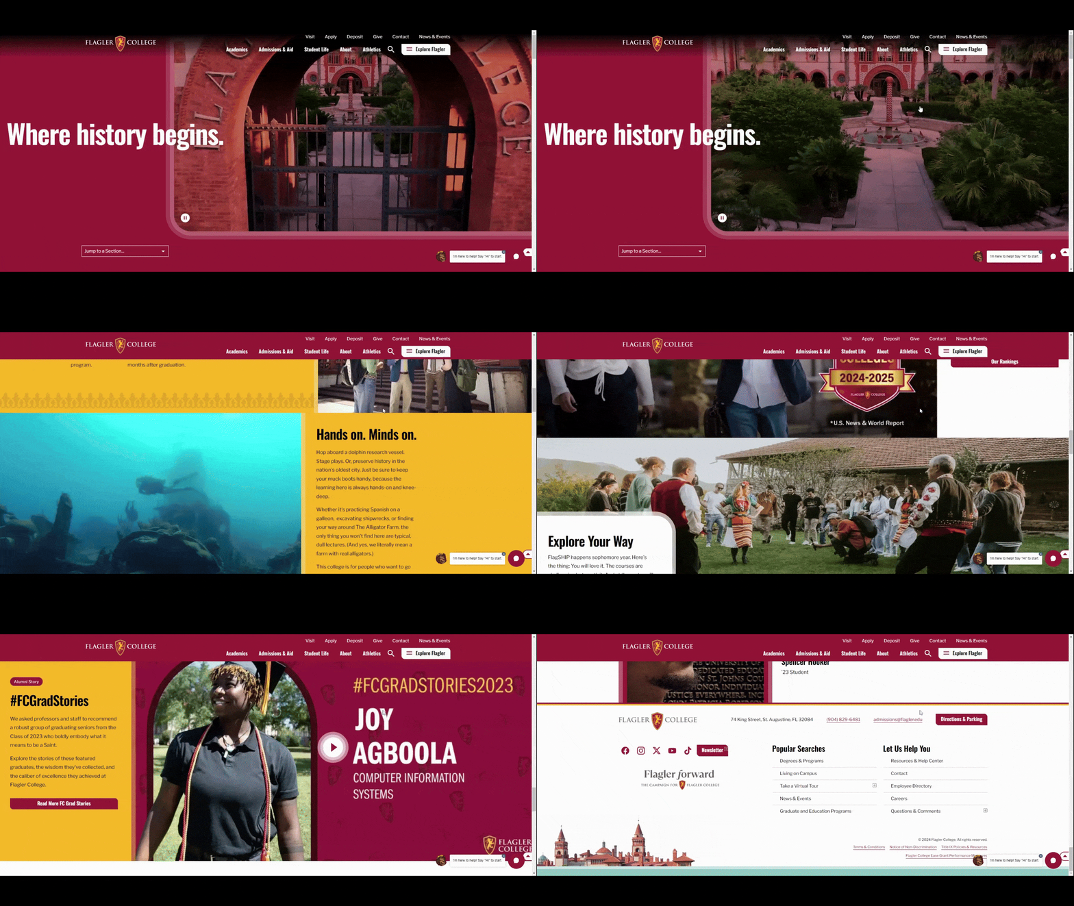
We see a number of modern design touches that will help this site design appeal to younger users, like:
- Fullscreen sections
- Immersive video
- Scroll-triggered color changes
- Short, easy-to-read content blocks
- Large and visually interesting photos
- Fullscreen navigation menu
The University of Texas at Austin website is another one that has been built for a modern audience:
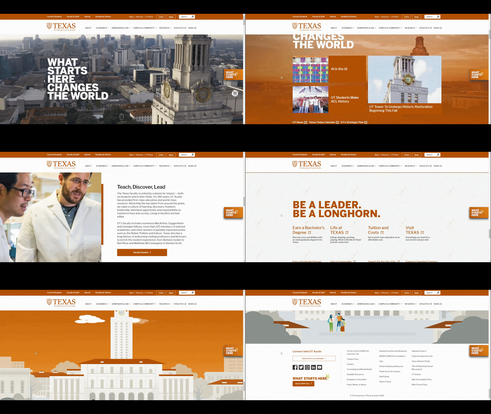
On this homepage, we see user-friendly elements like:
- Fullscreen sections
- Background videos
- Parallax scroll
- Split-screen scrolling effects
- Eye-catching shapes
- Large text and numbers
- Custom animation
Be sure to visit both of these sites on your mobile devices, too. The designs vary slightly to account for the inherent changes between desktop and mobile, but they’re just as well done.
Page speed scores for these sites aren’t great. However, if your hero section loads within a reasonable enough time on mobile and is super engaging, you shouldn’t have a problem capturing the interest and attention of your users.
Well-Constructed Navigation
Higher education websites have tons of information on them. So, the header navigation plays a critical role in the user experience.
When putting together the navigation for your site, you need to decide a number of things:
- Do you want the navigation to go across the top of the page?
- If so, which links or categories belong there (since you likely won’t fit it all)?
- How will you order and organize those links?
- Will your mega menu include images, or will it simply be list- or link-based?
- How will you present your secondary links: hamburger menu style or in a bar above the main header and navigation?
How you organize and present this information will have a huge impact on your users’ experience. So, it’s a good idea to take a look at how other universities and colleges have designed theirs.
Let’s start with the University of Arizona.
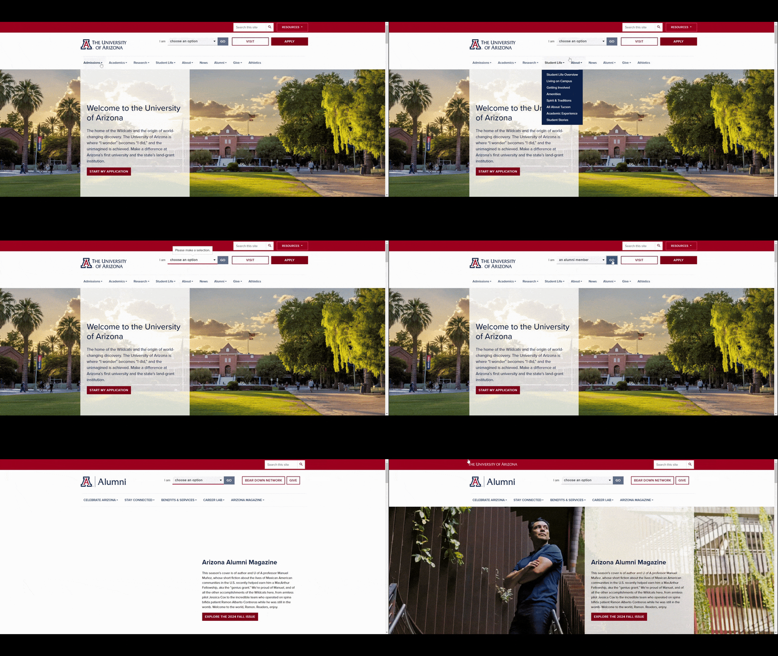
This example is great for a number of reasons.
For starters, the primary navigation is reasonably sized and well-organized. Also, each dropdown menu requires the user to click to reveal the subcategories. So, instead of users accidentally passing their cursor over a category and having the dropdown cover the content they’re trying to look at, they control when these menus open.
Also, there’s an “I am” dropdown at the top. You can’t see it in the video above, but the options are:
- A future student
- A current student
- A faculty or staff member
- A parent or visitor
- An alumni member
- A donor
- A business or partner
When one of these options is selected, the site transforms according to the user segment. This way, designers won’t need to overload the navigation with options for every type of user. Instead, they fill it with the most popular and important pages. Then create separate experiences and/or microsites for users with differing interests.
Another great example to follow is the navigation on the Kenyon College website:
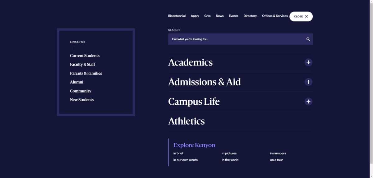
The minimal hamburger menu allows visitors to focus on the content instead of getting distracted by all the links and other options at the top of the site. When engaged, though, the fullscreen pop-out menu is beautifully organized.
On the left are links for user segments. On the right are links for everything else on the site. You can see how the designer has used typographical hierarchy (size and weight) to establish what the most important links are. Also, the way in which they’re laid out makes it easy to identify which groups of links belong together.
Overall, this makes for a great navigational search experience.
Smart Program Search
On a related note, no higher education website would be complete without on-site search.
Typically, we see this in two areas on the site. The first is in the header where visitors can search through all of the content on the site. The second is in the Programs/Majors section. The latter is the one we want to focus on.
Why does this search experience matter so much?
Well, many institutions offer dozens, if not hundreds, of different programs for students to choose from. Even if you make the list of degrees or programs alphabetical, students could be scrolling for a while. Plus, there’s no knowing how the school has worded them and if they align with the prospective students’ or parents’ expectations.
So, these program pages need to be equipped with a smart search experience. This means adding filters so that users can narrow down the list of visible options and including a search form that detects fuzzy matches and can provide accurate alternative recommendations.
For example, here’s the Mizzou Online Program finder page and how the search functionality works:
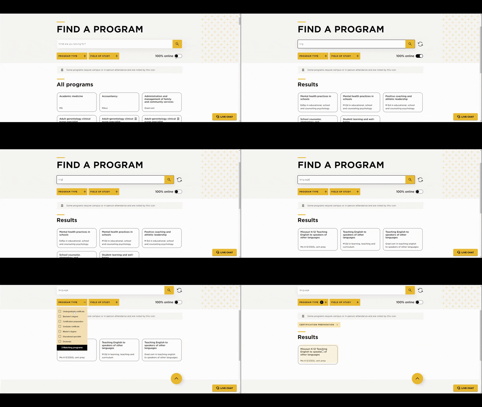
Notice how the program blocks at the bottom change as the user types their query into the search box at the top. This way, users see in real-time how many possible matches there are. It also might give them a better idea of the kind of wording they should use to find what they’re looking for.
Another good example can be found on the Undergraduate Majors page for Penn State:
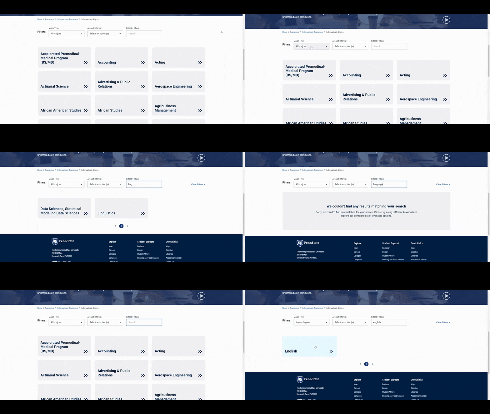
This school offers a similar search experience to Mizzou Online. What I like about the design of this page, in particular, is how the list of all majors doesn’t appear on the main page. Instead, there’s a numerical navigation placed at the bottom.
There are currently 259 majors available at Penn State. If the designer had included every block on the main page, any student or parent who attempts to scroll down the page would likely experience frustration or overwhelm at some point. So, the numerical navigation along with the filters and search bar are very smart choices.
In addition, the 18 pages found in the numerical navigation might actually encourage more people to take advantage of the search and filters. A more streamlined search approach will make students, parents and other users much happier with this search experience.
High-Tech Features
It used to be that college websites provided static information about the school, available programs, costs, faculty and so on. These days, there’s so much more that can be done with a website. You want it to act and feel like other apps that so many people use on a regular basis.
So, when it makes sense to do so, your higher ed site needs to come with high-tech features that enhance the experience.
Here are some examples of features you might include:
The University of Delaware website offers prospective students the ability to virtually tour the campus.
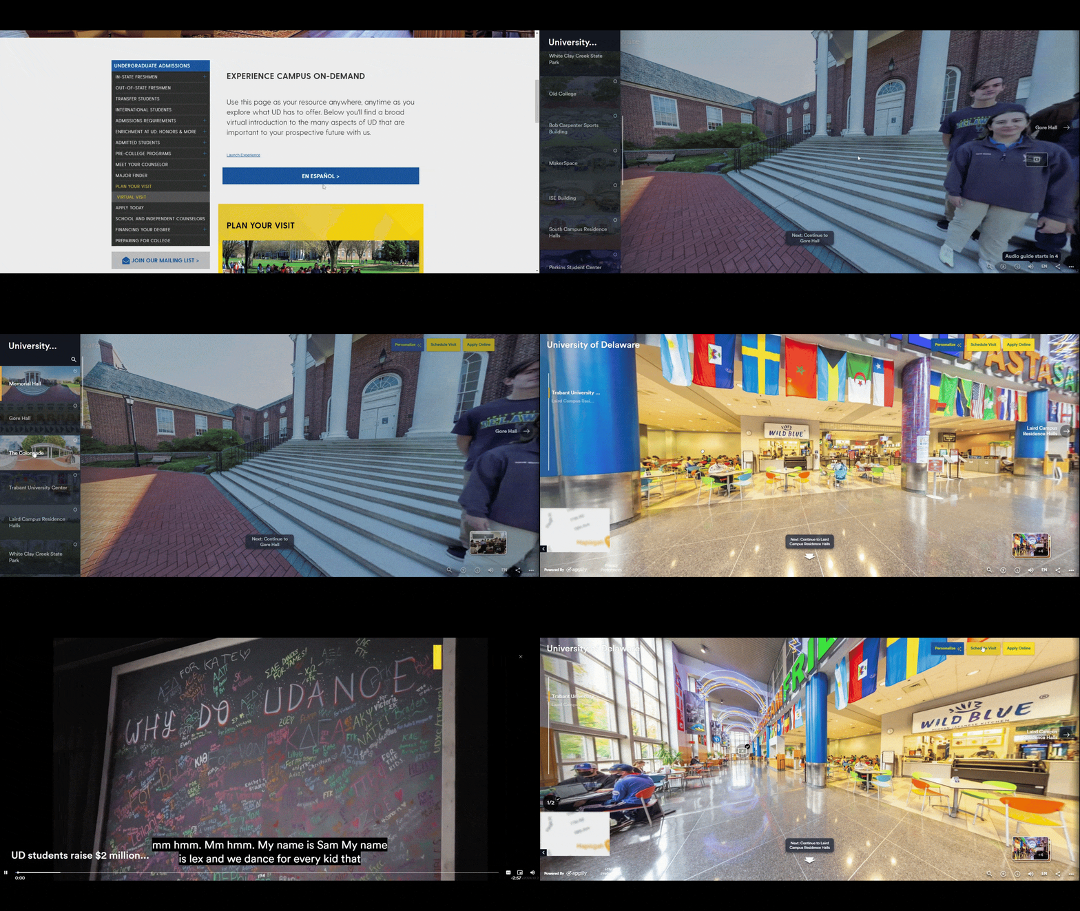
In addition to choosing various lecture halls, food courts and other spots of interest to visit, you’re able to move around the 3D space just as you would if you were touring in person. Plus, each locale comes with a unique voiceover from a tour guide that explains what you’re looking at, the history of it and so on. There are also occasional elements you can interact with as well.
While these 3D VR tours were a necessity in 2020, they seem to have stuck around on many higher ed sites, which is great. For students and families who might not have the capacity or money to travel to every college they’re interested in, virtual tours give them the ability to do so now.
Another worthwhile feature to add is something that many visitors will appreciate: an interactive campus map. You’ll find one of these on the Georgia State University website:
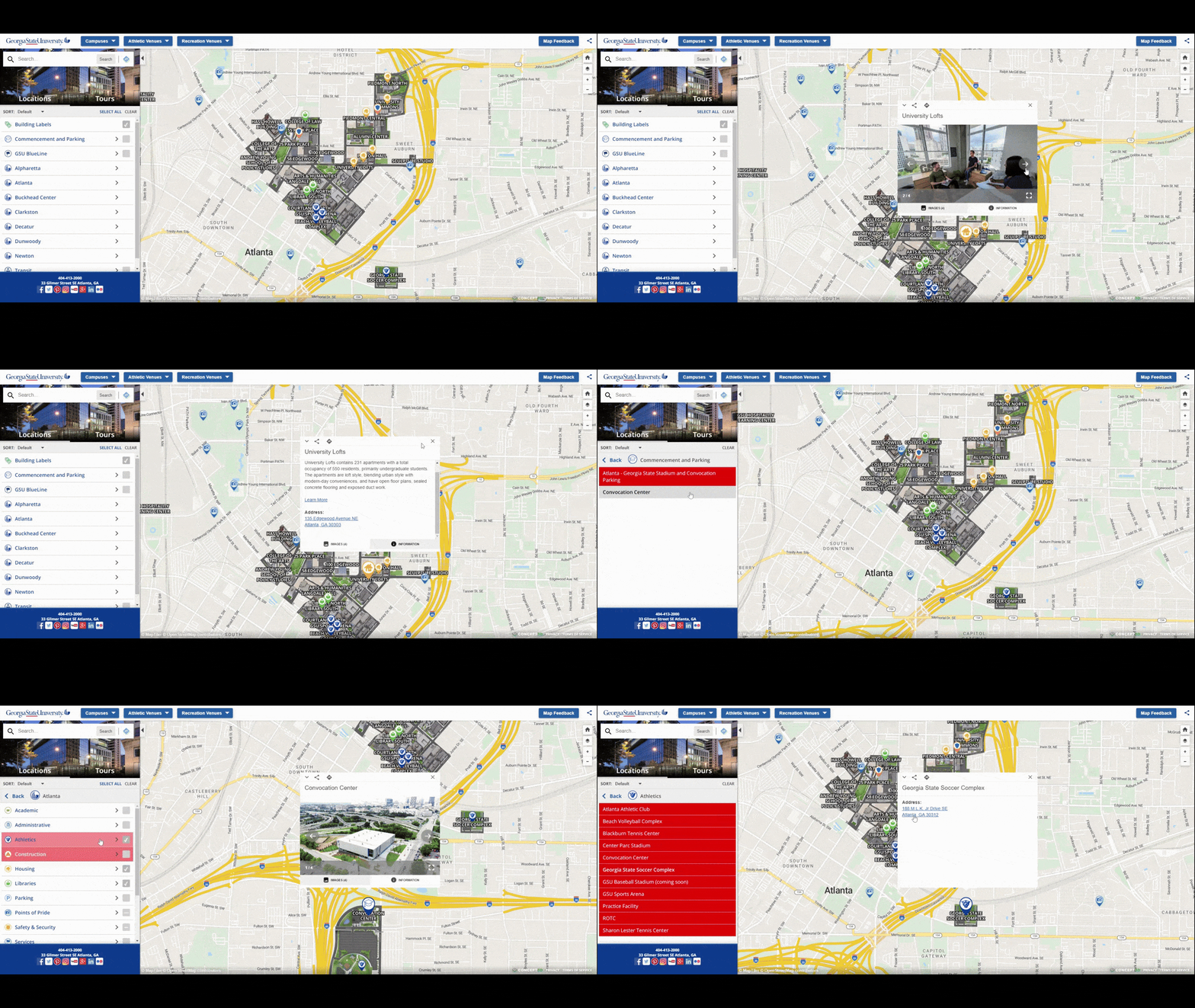
Similar to Google Maps or Waze, this map offers users the ability to locate points of interest—buildings, parking lots, student housing and more—in an interactive map format. Or they can use the options from the sidebar to home in on specific campuses or building types and find what they’re looking for there.
Once they’ve found it, each location comes with pictures, extra information and a physical address. Students can also share these locations with others, use an internal GPS system to map out directions to the point of interest, or open them up in Google Maps.
There’s also a tab called “Tours” in this app. From here, users can access the virtual tour, the audio for the self-guided tour and more.
Inclusivity
Inclusivity is a big deal when designing digital experiences for younger generations. In particular, the inclusion of images and graphics that provide a fair and accurate representation of your campus are a must.
While many people might think of this from an ethnicity perspective, there are so many other ways to reflect the inclusivity and diversity of your school.
As an example, watch the video found in the hero section of the Loyola University homepage.
In the full video, you’ll see tons of diverse examples, like:
- Students walking with professors
- Students hanging out together on campus
- Men’s sports teams
- Women’s sports teams
- Different sports (crew, basketball, volleyball, etc.)
- Sports fans
- An a capella group
- Science students working on projects
- Students campaigning for the Center of Community Justice
- A rooftop gardening project
Your campus is about more than the demographics of the students who go there, so your visuals should represent as much of the experience as possible. And if you want them to have an even bigger impact, make them feel more authentic and less staged.
A Note About Accessibility in Higher Education Design
When we talk about inclusivity in web design, we have to think about more than just the content we put on our pages. We also need to focus on how inclusive and accessible the website is itself.
Numerous colleges and universities in the United States have been sued for having inaccessible websites. MIT and Harvard are two such institutions sued for their websites and web-based applications being inaccessible to some students.
Neither institution was able to have the lawsuits dropped, and so they were forced just before 2020 to bring their websites up to standard. In particular, they needed to add captions to all their video content and make their websites capable of being read by screen readers.
Although this is somewhat old news, you can see how the slew of lawsuits around the mid- to late-2010s impacted higher ed design. Most schools nowadays have their own digital accessibility policies to go with their real-world ones.
In addition to making sure their websites are accessible, schools like the University of Minnesota provide students with the ability to request help with digital accessibility.
So, if your school website doesn’t meet the requirements of WCAG 2.0 or higher, now is the time to do so. Your site will also need to publish an easy-to-find digital accessibility policy as well.
Wrapping Up
In higher education design, it’s not enough to design a website that looks good or seems usable enough. You’re creating a website for the most tech-savvy generations of users, so the bar is set very high.
Granted, your website design might not be the ultimate deciding factor for a student when they’re deciding between their top school choices. However, it could be one of the first deciding factors as they whittle down a large number of schools to research and tour.
So, your higher education website needs to be built to make an amazing first impression. A modern UI, well-built navigation, smart search functionality, high-tech features and inclusivity will all contribute to this goal.
The information provided on this blog does not, and is not intended to, constitute legal advice. Any reader who needs legal advice should contact their counsel to obtain advice with respect to any particular legal matter. No reader, user or browser of this content should act or refrain from acting on the basis of information herein without first seeking legal advice from counsel in their relevant jurisdiction.

Suzanne Scacca
A former project manager and web design agency manager, Suzanne Scacca now writes about the changing landscape of design, development and software.
Next:
Comments
Topics
Sitefinity Training and Certification Now Available.
Let our experts teach you how to use Sitefinity's best-in-class features to deliver compelling digital experiences.
Learn MoreMore From Progress
Latest Stories
in Your Inbox
Subscribe to get all the news, info and tutorials you need to build better business apps and sites

