Sitefinity Admin UI Reimagined

Historically the Sitefinity admin UI (Backend) served different personas. Over time, the same UI became more and more complex while trying to satisfy the needs of backend developers, IT, front-end developers, content editors, campaign managers etc. To simplify the growing collection of features , we tried to streamline and group the users in different categories and provide more focused, targeted and fine-tuned context for each of them.

In the admin area, new features come with each release which could end up distracting you from completing your initial task. The new functionalities might be more technical and bring confusion to marketing people, who may not know what some of the options are meant for, and this makes the learning curve for non-technical users steep. Taking all of this into consideration, as well as your feedback over the years, we decided to reimagine the UI of the administrative area of the CMS.
How to start using the new Admin?
With Sitefinity 10.2 an early preview of the new UI is coming. It partially covers the functionalities for content editing in the Sitefinity admin. For now, you can use it only for content editing. Our plan is to revamp the content editing experience in the next official releases. Go to administration and switch to the new interface:
Why is the User Experience so important?
Before you start exploring, I will share a few details about the new user experience and the significant changes introduced to the interface.
As the rich functionality of Sitefinity grew through the years, the current interface got a little cluttered with various components and has become overwhelming for a content creator. The variety of elements distracts the user and limits the writing space.
The new UI hides redundant elements like filters, additional actions, and navigations to make room for the content. Each screen is focused on one primary task – content creation.
The secondary functions are tucked under menus and sidebars and available on demand. This distraction-free mode places the content center stage, cutting the chrome and enhancing readability.
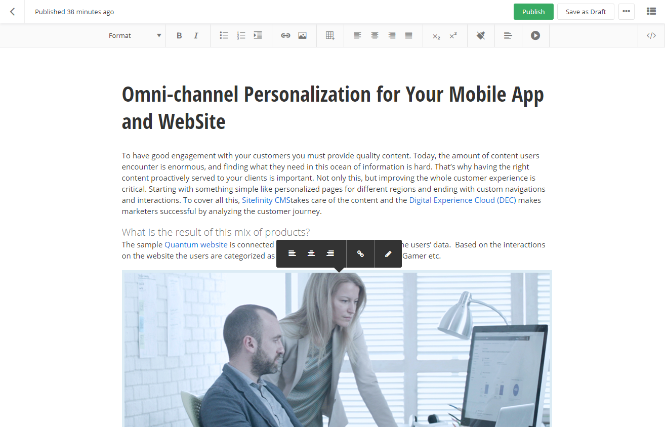
Striving for simplicity, we transformed the old-school boxy forms into modern day UI components where visual hierarchy is created by the typography and rich interactions improve productivity. Our text editor employs new functionalities like contextual toolsets, and its spacious design accommodates more content.
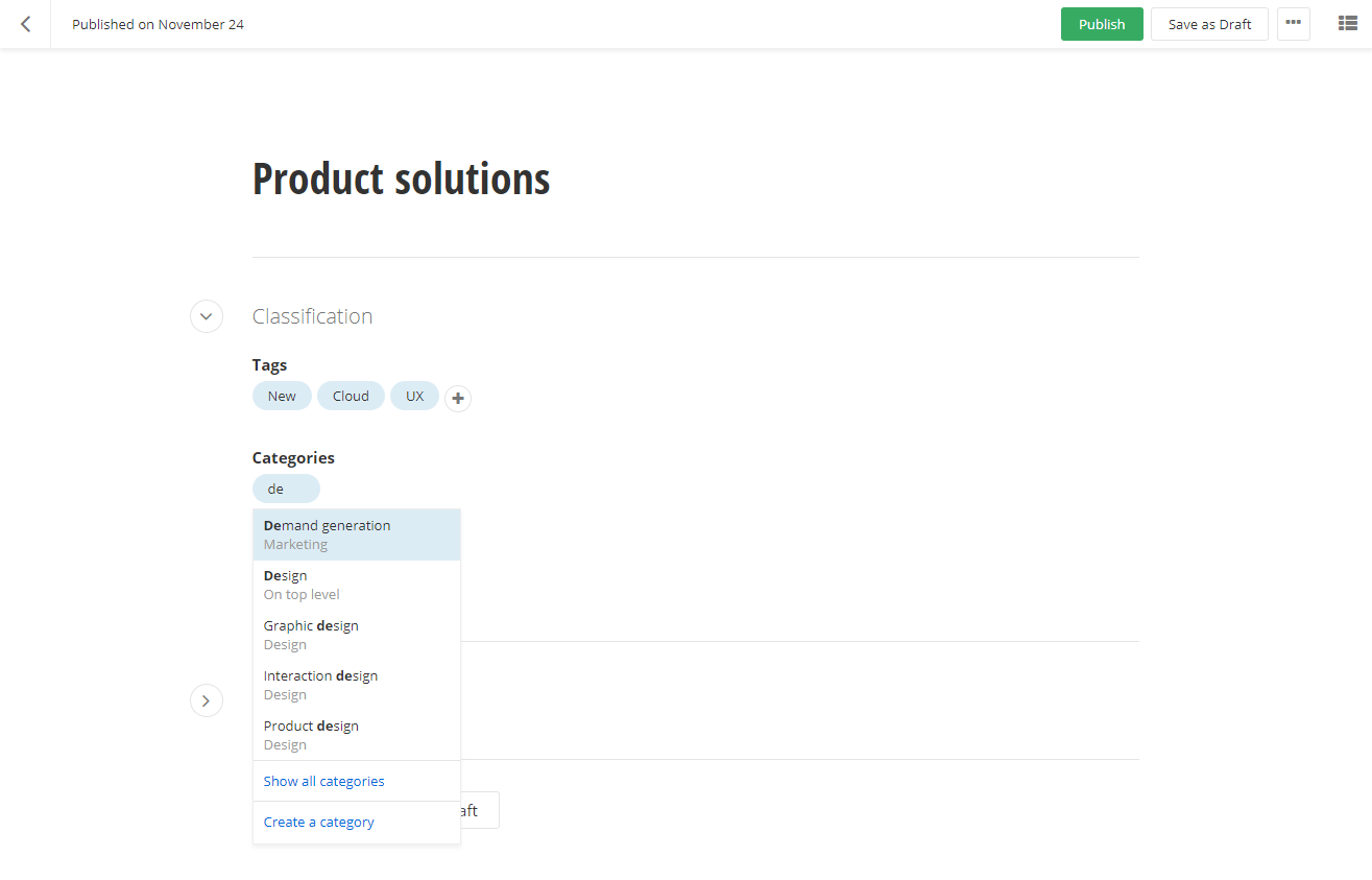
Selectors, related data fields, and classifications are easy to work with even when dealing with content at scale.
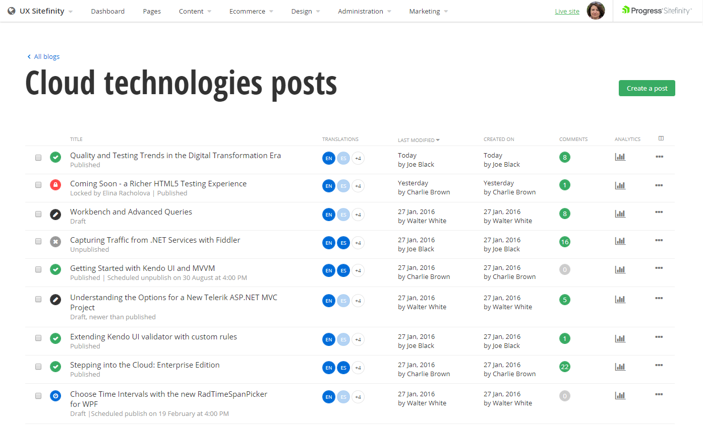
To view all the content items the new grid visualization is optimized with bigger fonts and more space, so users can have additional columns and better readability.
Where is the new UI applied?
The Progress Sitefinity team understands very well that a huge change in the current user experience can damage your productivity and bring confusion. That is why we want to introduce the new UI piece by piece. As we all know, content is king, and we decided to enable the new look first for the content creation in News, Blogs and dynamic content modules. In the next releases, other parts of the admin will be revamped, so you as users will have enough time to adopt it and get used to it.
Why should I give it a try?
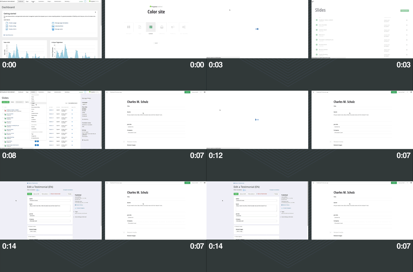
The reimagined part of the admin is based on Angular 4. With our API-first approach in combination with the new UI the result is obvious - faster productivity. The short video below compares the same action with the old and the new UI (the design is different because the video was taken during the development of the project, but don’t let this bother you). Notice that the work on the right side is done two times faster 😊. Our goal is to improve the productivity during the content creation process and make the navigation intuitive and fast.
(click on the video to start it)
Even though the new content creation experience is sneak peak of what is coming and not required, we suggest you give it a try today. We think you’ll find it an improvement over the old UI that will help you get your tasks done faster. Here is a comparison table with the classic UI where you can find what is supported in the current version. This will prepare you for the modern trends that will come Sitefinity 11.x. Any comments or feedback are more than welcome.

Peter Filipov
Peter Filipov (Pepi) is a Product Builder focused on building the future of Sitefinity, relying on the newest technologies such as .NET 6 (and up), React and Angular. His previous experience as a Developer Advocate and Manager of Engineering helps him to understand the customers’ and market needs of Sitefinity. He also is passionate about being active and healthy.

