Card widget
You use the Card widget to present your website visitors with specific types of information that guides them to their next best experience on your site in the context of their customer journey. The next best experience is a call to action, along with any content or image, and is based on the needs and specifics of the type of audience you are targeting.
You easily personalize the content of the Card widget in accordance with to the visitor segment viewing the widget. To do this, you use composite content elements within the widget that attract attention and entice action. For example, information you display to developers differs from the information you display to marketers. Thus, the call to action for developers may be “Download a trial”, whereas the call to action for marketers may be “Download our e-book”.
As a result, you engage your audience in a relevant and interactive manner with on-page contextual engagement signals and call to action.
You can personalize the Card widget for any user segment you previously defined. For more information, see Personalize widgets.
For a full sample of how to implement a personalized Card widget, see the GitHub repository.
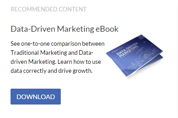
The following is an example of a Card widget on a page:

Configure the Card widget
The Card widget enables you to easily update, maintain, and personalize the recommended experiences and calls to action. The widget comprises of content elements, which are tied together to create an entry point to more detailed information or a conversion goal on the site.
NOTE: You can use all or only some of the elements of the Card widget.
The widget consists of the following:
- Heading
The title of the content that the widget displays, for example, Data-Driven Marketing eBook.
- Text
A personalized message or text targeted to the audience you want to engage.
- Image
Select an image that is displayed along with the description. You can later change the image and edit the image properties.
- Primary action
This is the call to action you want to invoke, for example, Download, or Learn more.
- Label
Name the Action button in accordance with the call to action
- Link to…
Select a page that is opened after the visitor clicks the Action button, for example, www.mydomain.com. You can select a page within current website or an external URL.
Define the Card widget layout and design
To define how the widget is defined or styled, expand the More options menu. Define one or more of the following:
- Template
The template you choose basically defines the layout of the widget, for example horizontal or vertical placement of widget elements. choose between:
- Card
This is the default option. This template is suitable for card-like blocks.
- Hero
Suitable for banners and page headers.
- Simple
Suitable for content summaries.
- Style
You can select the background color of the widget elements.
- CSS class
You can enter the name of a specific CSS file you want to style the widget.