Design the layout with the Section widget
Design process
Before creating the content of the page, you need to define the layout – for example, how many columns a page should have, what margins and paddings should be defined, what background colors should be applied, etc.
After creating the ASP.NET Core page, the process involved in designing the layout of a page is the following:
- Add the Section widget.
You start creating the layout by adding one Section widget.
- Add Section widgets below and above.
To define your layout vertically, you use one or more Section widgets, placed one above the other.
- Configure the columns.
To define your layout horizontally, you use one or more columns.
You can separate one Section widget into as much as six columns.
- Nest Section widgets
To accomplish more complex layouts, you can nest Section widgets.
For example, you can place two Section widgets one above the other inside the column of another Section widget.
- Style the Section widgets.
After defining the rows and the columns of your page, you can style the Section widgets on your page. You can choose background color. You can define the margins of each widget and the padding of widgets and columns.
- Add content widgets.
After you have defined the layout and styled the widgets, you can drop the Content block, the Image, or the Call to action widgets.
Create sections
After you have created a new page, you start designing the page by adding the Section widget.
- To do this, click Add widget here…
- Click Layout and select Section.
When you drop the Section widget on a page and hover over it, the Section label appears.
The following screenshot displays the Section label that helps you distinguish the Section widget:
A Section widget spans horizontally. You can then divide it into columns and further nest Section widgets inside the columns.
NOTE: By default, the new section is added with preselected padding S (small) for top and bottom. You can change this later.
-
To add another Section widget, hover below or above the existing Section widget.
The following screenshot displays the clickable elements that appear:
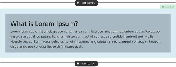
- Click ADD SECTION and select Section.
Another Section widget is added above or below the existing one.
NOTE: You can only place Section widgets one above or below the other, you cannot add Section widgets to the right or to the left of another Section widget directly. To do this, you must first use columns and then nest Section widgets inside the columns.
Nest sections
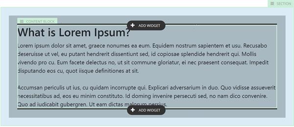
To achieve more complex designs, you can nest Section widgets. To do this, first place one Section widget on the ASP.NET Core page, then, divide it into columns, and, finally, place another Section widget inside one of the columns.
The following screenshot displays how you can place a Section widget inside another Section widget:
Reorder sections
You can use drag-and-drop to reorder sections. Each section is dragged together with its nested sections and content widgets.
Create columns
After you have created the sections of your page, you can further divide each section into columns. You can split each Section widget in two to six columns. Then, you can define the width of each column.
To divide a section into columns, perform the following:
- Hover over the Section widget that you want to divide into columns.
- In the upper-right corner of the widget, click its SECTION label.
A menu with options appears.
- Click icon
 » Layout.
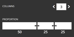
- In the input field, enter the desired number of columns.
- Adjust the size of the columns by dragging the column separators to the desired width.
The numbers attributed to each column represent the percentage of the column widget to the width of the entire Section widget. The minimum that a column can span is eight percent of the respective Section width.
The following screenshot demonstrates the column adjustment option:
- To close the column adjustment option, click the SECTION label again.
RESULT: After you have defined the columns, you can place elements inside them. Inside a column you can place:
- Another Section widget
- A Content block widget
- An Image widget
- A Call to action widget.
- A custom widget
CSS classes assigned to columns
The default Section widget layout is based on Bootstrap 5 framework. Therefore, the columns sizes can be only proportions that are supported by the Bootstrap styles. Once you choose the proportions, they are transformed to the Bootstrap class and are applied to the columns to provide the selected proportions.
The following tables lists some examples of the styles that are applied for some of the different configurations available:
| Proportion |
Class for column 1 |
Class for column 2 |
Class for column 3 |
50% - 50%
|
col-6
|
col-6
|
|
| 33% - 67% |
col-4 |
col-8 |
|
33% - 33% - 33%
|
col-4 |
col-4 |
col-4 |
17% - 42% - 42%
|
col-2 |
col-5 |
col-5 |
25% - 50% - 25%
|
col-3 |
col-6 |
col-3 |
For more information, see Bootstrap documentation » Grid system.
Quick style
You can quickly configure paddings and margins, without opening the widget settings.
- Hover over the Section widget that you want to divide into columns.
- 2. In the upper-right corner of the widget, click its SECTION label.
A menu with options appears.
- Click icon
 » Spacing.
- For the Section, you can configure the following:
- The section margins – choose from the predefined values of none, small, medium, or large.
- The section paddings– choose from the predefined values of none, small, medium, or large.
- For each column, you can configure individual paddings.
Widget settings
To open widget settings, perform the following:
- Hover over the Section widget that you want to divide into columns.
- In the upper-right corner of the widget, click its SECTION label.
A menu with options appears.
- Click icon
 .
.
The styling page appears. It has the Section style and the Column style sections.
NOTE: If the Section widget does not have any columns, it is treated as having one column that you can style separately of the section.
Style the Section
For each Section, you can configure the following:
- The section margins – choose from the predefined values of none, small, medium, or large.
- The section paddings– choose from the predefined values of none, small, medium, or large.
- The background color of the section.
Choose one of the following:
- Use a Color for the background.
In Value, select one of the predefined colors.
- Use an Image for the background.
Click  (Select) and choose between the following:
- Upload an image from your computer
To upload an image, drag and drop it in the window or click Upload image from your computer, browse your computer to find the image you want to upload and click Open.
- Select an image from library
The system displays recently used images.
You can select one of the recent images or perform the following:
- Select the content provider where the image is located
- Click the library where the image is located.
- Select the image and click Use selected.
- Choose how to place the image on the background by selecting between Fill, Center, or Cover.
- Select a Video for the background.
Click  (Select) and choose between the following:
- Upload a video from your computer
To upload a video, drag and drop it in the window or click Upload video from your computer, browse your computer to find the video you want to upload and click Open.
- Select a video from library
The system displays recently used videos.
You can select one of the recent videos or perform the following:
- Select the content provider where the video is located.
- Click the library where the video is located.
- Select the video and click Use selected.
Style the columns of the Section
For each column, you can configure the following:
- The column paddings– choose from the predefined values of none, small, medium, or large.
- The background color of the column – choose between none or one of the predefined colors.
When finished, click Save.
Example
The following screenshot illustrates the different styling options: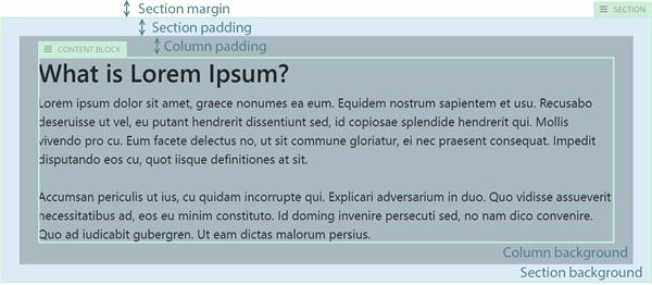
Advanced settings
When you are styling a Section widget, in addition to the basic predefined settings, you can also apply a custom CSS class to each element separately.
To do this, perform the following:
- Open the Section widget for styling.
- In the upper-right corner of the page, click
 (Advanced settings).
- You can enter individual CSS class for the Section and for each of its columns.
- Click Save.
Sample
To achieve a margin between two columns, you place two Section widgets inside the columns and configure their margins.
The following screenshot demonstrates how to nest widgets. All margins and paddings are configured to medium. The margins of the two nested sections are used as spacing between the two columns of the first Section widget.

Tutorial
You want to nest some Section widgets, so that you can achieve the following page layout:
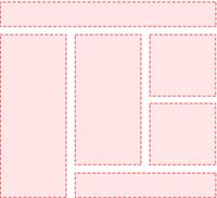
Perform the following:
- Create a new ASP.NET Core page.
- Drop one Section widget on the page.
- Below the first Section widget, drop the second Section widget.
- Divide the second Section widget into two columns.
- Adjust the first column to be 33 percent of the widget and the second – 67 percent.
- Inside the second column, drop the third Section widget.
- Inside the second column, below the third Section widget, drop the fourth Section widget.
- Divide the third Section widget into 2 columns – each 50 percent wide.
- Inside the second column of the third Section widget, drop the fifth Section widget.
- Inside the same column, below the fifth Section widget, drop the final, sixth Section widget.