Customize list components
Overview
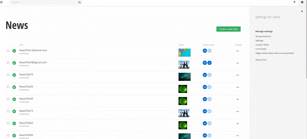
Sitefinity CMS Admin App uses the list component in various places, such as the list of content items, the sidebar, or related data.
This article demonstrates how to customize the list's item template using a custom Angular component.
One common way to extend the list of items is to add a column to the grid in the selector. This column makes the administration of your items more convenient and faster.
For example, you can display additional information for dynamic module selectors. For example, if you have a Physicians module with Physician ID as an identifier, the data is not sufficient for the content editors to understand which is the correct item to select, and you may want to customize the data displayed to your visitors.
To solve this problem, Sitefinity CMS exposes an API that enables you to modify the HTML of the related data selector. This way, you can change the displayed information. For example, in addition to its name, you can add the start and end date to an event.
When you create custom templates, these templates are applied in the following places:
- The full list of items
- The short list of items that can be selected, where five items are shown
- The already selected items
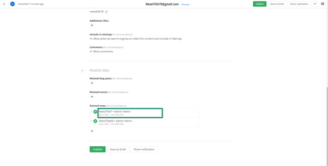
The picture below shows where the custom component is rendered in the list's item template.

Tutorial: Implement custom component for related data
In this tutorial, you learn how to create a custom Angular component for the related data feature. This component is rendered in the following parts of the UI:
- Already selected related items
- Dropdown box for the recent items and search drop-down
- Related data selector and the adjacent search feature
- Read-only mode of the content item

NOTE: The search functionality in the related data fields (and in the entire Admin App) is based on the item's primary identifier, which is the Title in the case of the default content modules. When you modify the component rendered in the tree's item template, it will not affect the search feature. If you want to add another field to the search, see Extending search functionality in AdminApp.
Implement the component
Implement an Angular component as usual. The only requirement is that your custom component must extend the abstract class CustomTreeComponentBase. This, in turn, forces you to implement its sole property item: DataItem, which Sitefinity CMS will populate with the item to be rendered.
IMPORTANT: You cannot use the Angular binding syntax {{item.data.CreatedBy}} when creating component HTML templates. Instead, you must use another binding such as [textContent]="item.data.CreatedBy" or [innerHtml]="item.data.Content".
Registering the component
After you implement the component, you must register it in a class that implements the TreeNodeComponentProvider interface. This interface has a single method - getComponentData, which accepts two parameters:
feature: TreeNodeComponentFeatures. The only currently supported feature is the related data.entitySet: string, representing the currently loaded data.
Admin App calls the getComponentData method. For example, if your project's news items have a related data field for events, the values passed to the method will be TreeNodeComponentFeatures.RelatedData and events. Therefore, the provider you implement must return a ComponentData object that you would like to be used when displaying the related data nodes in the content item.
To implement a custom provider, you start by creating a custom class, which in this sample is called RelatedDataTreeNodeComponentProvider, and it must implement the TreeNodeComponentProvider interface.
The sample implementation follows:
As a next step, you export the provider using the special Angular DI token CUSTOM_TREE_COMPONENT_TOKEN.
As the last step, you create a custom Angular module for this extension and register it where all other extensions are registered. Implementing this module is optional because you can reuse another module if you have it created already.
The sample code for a custom module follows:
To register the module, add the following line to the __extensions_index.ts file:
Your __extensions_index.ts file should look something like this:
After you complete these steps, your sample extension is ready to be tested.