4 Strategies for Better Site Search

A user-friendly site search can improve the overall user experience of your website. Here are four best practices for improving your search functionality.
Content is king. But only if people can find it on your website. While user-friendly navigation is useful in this regard, it’s not the only tool at our disposal for providing a positive user experience. Let’s discuss the benefits of a well-thought-out site search experience and best practices for creating it.
A search bar isn’t something that you need to include on every website. But the second your site grows past a couple dozen pages or you begin to publish new content at least once a week, you should be thinking about how you’re going to integrate the search bar into the user experience and how to make it one of the more valuable components on your site.
In this post, we’re going to share four site search best practices that will help you do just that.
Why Search Functionality on a Website Matters
Site search is especially useful for:
- Content-based areas of sites like blogs and knowledge bases
- Ecommerce inventory search
- Documentation and help centers
- Directory and listing sites
- Large enterprise websites
Bottom line: The more content your website has, the more complex it becomes to navigate using the header navigation, footer links and internal link structure alone.
Ultimately, the goal of site search is to help visitors find content that’s not readily accessible from the navigation. In turn, the website becomes a more valuable resource. But this is only when we create a great search experience for our users.
So, what does a poor search experience look like?
Visitor A enters your ecommerce website. They want to see if your store sells the shoes they’re looking for, but they don’t want to sift through tons of sub-categories and filters to find it.
Rather than use the navigation, they type what they’re looking for into the search bar. Only, the search results page says there are no matching products. That’s strange because they thought they typed the name correctly.
At this point, your visitors could take a number of actions.
They might try alternative search phrases that could lead them to the shoes they want. They might go to Google to see if they can find the correct product name. Or they might abandon your site and go to one that won’t create such an obstacle to finding the shoes they want.
Consumers don’t have much in the way of patience these days. As a result, a frustrating site search experience can end up creating confusion or a lack of understanding about what’s available on your site, increasing your visitor bounce rates and costing you leads and sales.
On the flip side of that, a great search experience can do a lot for your website and brand:
- Create an effortless user experience
- Instill trust in your brand
- Help visitors find older or not as popular, but just as useful or relevant content
- Improve conversions
- Reduce the need for them to contact customer support
Over time, a consistently positive search experience can also help you improve user loyalty and attrition rates as well.
How to Improve Search Functionality on Your Website
Your visitors should feel confident that when they use the search functionality on your site that it takes them to exactly what they were looking for.
Everything from the way the usability of the search bar feels to the results that turn up can make or break their experience. Here are some things you can do to provide the best experience and results possible:
1. Design the Search Bar for Greater Usability
Let’s start by looking at the way the search bar is designed. There are different ways in which the composition of the bar can make the search experience a frustrating one.
I’m going to use the VistaPrint website as well as the Sesame website as examples of what you should do when laying out your search bar:
Placement
Unless the search bar is specific to just one area of your site (like a blog or help center), it should be in the header of your website.
In the case of VistaPrint, the lengthy search bar sits between the logo and the customer-specific links in the header.
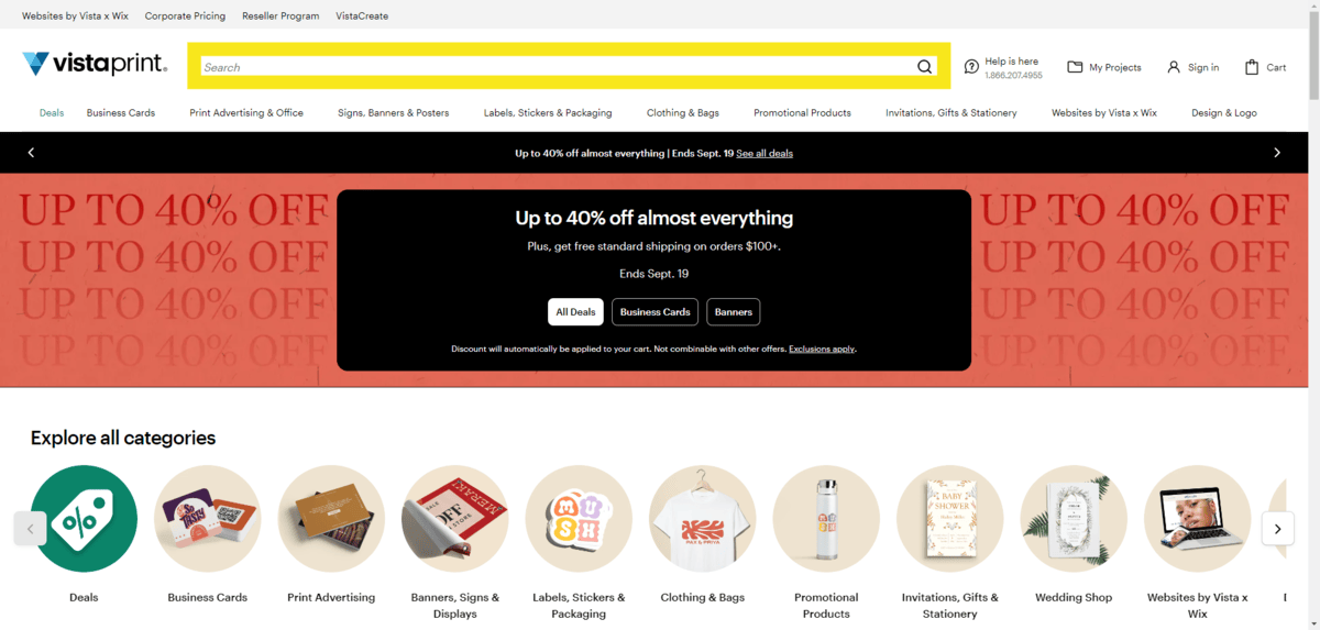
Even if it belongs to one part of your site, the search bar should always be as close to the top of the page as possible. Visitors shouldn’t have to scroll a number of times in order to get quick access to the content they’re looking for.
Structure
It should be 100% obvious to visitors which component is the search bar.
Size is one way to make the search bar stand out. While the search bar doesn’t need to span more than half of the page the way that VistaPrint’s does to get noticed, it’s an effective tactic.
Note: A larger search bar size can also help decrease click or tap errors by creating an input field that’s difficult to miss with one’s mouse or finger.
How you design the structure of the bar will also be helpful. For instance, the search bar is the only encapsulated element in the VistaPrint header. The black border might be thin, but it does distinguish it from the links all around it.
Labels
Unlike a contact or checkout form that usually has labels atop each field, you should place relevant labeling and placeholder text inside your search bar.

A magnifying glass search icon can be useful. And since it’s one of the few universally recognized symbols, you can use it on its own if you’d like. That said, you can include a built-in “Search” button within the field instead if you have the space for it.
Placeholder text isn’t always necessary. That said, if your search bar button is only an icon (the way that VistaPrint handles it), then your placeholder text should, at the very least, say “Search.”
You should also include placeholder text if you need to explain to visitors what part of the site the search results will be pulled from or what types of inputs to enter. We see this on the Sesame website:
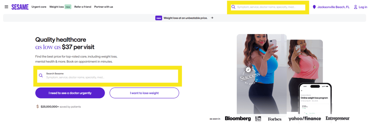
Within this search form, visitors are told that they can search by symptom, service, doctor name, specialty and medication. By being specific, this will reduce the chance of error and no results appearing as a result.
Accessibility
You want your search bar to be accessible to every website visitor. This means paying attention to things like:
● Responsiveness
● Icon selection
● Wording
● Colors
● Text size
● Input size
● ARIA labels
● Screen reader compatibility
You may even want to think about adding speech recognition to your search bar. That way, visitors who prefer not to or can’t use their hands or keyboard can execute the function using their voice.
2. Choose a Format for Displaying Dropdown Results
Now let’s turn our attention to how the search bar responds to your visitors.
The first thing to consider is what you want to happen when someone puts their cursor into the search field and begins to type. Do you want to auto-populate relevant matches right away? Or will they need to click the “Search” button to find them on the search results page?
What you do will depend on what sort of search engine you use or how much data you have to work with. It also might depend on how much content you have on your site.
While dropdown results are super convenient, they might not be if you want visitors to see that there are hundreds or even thousands of matching results to choose from. It also might be beneficial to prolong the results until the search results page where they can use tools like categories, filters and sorting to narrow down an extreme amount of matches.
Let’s say that you decide to display results in a dropdown as the user types. The next thing to determine is the best way to show them.
For instance, you can do as Eyeconic does and present a simplified set of search results.
In this example, I did a search for “cat.” I received two types of matching results in this single-column dropdown:
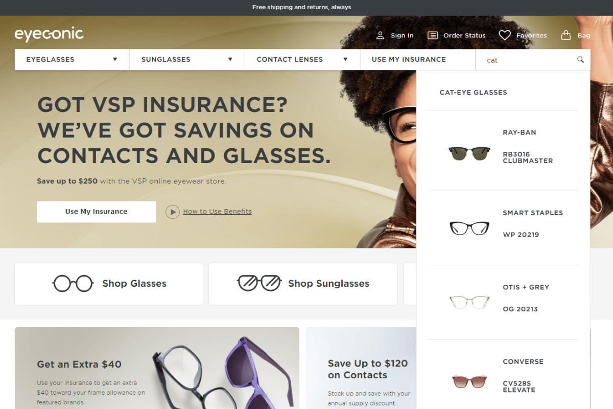
“Cat-eye glasses” takes me to the category page. The other results take me to specific cat-eye styles from brands like Ray-Ban and Converse.
Another way to present results in a dropdown is to make them more multifaceted as Nanyang Technological University does.
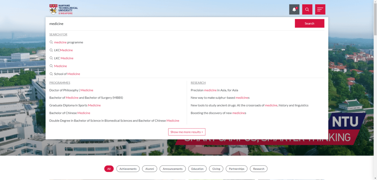
Because the NTU website is so big and has different kinds of content on it, the search results dropdown tries to help visitors find more accurate matches.
For instance, I did a search for “medicine.” I received three types of results—matching words, programmes and research. This type of multifaceted approach could help cut down on the number of clicks visitors would have to do on subsequent search results pages, selecting various filters and sorting to find exactly what they’re looking for.
Another thing you can do is provide recommendations before the user even types anything into the search field. AARP does this:
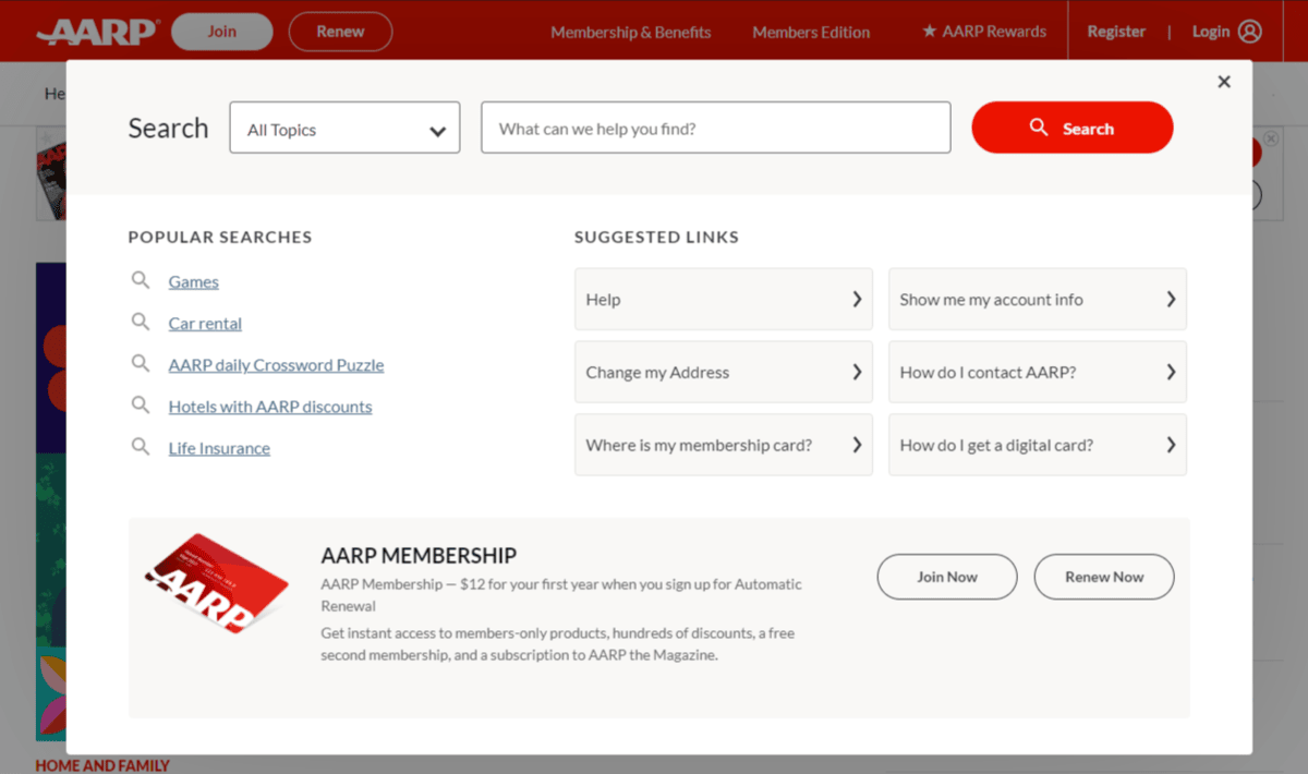
When a user clicks on the search bar in the header, this pop-up appears. At the top, they can select the topic type and then enter their query into the field. Or they can review the most popular searches as well as suggested links and start there.
This could be beneficial when adding search functionality to a blog, especially if you have viral blog posts you know would interest a lot of readers. You could also include recommendations in help center searches. You could anticipate what many visitors are looking for and show them links to frequently asked questions.
This could also be a useful strategy if you’re targeting an older audience that might not be as adept at online searches as their digital native counterparts. By anticipating this friction or merely trying to save them the trouble of typing everything out, you could greatly improve their experience.
3. Use an AI-powered Search Engine to Provide More Intuitive Results
Next, you need to decide how much help you want your search bar to provide to visitors. For example, will your search bar only autocomplete or show exact matches? Or will it have the capacity to correct the users’ search terms?
There’s a lot of complexity involved in autocorrection, so you’d need a strong natural language processing AI on your side to power your search engine. It would need to be able to:
- Predict what a user is about to type before they do.
- Find fuzzy matches and not just look for words in a controlled vocabulary.
- Anticipate typos or misspellings.
- Recognize homophones, synonyms and variations that the visitor might be using.
- Ignore stop words and prepositions.
In other words, your search functionality would need to be super intuitive and be able to provide accurate results regardless of how messy, incomplete or inexact the queries are.
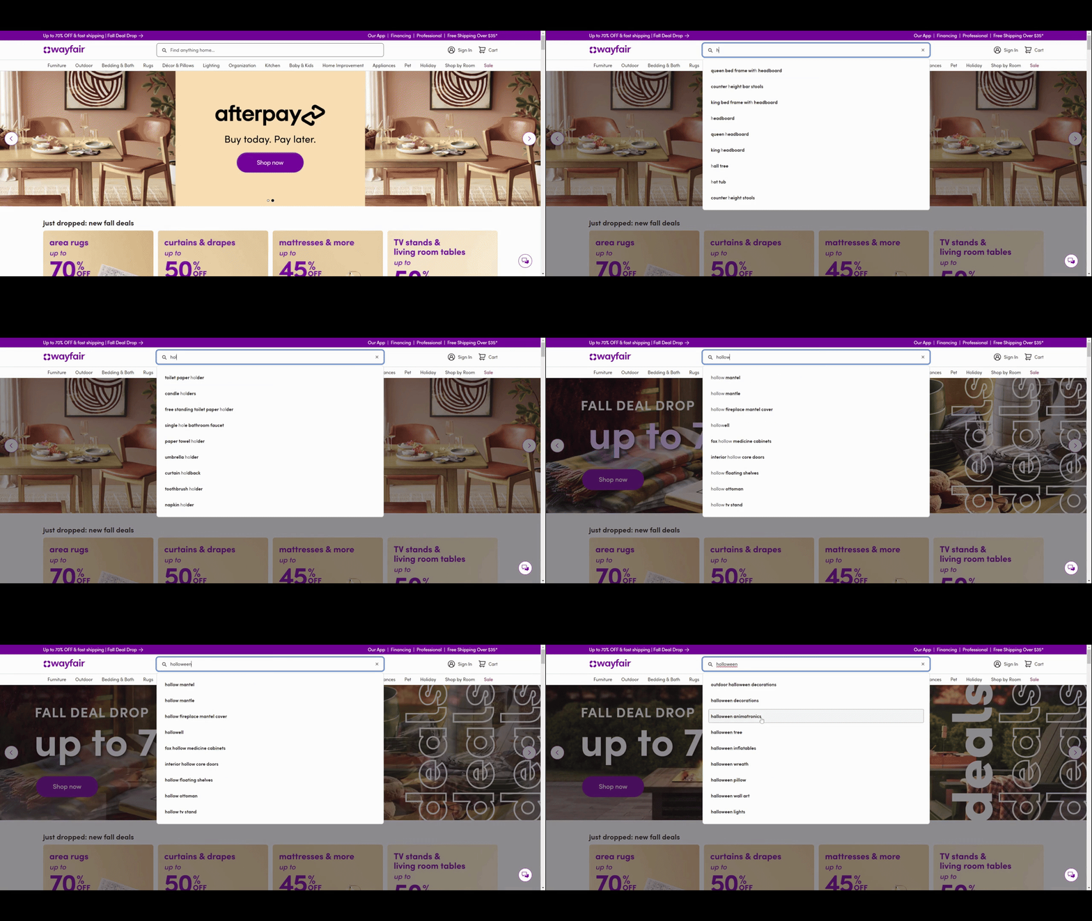
Let’s say you have a massive shop like Wayfair. You would need to invest in a high-powered AI search engine to do as much of the work for your visitors as possible.
In addition to speeding things up so they don’t have to type everything out, predictive and autocorrecting searches would improve the accuracy and relevance of their results.
Here’s what that type of search looks like as I slowly type out the incorrect “holloween” instead of “Halloween”:
The search results automatically adjust as more of the word gets typed out. Even when I misspell “Halloween,” the search engine knows exactly what I’m looking for and provides the correct results for me.
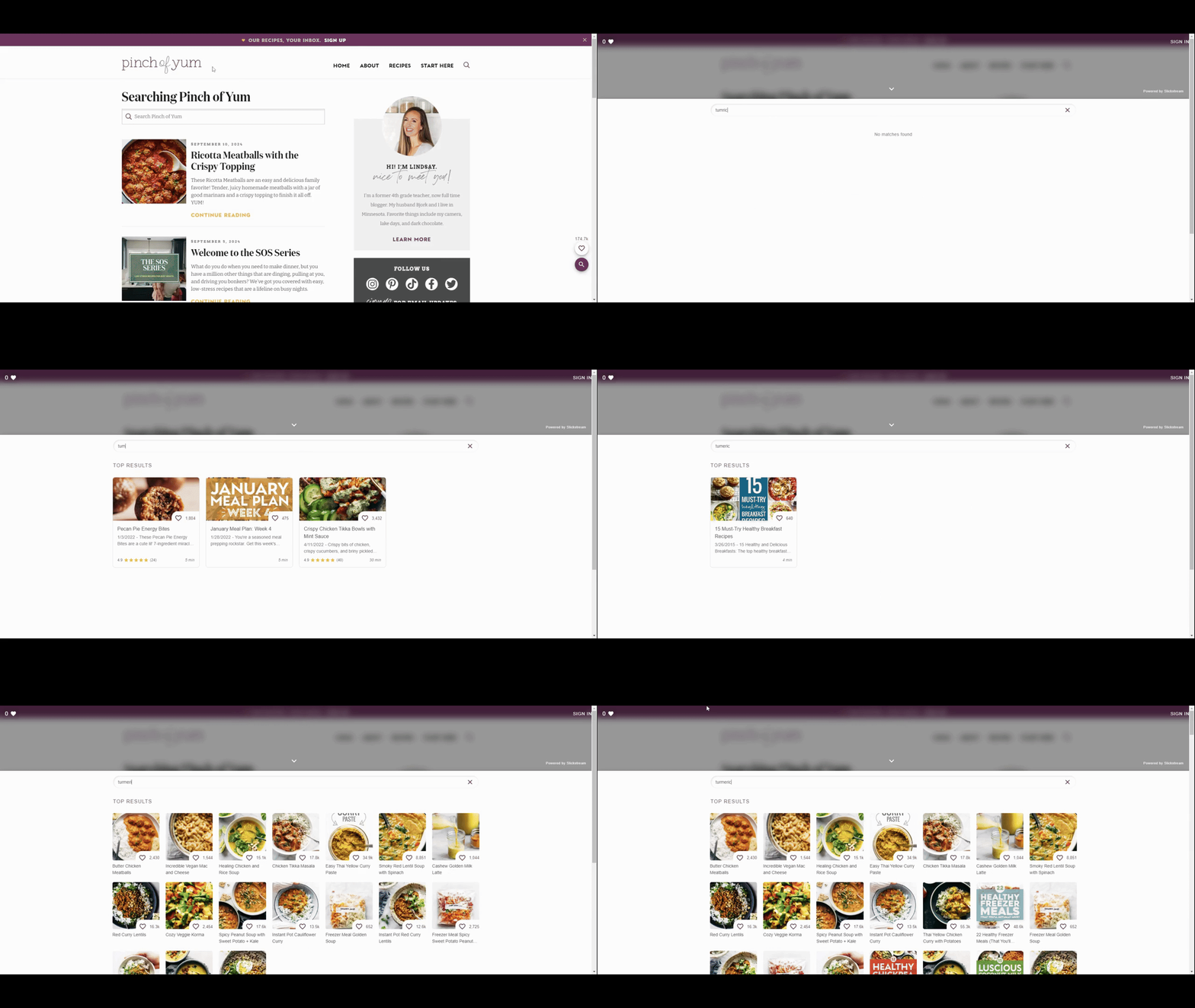
On some websites, you might not need that much query processing power. For example, let’s say you run a popular food blog like Pinch of Yum.
The search functionality includes auto-populating capabilities. It also provides results that match the user’s query to the title, recipe description and ingredients. However, it only shows matching recipes with exact matches instead of fuzzy ones.
The search results change based on my three queries for “tumric,” “tumeric” and “turmeric.” The first query yields no results as “tumric” isn’t a word. The second for “tumeric” has just one, but I suspect it’s due to a misspelling in the post. The last one contains the correct spelling of “turmeric” and shows the fullest and most accurate search results.
For a website this size—big but not like Bon Appetit big—you might decide that it’s not worth it to include auto-correct capabilities. Instead, you find it to be more valuable to provide accurate results that dig deep into the content of your recipes as opposed to just showing matching words in the titles.
4. Visualize Your Search Results
Whether it’s dropdown search results or the full search results page, there’s a lot of text your visitors are going to see when they get their results.
Similar to what we do with webpages with long walls of text, you may decide it’s worth it to make your search results more visually appetizing. That could mean adding accompanying images to the results, bolding the search phrase or even displaying a hierarchical structure between pages and categories.
Let’s start with an example from the BJ’s Wholesale Club website. In this example, I have searched for “water”:
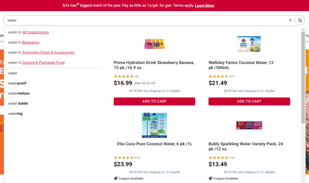
BJ’s has done a number of things visually to make this results dropdown easier to review.
In the top-left corner, I have the option of selecting water from different departments, like Beverages and Swimming Pools & Accessories.
In the middle-left, I see keyphrases that match my query and expand upon it. The word “water” remains unstylized, while extra wording like “proof,” “melons” and “bottle” is in bold.
Lastly, there are matching products that fill the remainder of the screen, each with a matching featured image.
All of these visualizations are meant to aid the user experience, helping them to either narrow down their search results easily or select what they want to buy more quickly.
Even if your site search doesn’t auto-populate or show a preview of results, you can still use visual aids to improve discovery of your content. Gizmodo is a good example of how to do this.
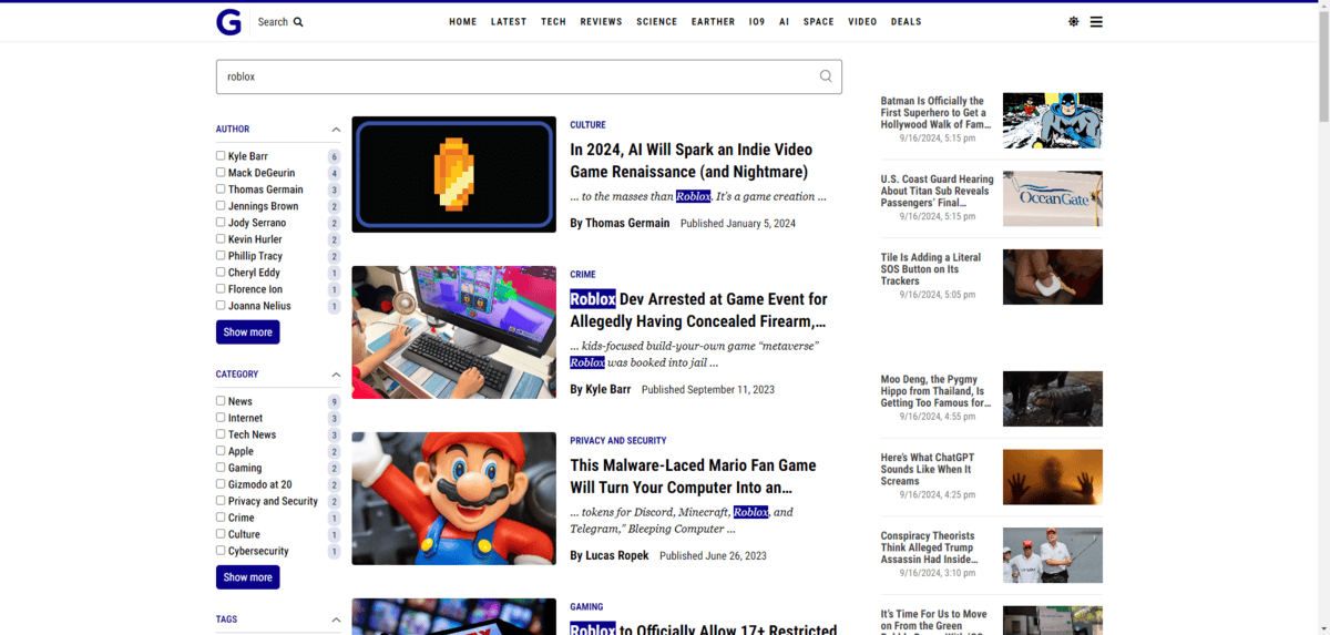
Here we see what the search results page looks like when you look up “roblox.” There’s definitely a lot going on on this page, from the filters on the left to the newly published posts on the right. However, the blue-highlighted “roblox” within the posts in the center is useful.
The highlighting not only calls attention to the search results, it also demonstrates how relevant each one is to the original query. For instance, some posts don’t have Roblox in the title. That suggests that Roblox isn’t the primary focus of those pieces and may help the reader discard those posts quickly to get to the more relevant links.
Visualizations don’t need to be huge and take up a ton of room. Sometimes just the highlighting or bolding of words is enough to improve the usability of your search functionality and the ensuing results.
Wrapping Up
A website with a growing amount of content needs an excellent site search experience. That means it should be fast to load, intuitive, accessible, helpful and smart.
Your content management system and an AI-powered search tool should be all that you need to design this type of search functionality for your website. Just keep in mind that not all search experiences should be the same. You have to consider things like the size of your website, the type of searchable content you have, who your target user is and what kinds of search results they would benefit from most.
If you’re unsure, start with the basic recommendations above. Then review your analytics every few months. There’s a lot to learn from this data, like what the most common search queries are, what kinds of queries lead to conversions, how much help your users need with finding content and so on. Then use that data to enhance your search form little by little over time.

Suzanne Scacca
A former project manager and web design agency manager, Suzanne Scacca now writes about the changing landscape of design, development and software.
