5 Free Ways to Enhance Your Content with Data Visualization


Have you ever spent countless hours researching and writing about a topic, only to have dismal number of interactions with your content? This is a writer’s worst nightmare. Avoid the pitfall of no one reading your hard work by following these tips to make your content pop.
My greatest revelation as a content writer came to me when I discovered that that everyone on the internet is lazy. WOAH hold up, that’s offensive! Why would you say that to me?!? I know that’s what you’re thinking, but let me explain.
Online readers have limited time, and they are going to read articles that they can consume easily and stand out from the crowd. This comes from concise writing and fantastic visuals. On that note, here are 5 free ways to make your content pop with data visualization.
1. Visualize Excel Data Using RAW
Built on D3.JS, RAW is an open web app used to create custom, vector based visualizations on top of the D3.js library. It is also open and customizable for anyone who is a designer or visualization geek, fork the project on Github!
For those like me who do not have the technical know-how to do complex coding and D3.js customization, RAW offers very easy built in graphs. All you have to do is copy and paste your excel data and then choose a graphing theme and drag and drop your variables.
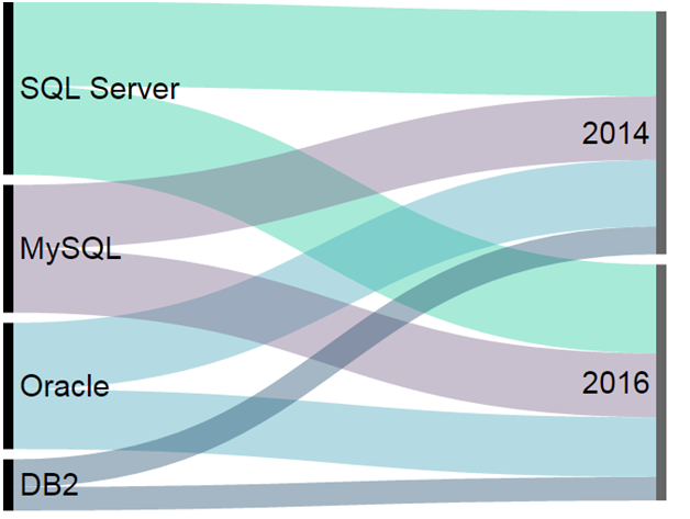
Below is a graphic I created using the Alluvial Diagram preset for a blog describing predictions from Progress DataDirect’s 2016 Data Connectivity Outlook. This diagram illustrates how our customers have not moved away from their relational databases in the last two years, represented by the thickness of the lines from year to year.

RAW offers some basic customization features like changing size and colors, but if you would like to change the font or more advanced attributes, I would advise downloading Inkscape. Inkscape is free vector graphics software that will enable you to edit the output from RAW.
2. Bring Facts to Life with Canva
Want the simplest way to create stunning Infographics? Canva offers you the option to choose between a rage of both free and premium fully customizable templates to make an Infographic in as little as 15 minutes.
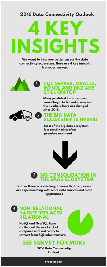
Below is an Infographic I created in 15 minutes based on data from our 2016 Data Connectivity Survey.

3. Embed Embed Embed
Sometimes, you just want some new, fresh UI in your blog but you don’t want to do the tedious coding. That’s where embedding third party interactive content saves you hours of work. Some blogs do not allow JavaScript in their embedding features to preserve the integrity of the website, in which case you need to find tools that do not use JavaScript.
You can embed tweets that are fully interactive by clicking the “…” on a Tweet, then click embed, then copy-paste the HTML into your editor. Here is an example below. No JavaScript needed.

A few more sites for interactive, embeddable content are Playbuzz and Survey Monkey. They allow for everything from surveys to polls to personality quizzes— all fully interactive inside your blog or website. Both of these use JavaScript.
4. Paint on an Open Source HTML5 Canvas with Chart.js
Chart.js enables you to create simple, clean and engaging HTML5- based JavaScript charts. It is an easy way to include animated, interactive graphs on your website for free. It is open-source and published in Github. The coding is fairly advanced, but if you are comfortable in HTML and JavaScript you should have no issues.
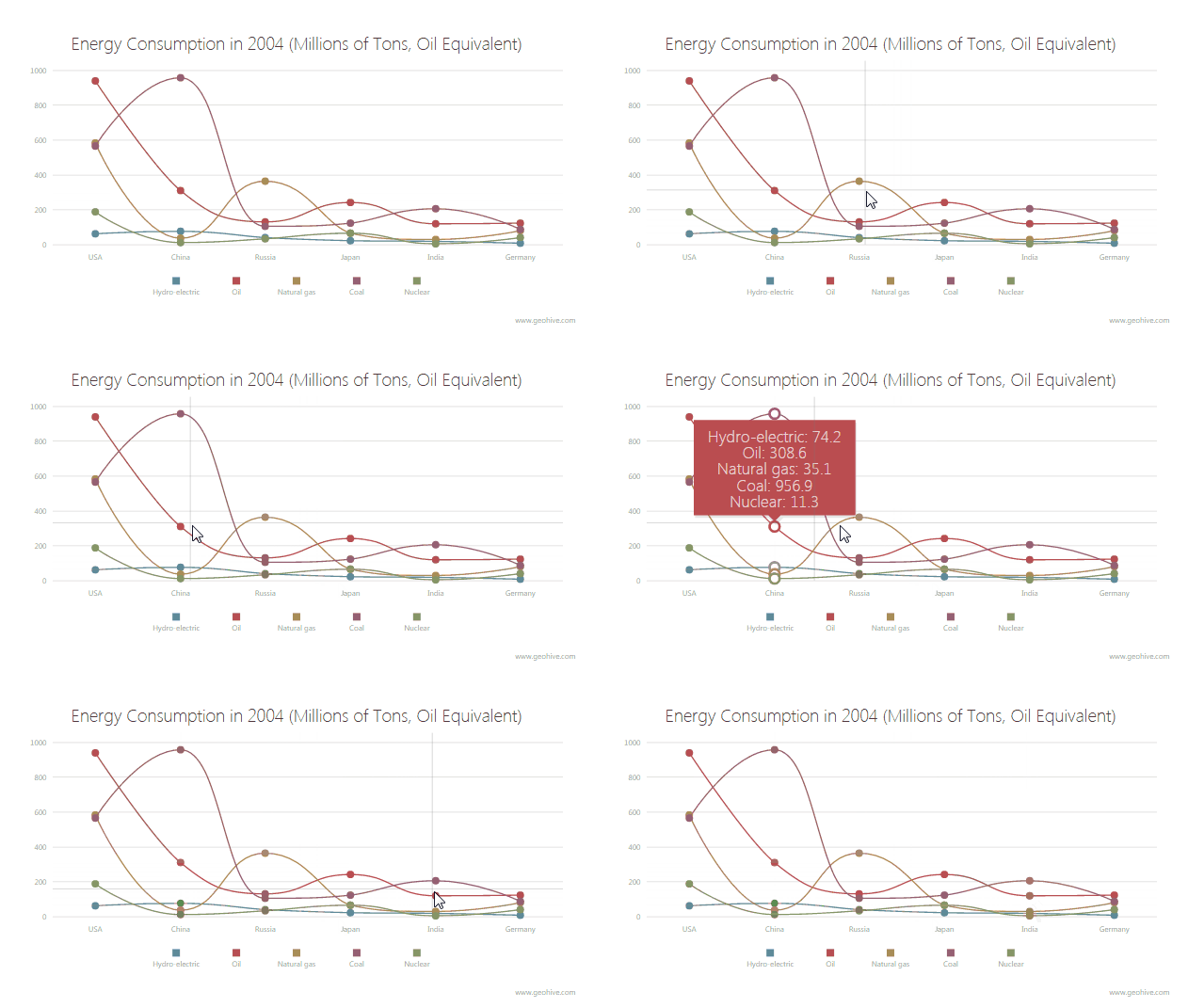
Below is a chart created for the Chart JS Visualization Gallery using data from Geohive. It record energy consumption in 2004 based for 6 countries with 5 energy sources.

5. Bring Data to Life with D3.js
D3.js takes custom visualization to a whole new level. It is not for beginners, you will need a thorough understanding of HTML and a basic understanding of JavaScript. D3.js is a JavaScript library for manipulating documents based on data using HTML, SVG and CSS. It is open-source and you can download it on Github.
There is an awesome Wiki on Github with over 100 examples of insanely creative graphics created using D3. Just as an example, below is an animation created by Mike Bostock. In his own words, “Inspired by this Paper.js example, this demonstrates animated rounded rectangles (svg:rect elements with "rx" and "ry" attributes). The data associated with each rectangle is its center position and rotation angle in degrees. Each tick of the animation, the rectangles drift towards the mouse location and rotate slightly. Built with D3.js using SVG.”

All of the code is published and released under the GNU General Public License. Here is the code for this particular animation:
<!DOCTYPE html><meta charset="utf-8"><body><script src="//d3js.org/d3.v3.min.js"></script><script>var mouse = [480, 250], count = 0;var svg = d3.select("body").append("svg") .attr("width", 960) .attr("height", 500);var g = svg.selectAll("g") .data(d3.range(25)) .enter().append("g") .attr("transform", "translate(" + mouse + ")");g.append("rect") .attr("rx", 6) .attr("ry", 6) .attr("x", -12.5) .attr("y", -12.5) .attr("width", 25) .attr("height", 25) .attr("transform", function(d, i) { return "scale(" + (1 - d / 25) * 20 + ")"; }) .style("fill", d3.scale.category20c());g.datum(function(d) { return {center: mouse.slice(), angle: 0};});svg.on("mousemove", function() { mouse = d3.mouse(this);});d3.timer(function() { count++; g.attr("transform", function(d, i) { d.center[0] += (mouse[0] - d.center[0]) / (i + 5); d.center[1] += (mouse[1] - d.center[1]) / (i + 5); d.angle += Math.sin((count + i) / 10) * 7; return "translate(" + d.center + ")rotate(" + d.angle + ")"; });});</script>
Start Visualizing
Start standing out from the crowd! In Hubspot’s article, 37 Stats You Should Know About Visual Content Marketing in 2016, they point out that that colored visuals increase people's willingness to read a piece of content by 80%. They also cite that when people hear information, they're likely to remember only 10% of that information three days later. However, if a relevant image is paired with that same information, people retained 65% of the information three days later.
So what are you waiting for? Oh, you don’t have an advanced web content management system to fully take advantage of these tips? Progress Sitefinity enables you to engage, convert and retain your customers with a full web content management system.
Apprehensive about the benefits of an enterprise content management system? That’s fine, try it for free for 30 days!

