Best Practices for Choosing Typography for Education Websites or Apps

Looking for some tips on how to choose typography for education-related websites or apps? In this post, we look at four strategies you can use for fonts that fit your brand well while simultaneously providing your users with a great reading experience.
Typography can be a tough thing to play around with in branding, especially for educational organizations and companies.
For instance, let’s say you’re building a website for a new preschool and want to use a cute handwritten font. While that might do a good job of visually describing your “brand,” does it benefit your website or its visitors in any other way? It’s not as though preschoolers are the ones looking at your site to determine if they want to go there.
So, as you consider which way to go with typography, it’s important to figure out what your unique brand should look and feel like first, but then balance it out. Legibility, readability and accessibility all matter a ton when choosing fonts.
Below, we’ll look at four best practices to help you bring the right balance to your education brand’s typography.
How to Choose Typography for Education Websites and Apps
Education is a pretty broad category. It includes preschools, K-12 schools, institutes of higher learning, online education programs, private schools, education technology companies and more.
Rather than try to identify trends within each of these subcategories (since they’re really not that clear-cut), let’s look at some strategies you can use to find the right fonts regardless of what kind of education website or app you’re developing:
1. Know the Psychology of the Typefaces You’re Using
When we think of the different kinds of fonts we can use, it’s common to think of serifs (the ones with “feet” on the characters) and sans serifs (those without). But there are other ways to categorize fonts. The types we choose can tell our visitors a lot about how they should feel about our brand.
This is what’s known as the psychology of fonts.
Once you understand how different typefaces are perceived, you’ll be able to choose ones that align with the brand perception you want to portray.
Serif Fonts
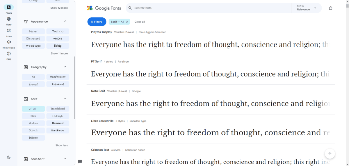
Serif fonts are commonly associated with traditionalism and formality. They’re also synonymous with literature and other printed information, which can make them a good choice for certain educational institutions.
But are serifs too boring and tired to be used in modern web design? Sure, Times New Roman and Georgia might seem a bit mundane, but there are thousands of other serif typefaces out there.
For example, this is the header and hero section on the Emory University website:
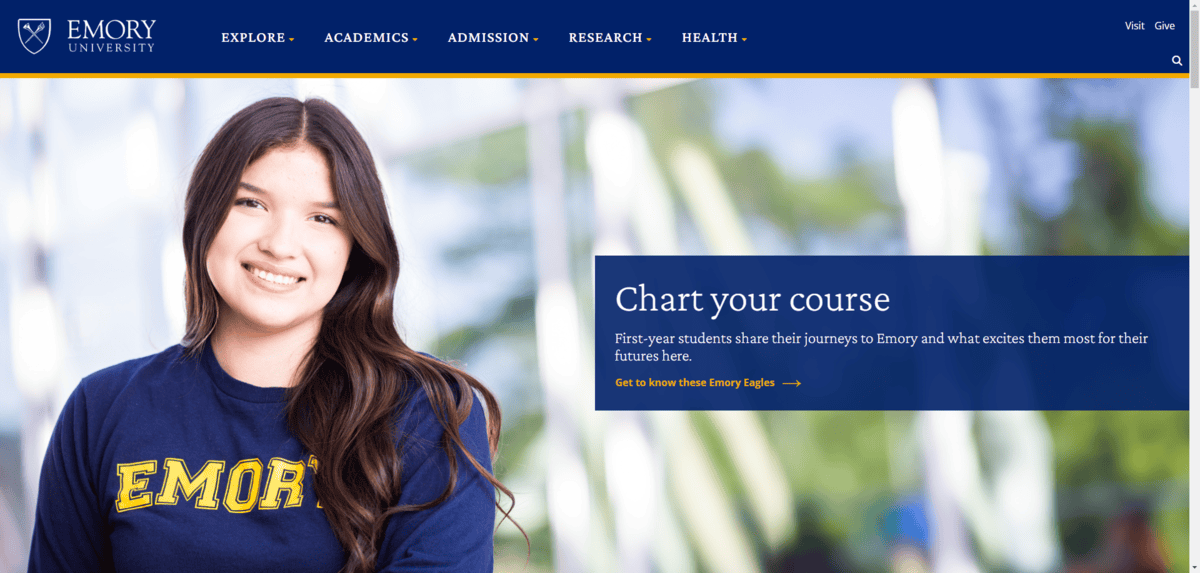
Most of the text you see in this screenshot is Crimson Pro. You’ll notice right off the bat that it doesn’t seem as clean and classic as a typeface like Times New Roman. The ascender in the lowercase “h” in “Chart,” for instance, stands far above the uppercase “C.”
So, there are definitely ways to choose serifs that convey a sense of traditionalism mixed with modernism.
Sans Serif Fonts
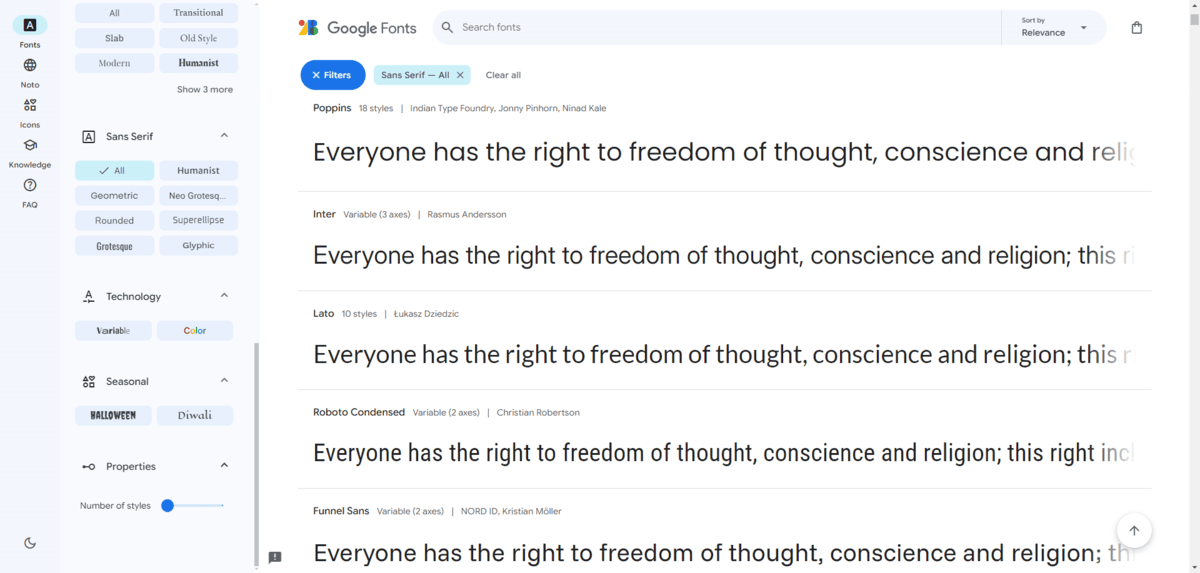
Sans serifs are commonly associated with modernity and efficiency. Like their serif counterparts, they’re also very easy to read, which is why these two types are commonly paired together when designing digital interfaces.
Now, just because sans serifs give off a simpler and perhaps more youthful vibe, that doesn’t mean that long-standing educational companies or institutions can’t use them. Especially if they’re looking to shake up their brand perception and to connect with younger people.
For example, Princeton University was founded in 1746. It is the fourth oldest university in the United States. That said, the website almost exclusively uses the Helvetica Neue sans serif font throughout:
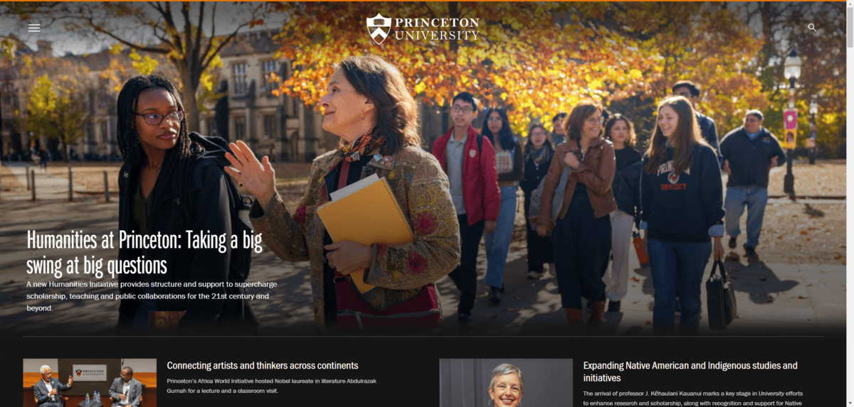
The styling of this font might not make you immediately jump to the conclusion that the university is super modern and easygoing. The condensed heading font conveys a sense of seriousness. It looks like something you might see on a major tech news website. Yet, it doesn’t feel as stuffy or formal as a serif might.
Other Font Types
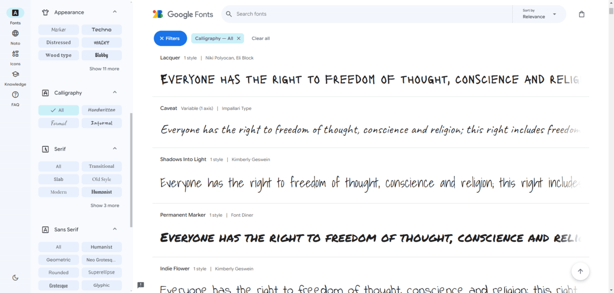
Serifs and sans serifs are the two fonts commonly paired together on education websites and apps. It’s not because designers lack the originality or creativity to use decorative or script fonts. It’s because most educational brands need to be careful about what signals they send to visitors.
How would you feel if you were applying to a university and the designer had used Permanent Marker as the display font in the hero image? (You can see it in the screenshot above.) You’d probably hesitate, wouldn’t you? It might work OK on the website for a preschool or daycare, but an institute of higher learning? Probably not.
That said, some educational companies can play around with more experimental and fancy fonts. For example, this is the homepage for Class, an edtech company:

The heading font used on this site is an Adobe Font called All Round Gothic. It’s inspired by sans serifs. What it is, though, is a geometric font with rounded forms.
Like with this example, decorative, script, experimental and other non-traditional font types should be relegated to very short heading phrases. It’s just too risky to use them over large swaths of text where users need to be able to read them quickly and without issue.
2. Minimize the Number of Typefaces Used
There’s no hard and fast rule about how to pair fonts on a website. You can use serif headings with sans serif body text. You can use sans serif headings with serif body text. You can use serifs for both or sans serifs for both. Or you can get a little creative with it and add a decorative touch to your headings.
One rule that we do try to abide by when it comes to typography, however, is that we only use two or three fonts max. There are a number of reasons for this.
The first is that too many typefaces and font style changes can stress users’ eyes. We want to create as comfortable of a reading experience as possible, so minimizing how many visual shifts are made is important.
The second reason is that a change in font sends a signal to users that they’re looking at something different. So when they see a 48-point PT Serif just above an 18-point Roboto, they know that these are distinct bits of information. They also know, based on the hierarchy of size and weight as well as the proximity of these lines of text, that they’re related, but the PT Serif heading is the most important bit of text and needs to be read first.
Also, choosing distinct fonts for headings and body makes it easier for your visitors to skim through the website and find the content they need. If you were to use the same font, size and styling for most text, scanning would be very difficult and users would be left having to read through as much as they could to find or just give up on it altogether.
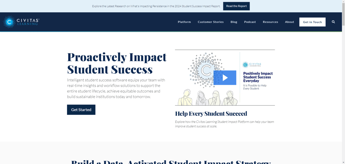
As for how to create your font pairs, choose ones with a good amount of contrast but that are compatible. For instance, Civitas Learning uses Playfair Display for the headings and Lato in the body:
Another option is to use the same typeface, but different fonts from within the family. Sharp Type, for instance, developed a custom font set for the Williams College website:
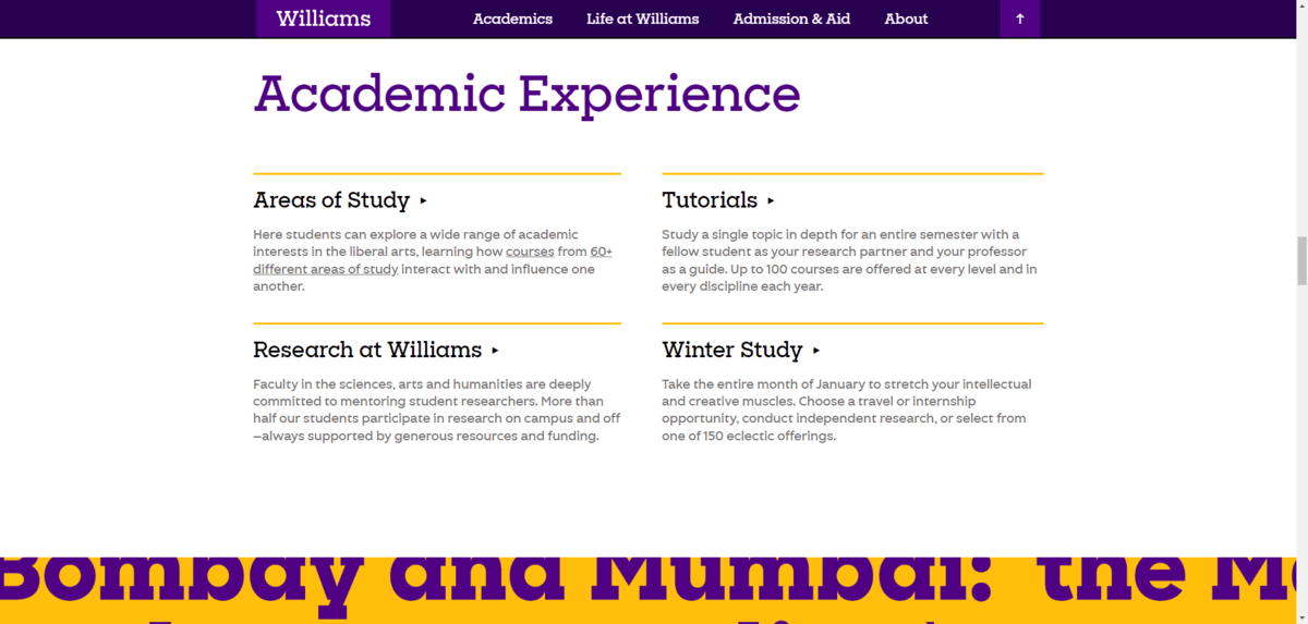
The typeface is called “Eph” and there are four variations used on the site for different purposes: Slab, Serif, Gothic and Octic. In the example above, you can see Eph Slab has been used for the headings and Eph Gothic for the body text.
3. Prioritize Legibility and Readability Over Fun
Educational websites and apps aren’t there for entertainment purposes. They contain tons of information that will help people decide to attend a school, sign up for a course or pay for premium tech, for example. Because of this, you don’t want your fonts to stand in the way of legibility or readability.
Legibility refers to how distinct the characters in a typeface are from one another. One of the best ways to test for legibility is to compare “uppercase “I,” lowercase “l” and the number “1.” If any of them are identical, users could have a difficult time distinguishing them while reading.
For example, here’s what those characters look like in Lato:

The uppercase “I” (the first character) and lowercase “l” (the second character) are nearly indistinguishable. The only difference is that the lowercase “l” is a bit taller.
Now compare that to Libre Baskerville:
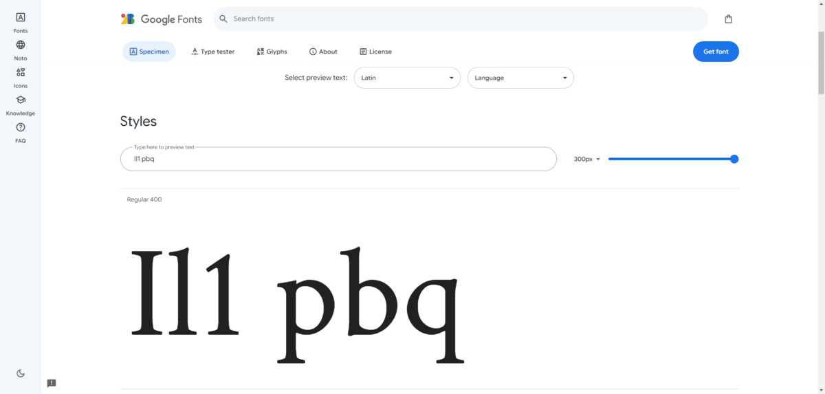
All three of these characters are distinct. The uppercase “I” has the perpendicular feet at the top and bottom. It’s also the thickest of the characters. The lowercase “l” has a curved extender at the top. And the “1” has its own distinct flourish with a straight extender with a sharper downward angle than the lowercase “l.”
Readability is also something you have to consider when choosing fonts. It has to do with the ease of moving from letter to letter and word to word.
There used to be a theory that serifs were the most readable fonts because the feet would naturally draw people’s eyes onto the next character. However, studies have since debunked that theory. Both serifs and sans serifs can create a fast and easy reading experience. The trick is to choose legible fonts and also to style them so that there’s not too little or too much breathing room.
The Little Friends Preschool website is a good example of how to use legible and readable fonts:
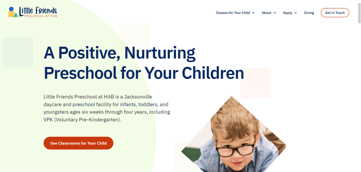
The font used for both the heading and body text is called IBM Plex Sans. It passes the l/I/1 legibility test. And, as you can see here, the text doesn’t feel overly crowded or spaced out, which should create a comfortable reading experience for visitors.
While this might not be the most fun font to use for a preschool, you can see that the designer has brought some youthfulness and excitement to the design in other ways—like in the script font used in the logo, the colorful objects in the background and the cute photo cutouts.
4. Make Sure Your Typography Is Accessible
When we talk about accessible web design, there’s a clear-cut checklist so that everyone has access to the digital products we build. With typography, it’s a little different.
In addition to all the things we’d worry about when designing for accessibility—like color contrast, font size and the like—here are some other things to think about when picking fonts for education:
Cross-browser Compatibility
Accessible typography means that the majority (if not all) of your users can see the fonts you’ve chosen for your website. While it would be great to be able to select a font and know that it’ll appear across every browser and device, that’s not always the case.
Web-safe fonts are the only ones that guarantee that your designated fonts will appear. The tradeoff, however, is that you’re going to have to use fonts like the following for that to happen:
- Helvetica
- Arial
- Verdana
- Times New Roman
- Georgia
- Baskerville
- Courier
- Lucida
- Brush Script
- Comic Sans
If you don’t want to do that, a good alternative is to use a Google web font (not the same thing as a web-safe font) and then assign a web-safe alternative.
Another option is to upload fonts to your server. The only problem is that uploaded fonts tend to be much slower to load than system defaults and web-safe fonts. So, you’ll need a good system for optimization in place. Serving them over a CDN can also help.
Dyslexia-friendly Fonts
According to the International Dyslexia Association, 15-20% of the world’s population experience the symptoms of dyslexia, which include:
- Slow reading
- Inaccurate reading
- Improper spelling
- Poor writing
- Mixing up words
While font selection alone won’t cure dyslexia, it can help to ease the friction that these users experience when reading text online. According to the British Dyslexia Association, one of the best things you can do is use one of the following sans serif fonts:
- Arial
- Comic Sans
- Verdana
- Tahoma
- Century Gothic
- Trebuchet
- Calibri
- Open Sans
What’s nice about this selection is that many of these fonts are web-safe, so it would allow you to kill two birds with one stone.
The reason why these fonts in particular are more preferable to, say, serifs or decorative fonts is because they have simple, open and rounded letters. Using fonts that feel crowded or too thin can create issues for people with dyslexia.
For instance, Landmark School uses Open Sans for its headings and Arial for its body text:
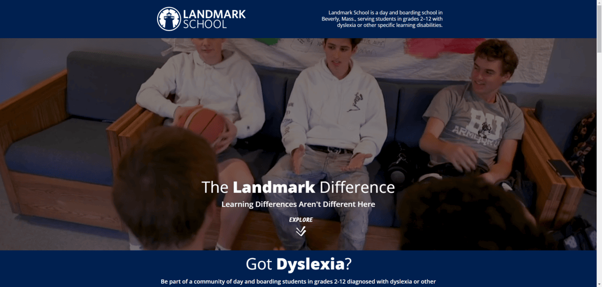
You can see how clean and easy to read this interface is, which is crucial for a school serving students with dyslexia and other language-based learning impairments.
Of course, you don’t have to use one of the fonts on the lists above. Sans serifs generally tend to provide an easy reading experience for users. Even so, you can always add ample spacing around letters and words to give other kinds of fonts breathing room. Avoiding super stylistic flourishes like italics or obliques can help as well.
Demographic Neutrality
Another thing to consider in making typography accessible is who is reading it.
I already mentioned the preschool example at the top of this post. But it might be different when designing an app or website where older children or adults attend, like a high school or college. You could end up with a varied audience of prospective students, parents, alumni, staff and more. The ages of your users could range from as young as 15 or 16 to as old as people in their 60s, 70s or even 80s.
When it comes to younger users, one thing you have to ask yourself is how they’ll respond to cursive text (i.e., script fonts). Back in 2010, cursive writing was removed as a requirement from the Common Core standards in the U.S. As a result, many people in Generation Z don’t understand script writing all that well.
Phil Garnaham of Monotype lamented:
“I’m also completely depressed by the kind of sans-serif of digital modernism of the state we’re in. …We’re missing emotive design. That’s why cursive is so appealing to me at the moment. There’s a great opportunity. [Cursive] is almost like a gateway to uncovering new ideas and new potential.”
The problem is, script fonts aren’t all that user friendly—to Gen Z as well as to users with certain neurological or language-based impairments, like described above.
Other types of non-serif and non–sans serif fonts can be used, though, if you feel as Garnaham does. For instance, there are some decorative fonts you could use to jazz up your logo design or hero section.
Go into Google Fonts and take a look at the ones classified as “techno,” “distressed,” “wood type,” “monospaced,” “stencil” and so on. So long as the characters are solid enough to not impair legibility or readability, there’s a lot here to play around with.
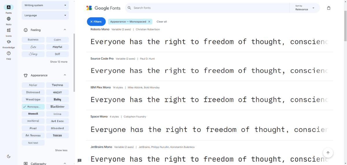
Just remember that your fonts should be a reflection of your educational brand as well. So don’t choose decorative fonts for the sake of breaking away from the mundanity of sans serifs and serifs. They should match the personality of your brand along with what you’re offering.
Wrapping Up
Typography design isn’t all that different from niche to niche. You want to choose fonts that strike a good balance between creating a memorable brand as well as an enjoyable reading experience for your users.
When it comes to education, though, the branding aspect isn’t always as important as usability. That’s because, unless you’re selling an edtech product, your website or app really shouldn’t feel like it’s marketing or selling to an audience. Educational websites are generally informational in nature and so it’s critical that that info be easy to find and even easier to read.
That’s why paying close attention to which fonts you use in educational design is so important.

Suzanne Scacca
A former project manager and web design agency manager, Suzanne Scacca now writes about the changing landscape of design, development and software.
