What You Need to Know about Enterprise Apps and UX

Enterprise app design is in high demand these days as everyone wants their company to work faster, smarter, and better. But do you know the secret to first marketing to enterprise decision-makers and then building solutions that cater to each of their users? This guide will break down the three things you need to know.
When it comes to designing the user experience for a consumer app, it’s typically straightforward. You market to the consumer’s needs or desires. You give them a low-risk way to try out the app. Then you provide them with a consistently enjoyable/valuable experience inside the app, so they have no excuse not to return to it over and over and over again.
With enterprise apps, however, it’s a bit more complicated as you need to first attract the attention of the business… and then win over its employees, clients, and other users.
So, designing the enterprise UX requires a more complex approach than the one you’d take with consumers.
In this post, we’re going to explore how designers and marketers should account for this complexity when designing their enterprise apps.
Market to the Decision-maker; Design for the User
With consumer apps, the decision-maker and user are almost always one in the same. So, the same approach you use to market and sell to them are the ones you use to keep them hooked as users.
Enterprise apps, however, are different because the person who has to open their wallet to pay for the solution isn’t always the primary user.
Let me show you why this matters.
Hootsuite is a very popular social media management tool. Its cheaper plans and basic features are perfectly suitable for individual users and small marketing teams. Its Enterprise plan, however, is targeted at larger companies and agencies.
This is how the Enterprise plan page welcomes prospective customers:
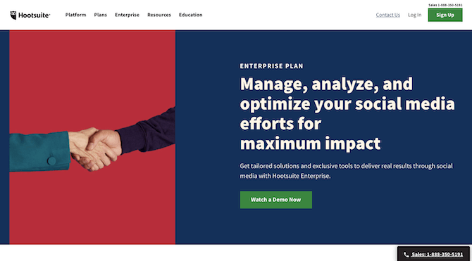
How can we tell that this is targeted to enterprise decision-makers? There are a number of ways.
The stock photo of people shaking hands, for instance, isn’t something you’d use to target social media managers or marketers. It’s representative of those in charge of making decisions and closing deals.
Also, the main message of the hero banner focuses on the goals and results and not so much on the act of doing. When C-level executives purchase software, they do so to guarantee an end result, so this is directly speaking to them.
The rest of the landing page reads similarly with buzzwords and marketing speak scattered throughout:
"Scale your solutions"
"Priority support"
"Activate your listening"
Even the social proof included in Hootsuite’s demo video is geared towards C-suite decision-makers:
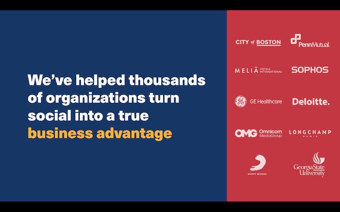
With enterprise decision-makers, this impressive set of logos might be enough to convince them that the software is a legit solution. For the people who actually need to use the software to manage social media profiles, connections, and interactions, talking about a "true business advantage" and flaunting enterprise client logos won’t do much.
That doesn’t mean that Hootsuite forgets to talk about its product and how users can leverage it to enhance their social media workflows.
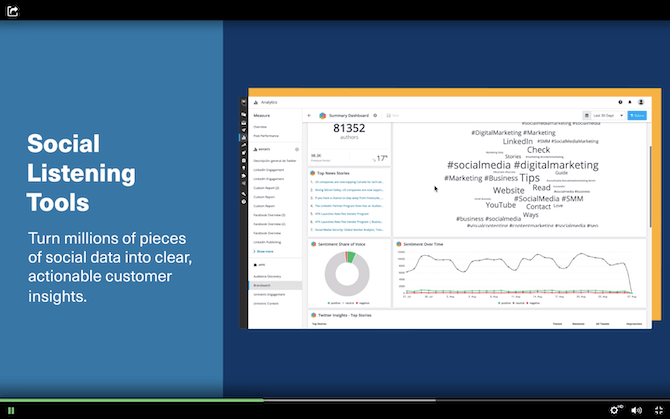
It includes those details here too because many enterprises need to get user buy-in before making a purchase and the features are what they’re more concerned with. They’re just not as robustly talked about as they might be for software built for smaller teams or freelancers.
Bottom Line: What matters is that the decision-makers are convinced, so your marketing should primarily target them. You can then spend your time actually building the digital experience for the users.
Distractions Have No Place in the UI
Unlike consumer apps where you have a bit more wiggle room in terms of creativity and content, enterprise apps need to be built completely distraction free. That means no third-party ads, no disruptive pop-ups, no lighthearted animations.
The reason we use these kinds of elements in consumer apps is because we need to keep users engaged. We also use them to generate more revenue.
But the whole point in building enterprise apps is to help companies get stuff done more efficiently and effectively, which means little to no distractions. Plus, they’re already paying a lot of money to use your solution, so there shouldn’t be any more attempts at making more money from them. They’ll scale up to a more expensive plan if the tool proves to be worthwhile.
So, how do you build something that encourages enterprise users to engage with it if you can’t get their attention with a flashy UI or functionality?
For starters, keep it very simple in terms of the interface as well as messaging. One of my favorite examples of this is Calendly:
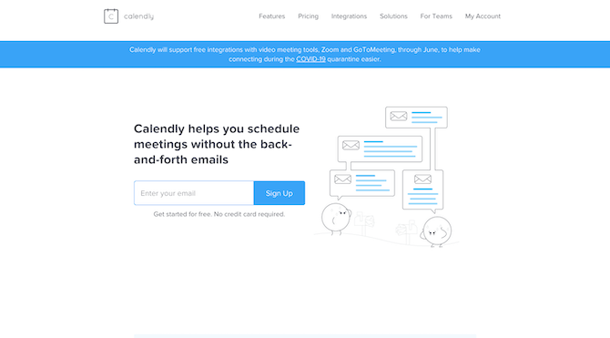
For such a powerful solution, you might expect a little more pizzazz from the website. But no, this is how Calendly markets itself to users of all sizes (including the enterprise) and it’s a brilliant move. Not only does it make it easier to focus on the value of the solution, but it introduces prospects to the simplicity of the tool itself.
This is what the app’s main dashboard looks like (at least, from my point of view it does):
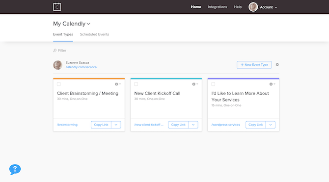
Considering what a weighty task scheduling can be, this open and lightweight UI is a smart choice. It makes scheduling appointments feel less overwhelming right from the start.
What’s more, everything in this app is designed to make users’ lives easier. Just from this dashboard, users can do the following: Copy and share links to existing events/appointment types. Create a new event type. Quickly embed this calendar onto their website or sales page. Turn an event into a template or clone for quicker event setup. View scheduled appointments.
The event setup page is just as minimally designed and yet chock-full of useful features:
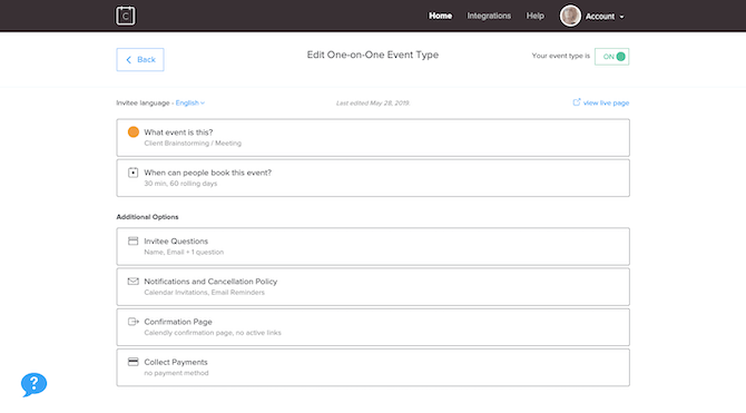
What’s so brilliant about this app is how well it anticipates what users need to do when it comes to scheduling appointments. Rather than just provide a simple scheduling solution, additional features make it possible for enterprises to streamline the appointment-setting process across their organization. For instance:
Set scheduling windows (which also sync to personal calendars).
Add buffers between appointments.
Request that prospects answer a series of questions before making an appointment.
Give those who made the appointment the ability to reschedule or cancel it.
Connect to tools like Google Calendar and Zoom to automatically add events to attendees’ calendars and set up the meeting details.
Like I said, there’s a lot of power in this app and it would be really useful for enterprises with large teams (especially in sales and leadership roles) to have something this simple that solves an otherwise complex problem.
Bottom Line: If you want employees to actually use the enterprise software purchased for them, then designing for usability as well as how the UI makes them feel (i.e. confident, relaxed, etc.) is going to be really important.
Different Users Require Different Experiences
When it comes to building apps for consumers, partners, and employees you usually build one experience for all users. That doesn’t mean they can’t personalize the information they see, but it’s very limited. For example, e-commerce users can choose to see products available in stores by activating location detection settings.
But for enterprise apps, you have to design different experience flows for many user types. There usually isn’t a one-size-fits-all.
There’s one major reason why your app needs to present a different experience based on who’s logged in: the person’s role.
For instance, let’s say you’re building a project management tool like Zoho Projects. A design agency has signed up for the software and put their project manager in charge of it.
As the admin and super user, they’d need unfettered access to the app. They’d also need additional controls that enable them to set rules for what other users can see and do within the app. (And to add other user roles as needed.)
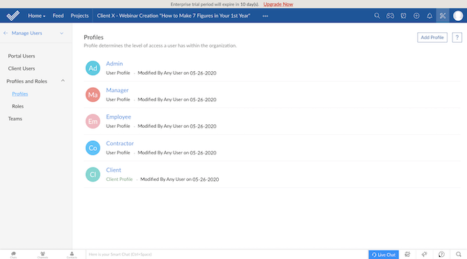
If these roles and privileges aren’t carefully designed and the experiences customized for each, that could have huge ramifications for the enterprise.
For example, let’s say the agency has hired a number of contractors to handle overflow design work. They should have access to the platform for the sake of staying in the loop and keeping everything and everyone centralized. However, Contractors should have only the bare minimum access to the platform:
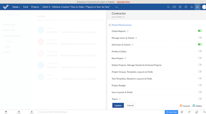
The same goes for other roles where you don’t want them to see as much sensitive information about your company or your contacts. Like Clients. Their experience in the app should strictly be limited to their account or project and nothing else.
You also have to take into account the difference between an Employee and Manager.
Employees, for example, use enterprise software to get tasks done, so you’d want to create different ways for them to view this information. For instance, a calendar view:
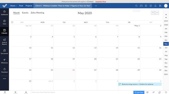
There are a number of ways people may want to look at and manage their tasks: lists, Gantt charts, drag-and-drop cards. The point is, employees are the doers, so when you design an experience for them, it needs to be focused around task management and milestone tracking.
Then you have the managers to think about. Managers usually use enterprise software to do things like: Review requests and issue approvals. Analyze team performance, time tracked, task completion, and so on. Monitor progress towards monthly/quarterly/annual goals. View and update the overarching team or company strategy and plan. Keep the team motivated.
So, a good part of their experience will need to revolve around analytics and dashboards.
Bottom Line: Imagine what would happen if every contractor, employee, and client were presented with the same version of your app. You’d either have to design something so trimmed-back that it became virtually useless and actually hurt the company’s productivity levels or you’d have to put things like privacy, data, and control at risk by making it a free-for-all. This is why user experience design is so complex when it comes to the enterprise.
Wrap-Up
As we’ve seen, there’s nothing simple about marketing or building apps for the enterprise. That said, there’s a lot to gain in being able to design a platform that improves a company’s bottom line.
An enterprise solution has the ability to completely transform an organization. And because it requires such a huge commitment of time and resources to implement, you’re more likely to gain a long-time user if you nail the experience. Just keep in mind that it takes more than just impressing C-level executives to get total buy-in. The experiences and opinions of the managers, employees, clients, and even contractors counts.

Suzanne Scacca
A former project manager and web design agency manager, Suzanne Scacca now writes about the changing landscape of design, development and software.
