New content editing experience
Behind every successful website there is a lot of good content. Empowering content creators and editors to produce and manage this content easily and efficiently even more so. Having this in mind, Sitefinity CMS now brings you its new content editing experience, improving existing features and introducing new ones. The goal of the new editing experience is to make content management simpler and content creation more productive.
Key principles
The reinvention of the experience abides to four key principles:
Focus on content
The new editing experience strives to serve content creators and editors by putting content center-stage. The editing area is expanded to accommodate more content and to make interacting with the content easier. The new clean and simple design transforms the old “boxes” into modern UI components. Layouts rely mainly on typography and white space to create visual hierarchy and enhance content readability and findability.
Distraction-free user interface
The new content editing experience is intuitive and contextual, without superfluous elements that may clutter the layout and take your attention away from what you are doing now. The focus onscreen is on your task at hand, without overwhelming menus or additional options. Contextual toolsets are disclosed progressively only when you need them, so you do not get distracted. Any additional toolsets you need are displayed on demand.
Content at scale
The simple design helps content creators manage content at scale and the complexity of tasks and options it implies. This improves usability and the load of dealing with too many functions. You complete your tasks step by step, using dedicated toolsets contextually and on demand.
Delight in the details
To make the new experience more engaging and appealing, special attention is paid to small details, as well. Many tiny features within the interface make content editing and management easier and enjoyable.
Let’s have a closer how these principles are reflected in the UI and in the functionality of Sitefinity CMS.
Features
Focus on content
More space and features in the brand new rich-text editor
Sitefinity CMS rich-text editor is based on the Kendo UI framework. When creating or editing your content, you can simultaneously make it more readable and richer with the diverse set of tools the Sitefinity WYSIWYG rich-text editor provides you with. Be it formatting and structuring the text and layout, building tables, or embedding media and links to internal or external content.
When you create content, what you work with is just that – your content. That is why the new experience provides you with large screen estate that accommodates more content.
For more information, see Work with the content editor.
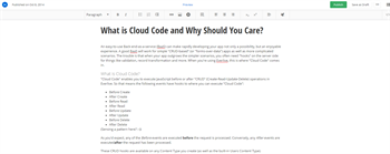
Following are some highlights among the new or improved features in the text editor.
Contextual toolsets:
Insert links
Place a link in your content to internal or external content. You can, for example, reference another website or direct readers to an email address. You can configure key aspects of the link, such as display text, tooltip, and adding an anchor to a specific place in the website you are linking to. Of course, always go back and edit the link properties. In addition, you can insert dynamic links to any page within your site(s) and any content type, for example, to a specific blog post.
For more information, see Create and manage links.
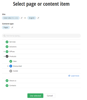
Image management
The content editor makes retrieving and presenting your visual content easy and straightforward. You browse through recent files and libraries to find the right image for your text.
For more information, see Insert images.
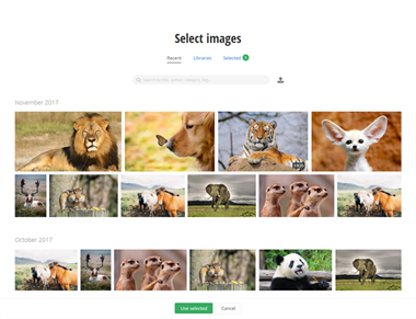
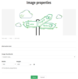
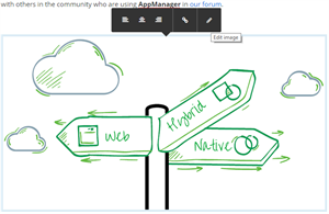
You need to make your image picture perfect by making sure it is properly sized, positioned, and labeled. You can do this either when uploading the image or modify its properties after:
Embed media
You can make you content richer with references to social media, such as Twitter, YouTube, Vimeo, Facebook, or any other iframe provider. You can either paste a YouTube URL, or embed snippets in the content for the rest of the social media.
For more information, see Embed media.
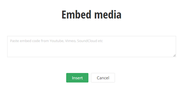
For example, you can embed a video from your YouTube media channel:

Table wizard
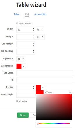
The table wizard makes adding tables and styling them quick and simple. The contextual menu provides you with the key table operations, whereas the wizard enables you to define each detail of tables.
For more information, see Create and configure tables.

You can tweak the properties, colors, and styling of the whole table or of single cells.
HTML editor
If you need to write or edit your content with the help of tags and HTML code, switch to the HTML mode, based on the Monaco editor. The HTML source editing with validation, syntax highlighting, and IntelliSense makes working with the code easy.
For more information, see Work with the HTML editor.

Content extras
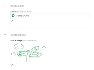
You can define and configure additional information about the content. For example, you can tag and categorize the content or make it more findable via additional URLs. You can also enrich the context of the content with related data and images. You do this without leaving the content editing screen, in dedicated section below the content editing area.
For more information, see Additional content properties and information.
Multilingual management
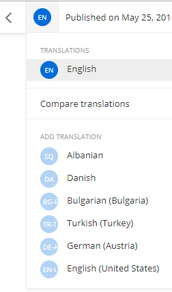
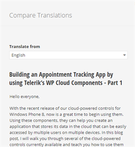
If you are working in multilingual environment, managing translated content with the new experience is straightforward and simple. Get an overview of the number of translations for each content item, switch between cultures, and translate your content assets.
For more information, see Content and multiple languages.
Distraction-free user interface
The new design provides you with distraction-free content workspace and hides elements that are not in use, for example, filters, additional actions. The focus always is on one primary task – be it content creation, media properties, or creating a table.
For example, you are creating a blog post. Only after you start typing in the content area, you see the complete toolset for your task, and in this particular context. Once finished with the content itself, the formatting toolbox becomes conveniently hidden, not distracting you from your next task.

The emphasis is on a clean writing space without sacrificing functionality. The secondary functions are still there and when you demand them, you can always open the menus and use their toolsets.
Once you have your content written down, you probably want to relate it to some other content or enhance it with related data. For example, you may have related data or media, additional URLs, categories and tags, and so on.
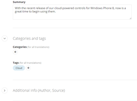
Each additional task and content option has a dedicated section to assist you in completing tasks step by step. The UI guides you by displaying additional options on each subsequent step of the flow. Say you want to add a classification. You first start typing with suggestions being filtered and displayed as you type. If you cannot find the needed classification, you proceed with the next step and open a list of all classifications, complete with their hierarchy.
The flow allows content creators to concentrate on their main task and the content itself.
Error-safe reordering of list items
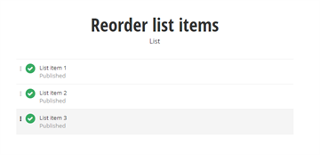
You can easily manage list items in Lists sections by opening a distraction-free mode of the Lists section. Focused specifically on reordering your lists, this section allows you to easily drag and drop items at the desired position in the list.
Content at scale
Working with content-heavy websites may pose challenges, such as the organization and findability of the content, management and workflow, as well as collaboration between team members.
In addition to all the content editing features listed in the previous section, the new experience and its tools helps you be more efficient with content production and doing more with less.
Content relations and additional information
Selectors, related data fields, and classifications are easy to work with even when dealing with content at scale. You organize and classify your content on the go. Even if you cannot find the proper tag or classification, you simply add a new one that can help you relate and find content later.
For more information, see Additional content properties and information.

Findability and filtering
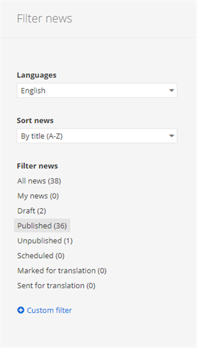
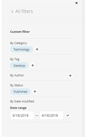
Searching for specific content item is made easy with advanced filtering and sorting options. Apart from the options to filter by status and language, you can create custom filters that aggregate complex criteria. For example, you can filter simultaneously by category, tag, and date range. This makes finding any content within your system quick and easy. Custom filters enable you to create more complex dependencies and relations between items, for example, by displaying results that are simultaneously filtered by status, tag, and custom field.
For more information, see Search and filter content items.
Browse and switch to sibling items
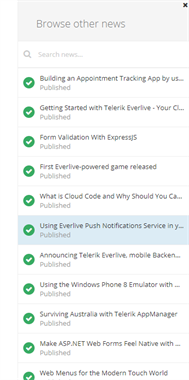
Sometimes the content you are looking for is literally a click away. Say you are editing a news item but need to quickly cross-reference with or make a correction in another news item you write yesterday. You can browse and switch to other items in the same section while still editing your piece. You simply open the content editor sidebar and see a list with all siblings of the content currently edited.
For more information, see Work with the content editor.
Collaboration – smart lock and sharable link
Tired of content being locked by someone who just forgot it open and went on a vacation? The new content editor’s smart lock prevents others from opening and editing a content item only after you start typing in the editing area and not a second before. You can also share your work with team members via a shareable link and get their input or feedback.
For more information, see Collaborate on content.
Bulk operations and selection
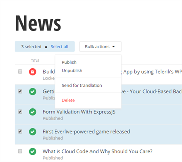
Content at scale may require operating simultaneously with large volumes of different types of content. Bulk operations come in handy when you need to publish or send for translation 50 blog posts, for example. With a single click you can select all items and perform an operation.
For more information, see Manage content.
Delight in details
Productivity and performance improvements may be key differentiators between the new and classic content editing experience. What we consider no less important, however, are the small details that subtly help people complete their content-related work with ease. Following are a number of small but delightful enhancements or new to the user interface:
- Contextual menus
- "Load more" paging for listing items
- Tooltips
- Suggest-as-you-type selector for related content items and media, with hints for recently used ones
- New list visualization
- Expandable sidebar with filters and sorting
- Counters in filters
- Expanders persist state after selection
- Quick sidebar navigation to sibling items
- Smart lock of content items upon modification
- Enhanced date and time pickers
- Drag and drop reorder of lists