10 Tips for Designing Your Website’s FAQs Page

When website visitors want an instant answer to a question—about the brand, product or something on the site—the FAQs is the best resource to give it to them. In this post, we’ll look at 10 things you can do to ensure that the FAQs page is designed to be both useful and usable.
Is a list of Frequently Asked Questions even necessary on a website? After all, each of the questions should be answered within the main content. So why the need for a separate FAQs page?
In part, it’s because of convenience. Sometimes users just want a quick and easy resource that gives them answers to their questions.
It can also be an effective way to reduce the time you or the customer service team spends on answering questions that can be unpacked in a succinct write-up.
The FAQs page can also be beneficial for SEO. A well-structured page or section that deals with the most commonly asked questions can put a website in a better position to rank for those specific queries.
In this post, we’ll look at a bunch of examples of great FAQ page designs and the biggest lessons to take away from them.
Tips for Designing the Frequently Asked Questions Page
The FAQs page (or section) should be just as well-thought-out in terms of design as the main pages of your site are. Here are some things to remember as you approach this task:
1. Use a Simple Layout With Plenty of Space
The FAQs page needs no introduction. Just add an attractive banner to the top of the page and jump right into the thick of it.
In terms of laying out the questions, I’ve found that many sites go with a two-column format. I don’t necessarily think there’s a wrong or right way to handle this.
The two-column format reduces how much scrolling visitors do to see all the questions. On the other hand, the one-column format minimizes how many questions appear at once—it’s also inherently responsive. So there are benefits to doing it both ways. It just depends on what type of “fatigue” you want to fend off with your design.
One thing that every good FAQs page has in common is white space. Even if the page has only a few questions on it, spacing is essential for improving user focus.
The Zinus Support page and FAQs demonstrate the various ways in which white space can improve the usability and readability of this content:
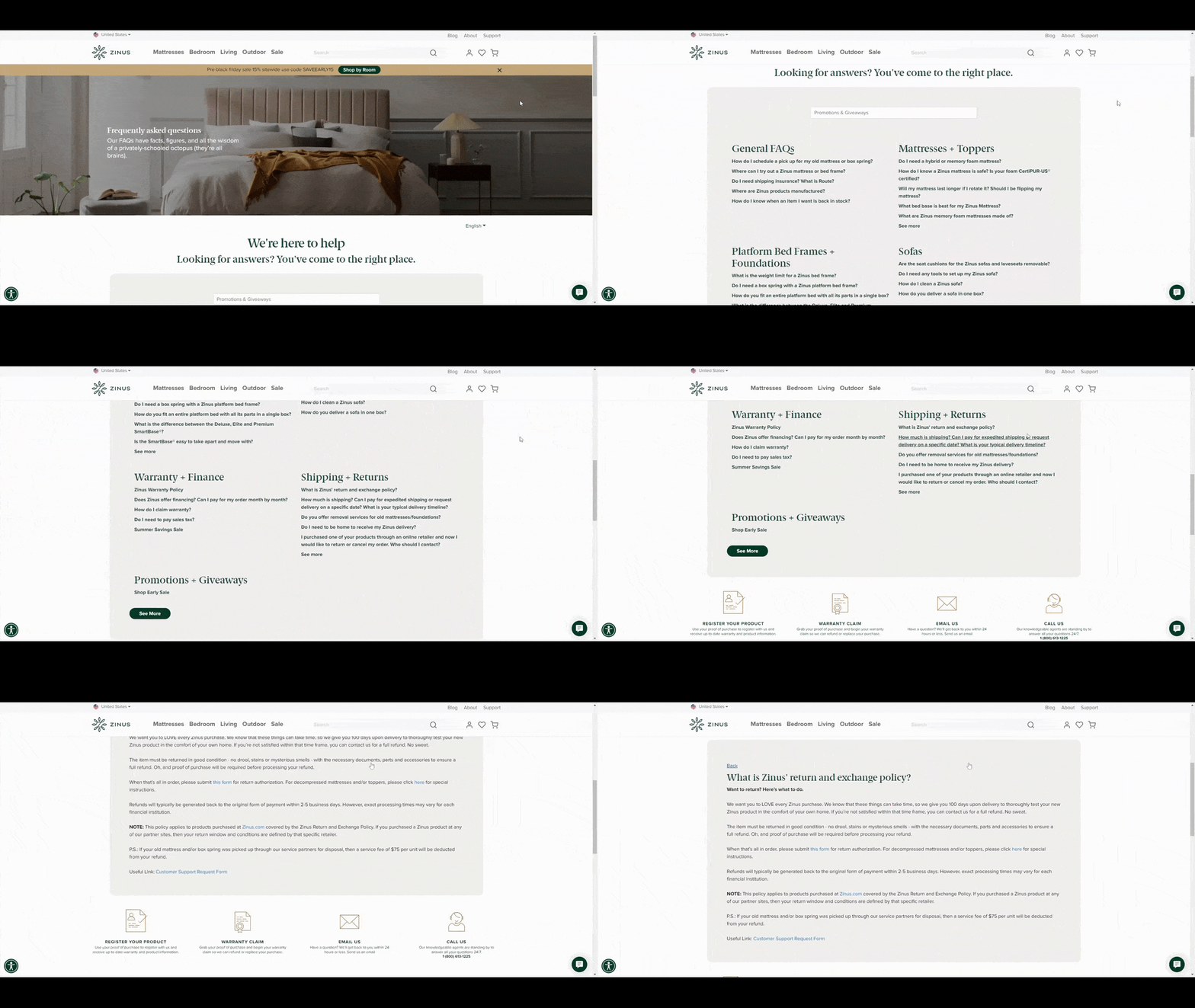
We see ample white space around the enclosed FAQs box. This draws users’ attention to the center of the page.
There is also abundant white space built in around the categories/headers. While there are no lines to separate the categories, the spacing lets us know where the groups of questions begin and end.
Space is also used on the subsequent answer pages. It’s used to frame the answer box while also providing some breathing room between the paragraphs in the answer.
2. Organize the Questions in a Logical Order
Logic is going to mean different things based on the FAQs page.
For example, you might only have a list of 10 or so questions that answer basic questions about your company or services. In that case, you might order them in a way so they tell a story about your brand. For instance, you’d put something like “When was your company founded?” at the top and then something like “What types of technologies are you working on launching by 2030?” at the bottom.
Another way to handle the ordering of content is to do so by popularity. You’ll need user data for this. A feedback form from your site or mailing list can provide you with a list of top questions. You could also use your social media channels to comb through requests and questions received there. User research and testing can also be useful.
Once you’ve compiled your questions, sort them by popularity or importance. Also, group them into categories. This will make it easier for users to find what they’re looking for.
The Nioxin FAQs page is a good example to follow:
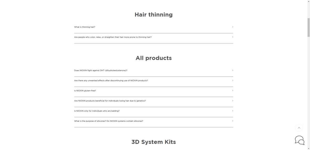
This page specifically deals with questions about hair loss. So rather than make the first questions be about their products, they tackle users’ biggest concerns:
“What is thinning hair?”
“Are people who color, relax, or straighten their hair more prone to thinning hair?”
Without addressing these underlying concerns, users might get the impression that the brand is only looking out for its own interests. Plus, they have the rest of the page to unpack answers that relate to how Nioxin products treat hair thinning.
3. Use Accordion Dropdowns Whenever Possible
Unless you have a very short list of questions (fewer than five), accordion dropdowns are a must for the FAQs page. You can style them however makes the most sense for your brand’s and website’s style.
For example, you can use white space to organize everything or add lines to create a clear division between each question. You can add a plus-sign or arrowhead to the end of the question line or use a symbol at the start of it to let visitors know they can click to expand.
The Zoho One, for instance, uses a combination of white space and separators within its FAQs accordion design:
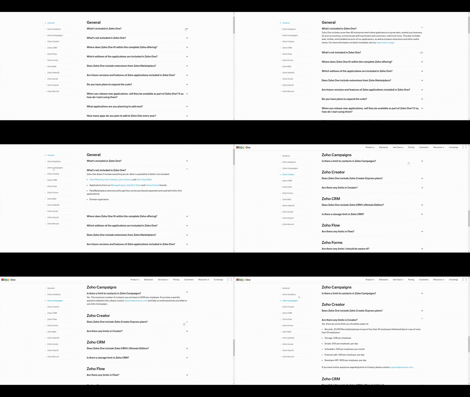
The down-arrow symbol at the end of the question lets users know they can expand it for more information. What’s great about the way this is designed is that one accordion will close before a new one opens. So users won’t ever have to deal with a cluttered FAQs page simply because they forgot to close the previous question. The page automatically cleans up behind them.
4. Use Breadcrumbs for More Complex FAQs
You might not want to use the accordion style if your FAQs are full of longer, more complex answers.
To maximize FAQ usability, an alternative way to present answers is to push them out to a separate page. This is what Grammarly does on its Support page:
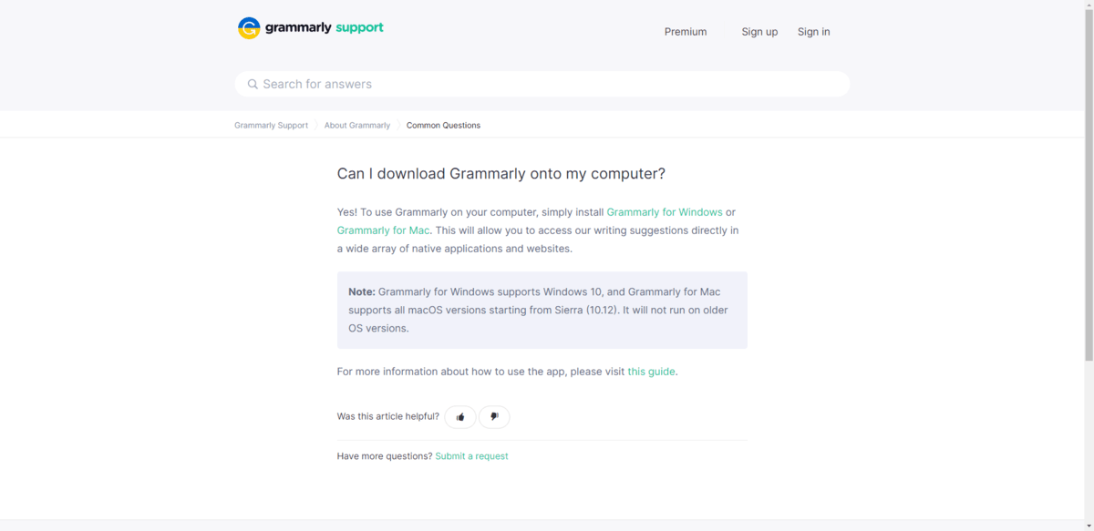
Many of these questions are technical in nature. Having a separate page to present the answer in full can really benefit users. Leaving them to rely on the browser “Back” button isn’t, though, which is why the breadcrumbs in the top-left corner are necessary.
5. Add a Search Bar
Just as a website, blog or store with a ton of content can greatly benefit from having a search bar, so too would a lengthy FAQs page. You might even consider adding a sticky sidebar navigation to the page if there are a dozen or so categories to peruse.
The search bar alone may be all you need. You won’t need to add sorting or filters to it. Just make sure it provides real-time, auto-populated results so that users can select their queries right from where they are. They shouldn’t need another page to sift through results.
Home Chef has a good example of how to design the search bar:
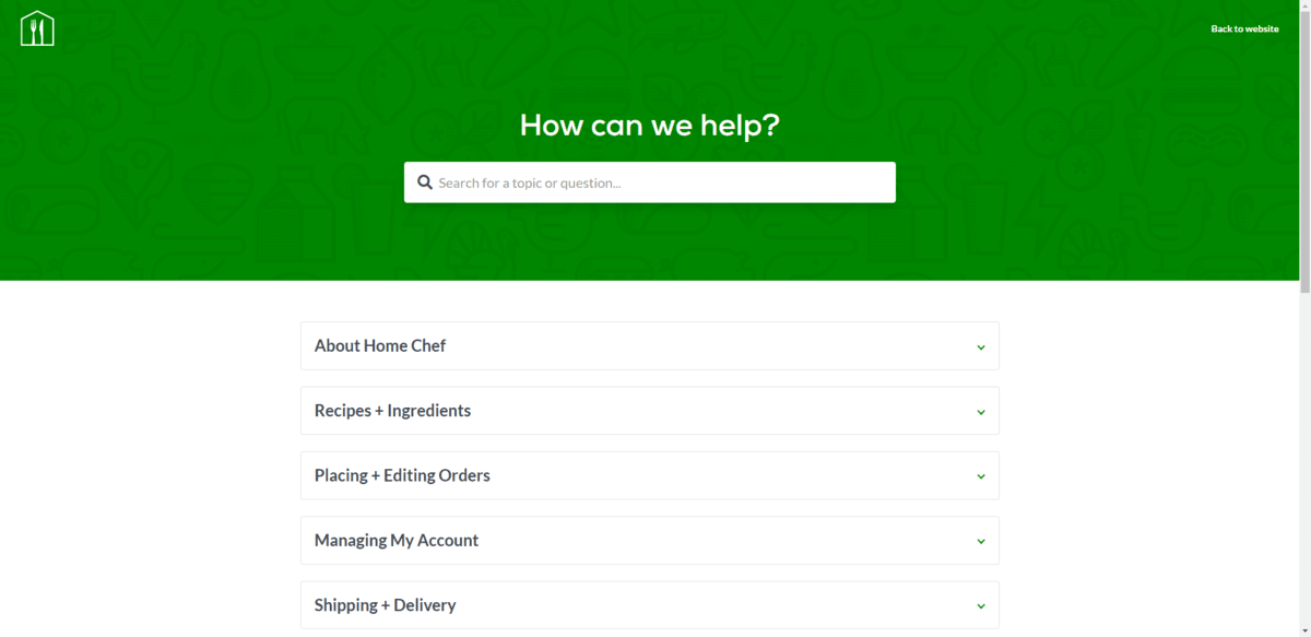
It sits at the very top of the FAQs page. It also follows users as they scroll down the page. This is done by minimizing the search bar and making it stick to the top:
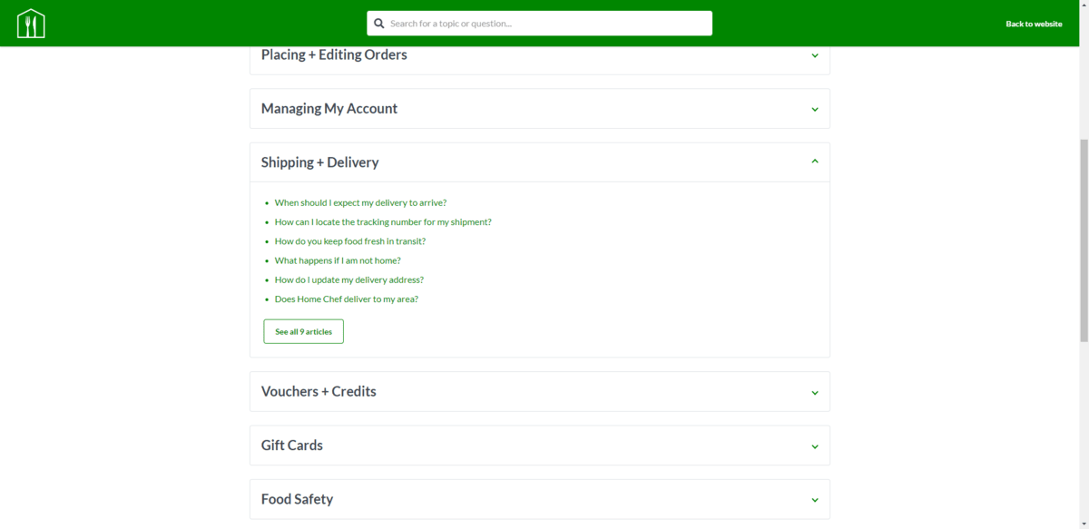
Even as users engage with the content on the page, the search bar always stays in view in case they can’t find what they’re looking for.
6. Make Each Question an H2 or H3
While you might be tempted to use bold font to style the questions in your question-and-answer pairs, the better option is to treat the questions like website headings. This will be useful for the page’s SEO strategy. Plus, a more distinct hierarchy between text and heading will make questions easier to find and the answers easier to read.
The FAQs page for MINI has a great example of how to do this:
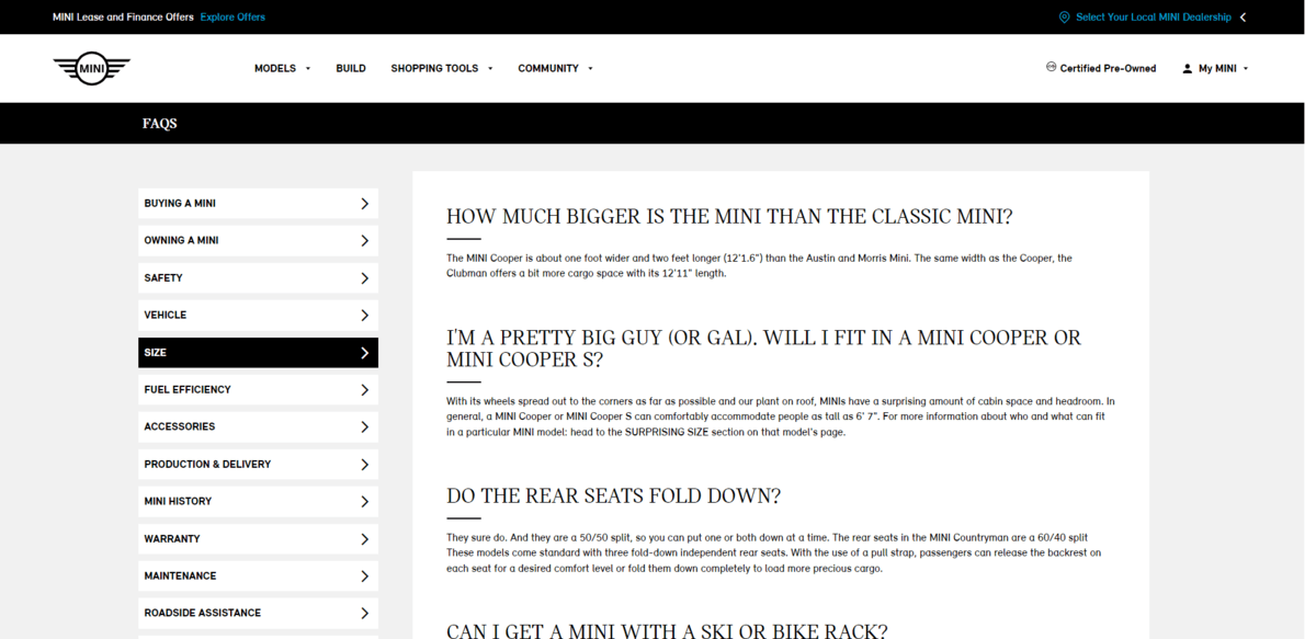
The headings are styled as H3. They’re in an all-caps font that’s exponentially larger than the paragraph text.
7. Keep the Answers Short When Possible
Unless you have to provide a step-by-step response, the FAQs page should provide succinct answers for succinct questions.
For example, this is how Liquid I.V. answers the question “How does Liquid I.V. work?”:
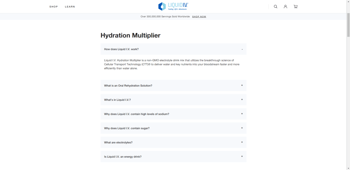
This easily could’ve been a lengthy response that goes into the science of the product, its ingredients, as well as the human body. However, the answer is kept short and sweet and is only a paragraph in length.
If you want to give visitors the option to explore the topic further, provide an internal link within the response.
8. Give Internal Links a Pronounced Look
Speaking of internal links, they can come in handy in the FAQs. Whether it’s to elaborate on an answer or to provide users with a contact email or phone number, links help them get more out of the FAQs page.
To ensure that they spot those links, make sure they’re designed to stick out. Magic Spoon, for instance, underlines all of its links:
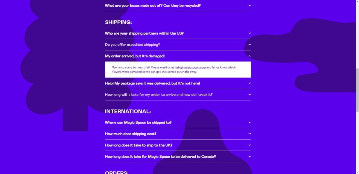
Another option would be to make link text a different color. For Magic Spoon, however, the page already has so much color that the underlined links are the better choice.
9. Only Include Images When Necessary
Decorative images have no place on the FAQs page, except maybe the header. Other than that, the only images that should appear on the page are descriptive ones that help illustrate your points.
For example, MeUndies includes GIFs to show customers how to carry out specific actions on the site. This is in conjunction with the written-out instructions on how to complete tasks:
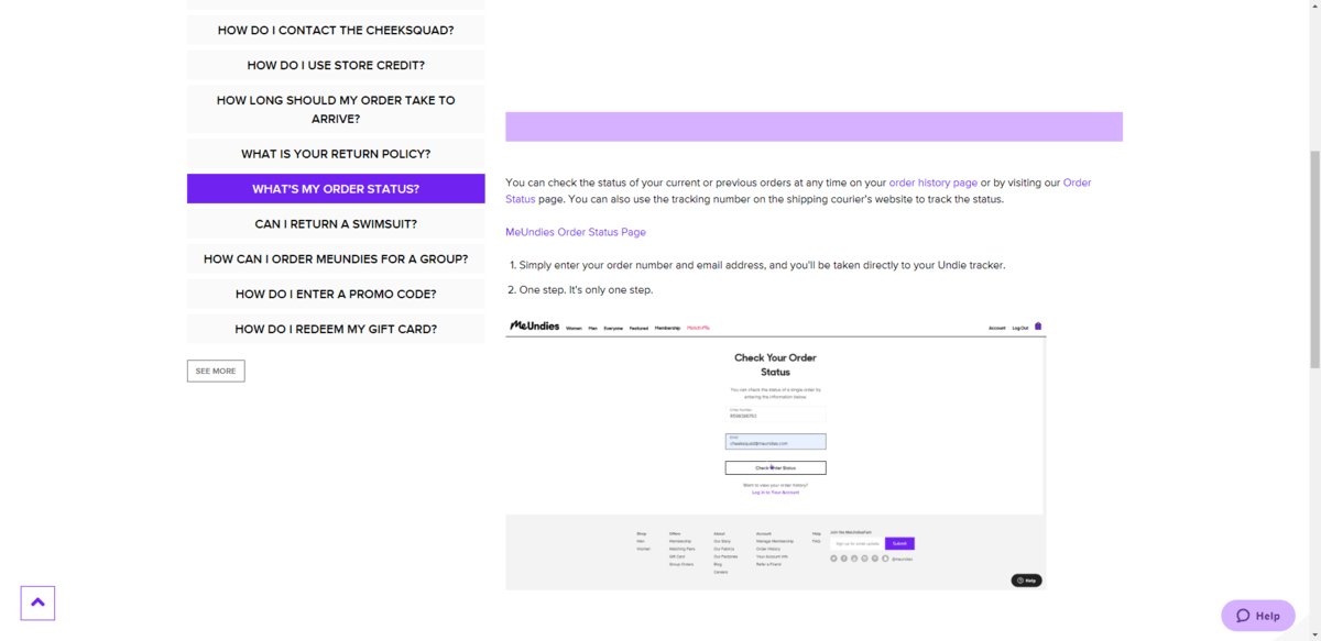
Screenshots would be just as effective, though you might need multiple screenshots to explain a process. You’ll need to determine what the best format is and which will keep your FAQ answer pages loading the quickest.
10. Mark Up FAQs With Structured Data
If you spend time marking up your FAQs page with structured data, you might be able to enhance how the page and relevant queries appear in search results. According to Google:
“Properly marked up FAQ pages may be eligible to have a rich result on Search and an Action on the Google Assistant, which can help your site reach the right users.”
While Google focuses on placement in rich results and actions, structured data can enhance search results in other ways. For example, I did a search for “are digital coupons accepted at publix”:
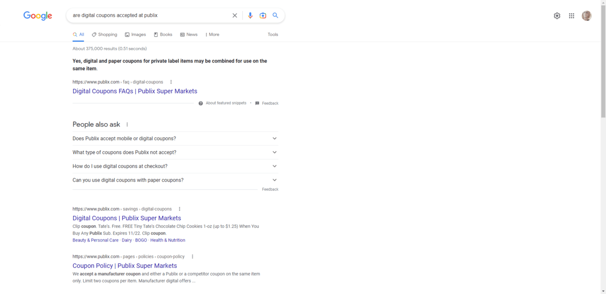
The top result is the FAQs category page for Digital Coupons, not a single answer page or even an internal page on the site. Because the page was so well-structured, Google was also able to parse together an answer despite this not being a question on the page.
Wrap-up
Some of your clients might opt out of putting an FAQs page or section on their site. If they see no value in it, then don’t stress about it.
However, for the clients that do see the benefit in including Frequently Asked Questions in their information architecture, make sure the content is designed well. The more attractive and usable the questions and answers are, the more your visitors will get out of them.
What’s more, don’t be afraid to take these best practices and apply them to, say, the Help or Support area of the site. As we’ve seen in a number of the examples above, the FAQs are sometimes included on these pages or simply rebranded as “Help.” Regardless, by posing the question-and-answer pairs on your websites in more user-friendly formats, you’ll increase their usefulness for visitors and effectiveness for your clients.

Suzanne Scacca
A former project manager and web design agency manager, Suzanne Scacca now writes about the changing landscape of design, development and software.
