Using a CMS to Design the Right Content & User Experience

Your CMS is a powerful asset, enabling you to create a truly engaging user experience. See how we use Sitefinity to fine-tune the Sitefinity.com user experience.
When you hear the terms Web Content Management System or CMS, what do you think about? To be honest, I think about updating content on our website. However, these systems enable us to do so much more than just updating content. They make updating content so easy that we can turn our focus on the experience we are providing our customers.
While we may not all be experts in user experience, we can impact the user experience quite a lot, through content such as calls to action, imagery and relevant, engaging messaging and resources.
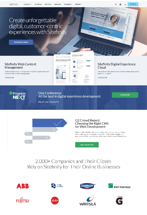
Let’s use this image of the former homepage of Sitefinity.com as an example and look at the “building blocks” that make up this overall experience.

Let’s start with the layout. This is really a framework to house all the other pieces. It is where we define how we are going to tell our story in digestible, scannable chunks so the user can easily interact with it, understand what they are seeing and what they need to do next. Order also plays an important role here. If something important is too far down the page, the majority of visitors may not see it.
Other things that can impact the user experience are:
- Imagery
- Web copy
- Headlines
- Call to actions
All these items have the potential to really make your digital experience quite powerful.
Header Image
Let’s take the header image of our website. Here you can see someone sitting at their computer. The image within the laptop shows a website (our site, in fact) within the context of a CMS. When I look at this image, I immediately look at the headline. Do the two relate? Does it relate to what I am looking for, or what I expect to see? Other people may see this and wonder, is that an image of their product? What do they sell? Does this make sense? What we were really trying to get across with this image was to subtly portray that Progress uses their own product Sitefinity to manage their website.
Now, imagine if we could see the person’s face. What if they were smiling? An image such as that may invoke a feeling that the product is easy to use or that the person likes using the product. This could influence a user to engage further as they want to learn more.
Content
Content also plays a major role. It can strongly influence whether a visitor wants to stay and further engage. Does the message resonate with the users who are coming to the site? For example, we have “Create unforgettable digital, customer-centric experiences.” Does this speak to our target market? If your target market is a marketer, web designer… maybe yes. But if the target market was a developer, maybe not. What about the product descriptions? Is it clear what is being sold? What was the description of the action that resulted in visitors coming to your site? Did that message truly connect with the message on the landing page?
Supporting content can also invoke a feeling of trust. Highlighting customers or reports can show you are a trusted, reliable vendor to work with. Similar companies using your product may entice someone to look more deeply at your offers.
Calls to Action
On a webpage, the most important action that you want the user to take should be highly visible. We often have multiple actions we want users to take, but putting the wrong one as the priority may result in fewer people taking that action. For example, what if we had a form asking someone to download a trial rather than just clicking to learn more. Visitors who are new to the site may not yet be ready to commit to a download. Even the text on a call to action is important. We once had a button for our free trial that said: “Download now.” When we changed it to read “Free 30-day trial,” we saw the number of downloads decline. They both went to the same page, but maybe the user didn’t download because one felt like one was more of a commitment than the other.
Now that we understand the building blocks, we can start to think about how tactics like personalization, optimization and localization can improve the experience further. Fortunately, Sitefinity makes these enhancements easy, as you’ll see in the next installment of this series.

