Fat vs. Slim Footers


We see footers every day, all over the internet. Sometimes they are huge sections, containing a lot of shortcuts to other pages and additional items like social widgets, contact forms and more, while other times they are just horizontal bands with a few links. But what makes a good footer and how do we actually decide how big our footer should be, and what information it must contain?
A fat footer is the term given to a website footer that can act as an additional navigation option for a webpage. There we put all important links, a sitemap of the website. Giving a lot of navigation options at the bottom of а page is also called a “safety net”—we hope that if the visitor is not interested in the content presented above, he might still get curious in what else we offer. That is why another definition of the fat footer is:
The online equivalent of that well-turned phrase: “Is there anything else we can help you with today?”
How to Know if Your Visitors Need More Options
We tend to create a fat footer on pages which present general information about a brand or a service (a home page for example), where we assume that the visitor is still not sure what to discover next. In this case we should consider giving more links at the bottom of the page, to keep our guest on the website.
Here is a list of extra elements you can place in your fat footer:
- Products or services
- Resources
- Support
- Events and Trainings
- Recent news or top blog posts
- Sitemap
- About the company
Of course you can include much more, but it is better to be selective and give the visitors just enough to remind them that there is more they can explore on your website.
Why the Fat Footer Is Useful
- It increases usability for visitors that didn’t find what they were looking for
- It improves SEO by taking visitors to the most popular and beneficial pages within the site
- It is a functional space, exposing important links
What Can Go Wrong When Using a Fat Footer
- The link collection can be so big that it is impossible for your visitors to scan quickly
- Using fat footers on pages with clear goals could cause distraction for your visitors, and might take them off the desired journey
Let’s look at a few examples:
Example 1
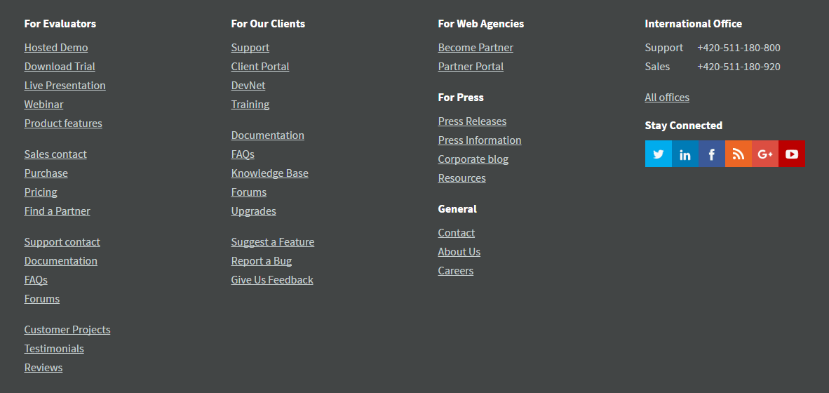
In this footer example we see a lot of options—the most important pages of the website are exposed here. They are organized in groups, with labels for each group, which helps visitors navigate. The problem here could be that the length of some of the links is too long, which makes them hard to scan quickly. Try using cleaner and more concise text links to improve usability.
Example 2

The positive of this example is that the links are nicely organized and distinguished by labels which speak directly to the different target personas: evaluators, existing clients, web agencies representatives etc. This grouping approach helps visitors quickly scan trough the labels and find their positioning in the website.
Example 3

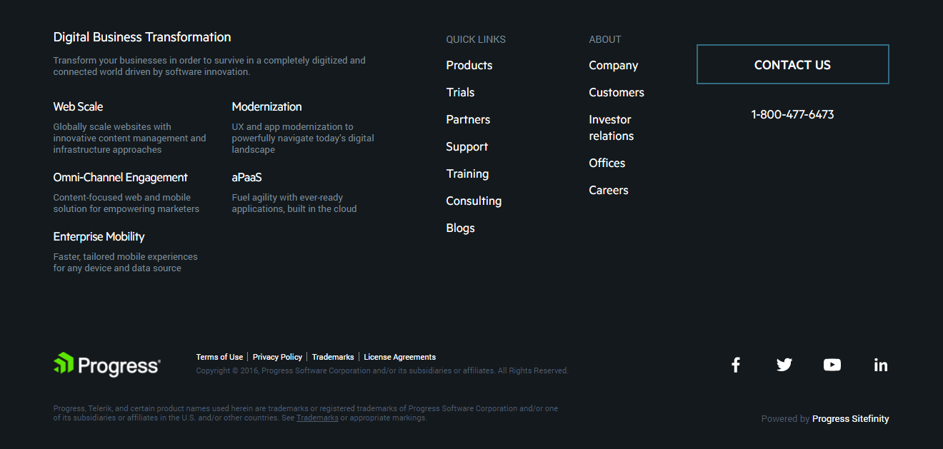
Another example of a fat footer, directly from here at Progress, which includes: highlighted links with short descriptions, quick links, navigation options about the company and a CTA to a contact form. The footer is well organized and easy to scan. The hierarchy of the navigation options is obvious.
The slim footer, on other hand, is а compact and unobtrusive finish for our webpage. It contains only the information that most website visitors expect to see in this particular place:
- Sharing icons
- Contacts
- Careers
- Terms of use
- Privacy policy
When to Use a Slim Footer
If we assume that we have exposed the most important topics with further links in the content of a webpage, and we have provided the desired CTAs that point the user to the desired website journeys, then it is better to keep the footer simple to avoid confusion. By doing this we keep users away from any distractions.
Here is an example of one really compact footer. It contains only a couple of links, which users expect to always be able to find at the bottom of a webpage. Included are also some of the most important links from the top navigation.

Build a Better Footer
If you are about to create a new website journey and you are wondering how to organize your footer, you might consider this checklist of questions before starting:
- What does my visitors expect to see here?
- What questions might visitors still asking at the bottom of the site?
- How can I continue the experience beyond the content on this page?
By asking yourself these questions—and considering any data you’ve collected about customer behavior to help answer them—you’ll be better prepared to build an engaging footer for your business.
Are you a seasoned web developer, or just starting your journey of building better websites? Sitefinity provides all the capabilities to help you easily create, reuse or even A/B test different layouts across pages and websites.
We have designed a free course to help developers who have little to no experience in developing against Sitefinity to get up to speed. Sign up here.
![[768fc25d-f120-42d6-a6c0-3ffe94f01714]Radostina_Imetska-headshot](https://d117h1jjiq768j.cloudfront.net/images/default-source/blogs/blog-authors/-768fc25d-f120-42d6-a6c0-3ffe94f01714-radostina_imetska-headshot.png?sfvrsn=fed99fc4_6)
Radostina Imetska
Radost has 3+ years of experience in the field of website design, and recently turned her focus to UX and interaction design. She has a passion for and curiosity about user behavior, end-to-end experience and human-centered design.

