The surprising potential of peripheral vision in driving user attention

Have you ever worn glasses then after a while switched to contact lenses? If so, you know how unreal it feels. Like accessing another perception to explore the world around you, it’s a new experience, a new sense through which you are completely aware of the space and movements around you. You feel excited, alive. But why is that, what so significantly changed? Nothing more than you have had your peripheral vision liberated.

Peripheral vision has a direct impact on our emotions, and emotions dominate our choices
Vision truly dominates all of our senses. Half of our brain’s resources are acquired in seeing and interpreting what we see. Interestingly, central and peripheral vision is processed independently to a large extent, and peripheral vision connects to a unique circuit in the brain linked to the areas that control movement, emotion, attention and decision making. Researchers have proven that peripheral vision has an immediate, direct impact on what we’re feeling, how we’re moving and how our central vision responds to different visual triggers.
In the book, Emotional Design—Why We Love (or Hate) Everyday Things, Don Norman divides the human brain into three levels when it comes to processing information from the outside world—visceral, behavioral and reflective. The visceral level is the most primitive and simple part of the brain and responds to sensory information, as the other levels are more related to education and experience. Peripheral vision is part of the visceral level of perception, referring to unconscious or emotional reactions that are more instinctive in nature.
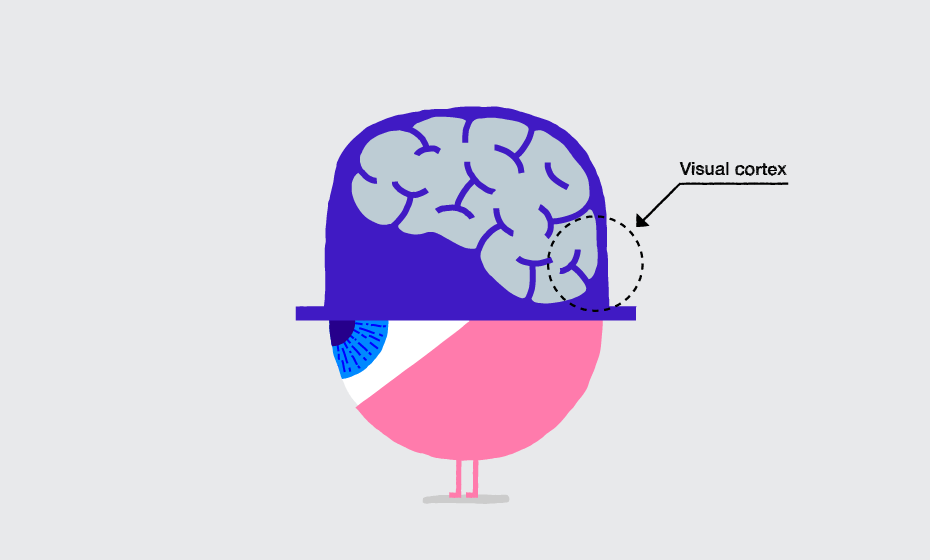
In website design, this type of instinctive response is the first impression users get upon visiting your site. A good look and feel causes a (fake or not) perception of usability and enhances user adaption level. Peripheral vision plays an instrumental role in comprehending visual information and getting the essence of what's around us. When people look at a computer screen, they usually decide what a page is about, based on a quick glimpse of what is in their peripheral vision.
In their research, Larson and Loschky found that if the central part of the photo was missing, people could still identify what they were looking at. But, when the peripheral part of the image was missing, then they couldn’t say whether the scene was a living room or a kitchen. They tried obscuring different amounts of the photo, and concluded that central vision is the most critical for specific object recognition, but peripheral vision is used for getting the gist of a scene.
Make sure the information in the periphery clearly communicates the purpose of the page.
Although the middle of the screen is important for central vision, don’t ignore what is in the viewers’ peripheral vision. Don’t just leave it blank, use it to convey a feeling.

The Progress homepage spends a lot of real estate promoting its vision. The hero image doesn't contain any motion, thereby reducing peripheral distraction and encouraging users to scroll down.
Can we design in a way to appeal to our users in deep emotional terms? Creating the right emotional overtone that reminds people of enjoyable circumstances—a picture of food, a glass of wine, the beach at the sunset, beautiful people all around—emotional design often starts with the right image calling for loyalty, affection and commitment.
In his book, Designing for Emotion, Aarron Walter describes how important emotional experiences are, as they make a profound imprint on our long-term memory and create “an experience for users that makes them feel like there’s a person, not a machine, at the other end of the connection.”
Central and peripheral vision can handle different amounts of detail
Central vision is capable of comprehending a high level of detail, but peripheral vision is blurry and processes simple objects faster.
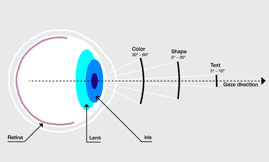
Decide the main attention points and put more detail there. Make design in the outer edges as simple as possible. Pay attention to what people will see in their peripheral vision when they focus on certain parts of a page with their central vision. When elements in the peripheral area are simple, your peripheral vision will perceive it easily. This will increase the feeling of well-structured information, fostering a positive attitude towards not only the company, but its products. People tend to transcend their positive or negative impression throughout all touchpoints, products and services. If they are not satisfied interacting with your website, they will be less compelled to download your product.
Leave peripheral areas blank, only if you want to concentrate full attention to an object in the center. You can also design chunks of information in rectangles that are wider than their height for easiest comprehension. Yet, don't use only the middle part of the screen and leave the edges blank. This might be easiest for creating one screen that translates into multiple devices, but it means you’re leaving peripheral vision with nothing to comprehend.
Screen sizes and level of detail—research on peripheral vision goes against some oft-repeated design wisdom
In her book, 100 Things Every Designer Needs to Know About People, Suzan Weinschenk talks about the interesting conclusions from research on how peripheral vision perceives information on different screen sizes: “It’s common to find guidelines that say, for example, that icons on a smartphone should be both smaller and simpler than those on a desktop. On the surface, this makes sense: however, there’s another way to think about this interplay of size and visual detail. The more of the visual field that’s in central vision, the more detail you can use, not less. Central vision will pick up the detail.”
One of the interesting conclusions she makes is that when you’re designing for a small display, the design can be more detailed, and when you’re designing for a larger display, the design should be simpler and less detailed.
Your peripheral vision is very sensitive to motion; it reacts twice as fast as central vision to a moving object
People can’t help but notice movement in their peripheral vision. For example, if you’re reading text on a computer screen and there’s some animation or something blinking off to the side, you can’t help but look at it. An example of the inverse of this is in Mac OS and Windows where you’ll notice that when a program wants your attention, its icon in the task-bar or dock will flash or jump at you repeatedly. Even though we may find it annoying, it does get our attention.
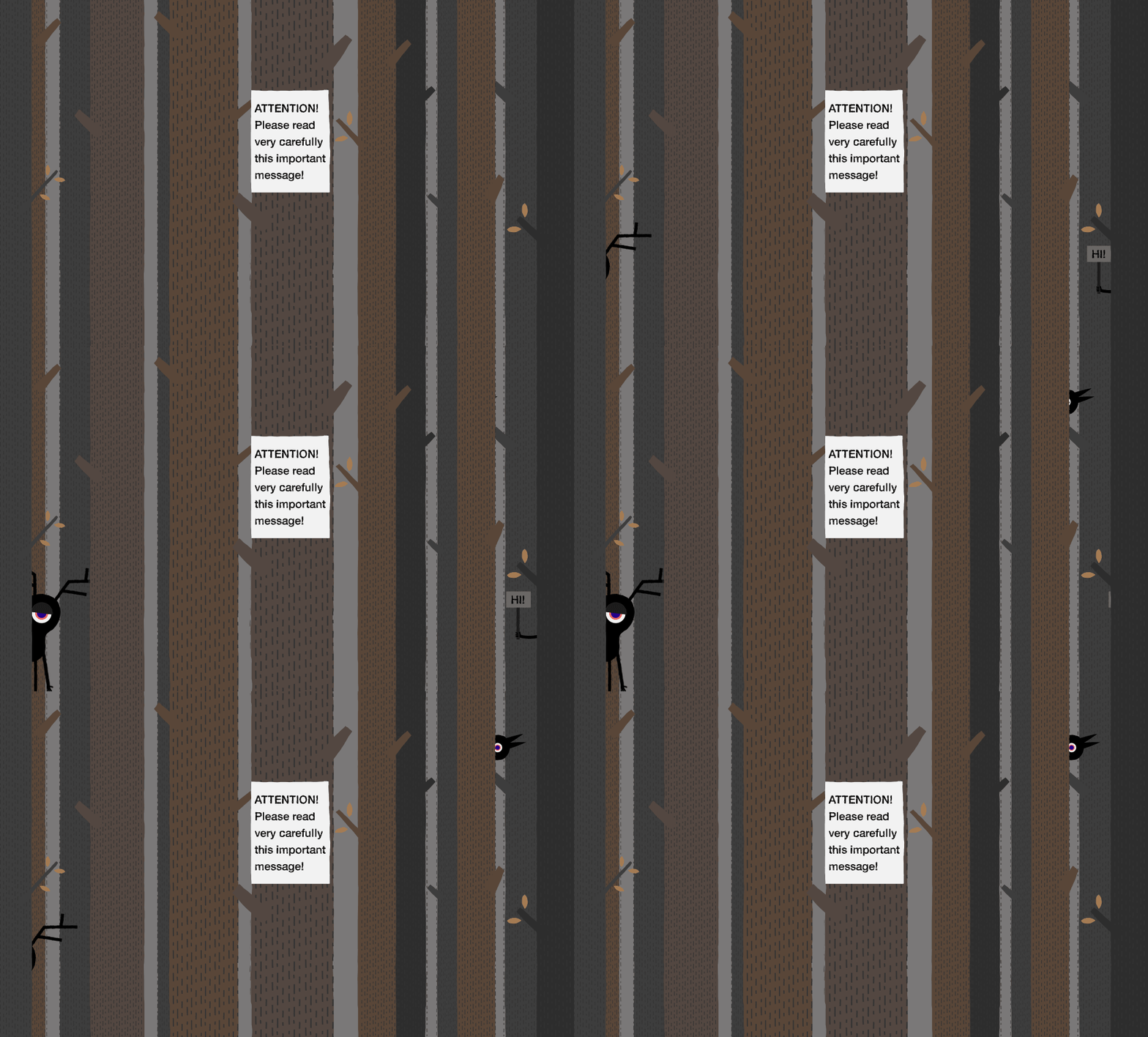
If you want users to concentrate on a certain part of the screen, avoid putting animation or blinking elements in their peripheral vision not related to their current task. Try to use on-demand animations or moving elements only when they reach the central visual area of the screen. This is especially important if you have long paragraphs of text you want your visitors to read. In such a case, don’t use auto-play videos or blinking images around the text area.
Peripheral vision just doesn’t get the colors
Due to its structure, the periphery of the eye has more Rode than Cone cells, which process motion (even in the dark) faster than Cone cells, but are not very sensitive to colors. At the periphery, our eyes don't have any Cone cells that are able to perceive color. Researchers say the brain compensates as much as possible for the lack of information when it cannot get the information from our senses—that’s why we may believe we see colors with our peripheral vision.
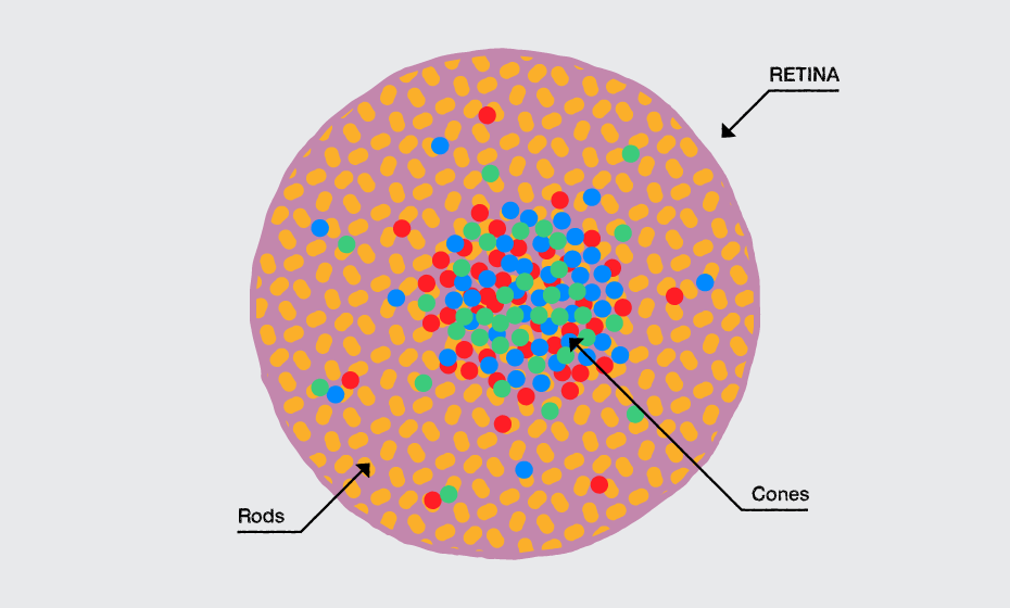
To grab people’s attention to the periphery of your page, use high contrast and intensive colors, especially yellow.
Yellow is the color that our vision is most sensitive to.
Don’t base design decisions solely on eye-tracking studies
Even though eye-tracking research gives us reliable data on how our users use our website, there is much more to consider when we design websites, like creating an appropriate emotional look and feel in relation to the purpose of the site and its users. Peripheral vision is just one of many factors to consider when creating websites that better promote customer engagement and enhance the entire customer journey.
But before I close off today, here’s a list with useful reference materials:
Adam M. Larson, Lester C. Loschky. The contributions of central versus peripheral vision to scene gist recognition. Journal of Vision September 2009, Vol.9
http://jov.arvojournals.org/article.aspx?articleid=2122327
Hsin-Hao Yu, Tristan A. Chaplin, Amanda J. Davies, Richa Verma, Marcello G.P. Rosa. A Specialized Area in Limbic Cortex for Fast Analysis of Peripheral Vision.
http://www.cell.com/current-biology/abstract/S0960-9822(12)00582-9
Exploratorium Teacher Institute. Peripheral Vision. Discover the outer limits of your eyes.
http://www.exploratorium.edu/snacks/peripheral-vision
Susan Weinschenk.100 Things Every Designer Needs to Know About People. https://www.amazon.com/Things-Designer-People-Voices-Matter/dp/0321767535/ref=sr_1_1?s=books&ie=UTF8&qid=1475759233&sr=1-1
Don Norman. Emotional Design: Why We Love (or Hate) Everyday Things. https://www.amazon.com/Emotional-Design-Love-Everyday-Things/dp/0465051367/ref=sr_1_2?s=books&ie=UTF8&qid=1475759322&sr=1-2
Aarron Walter. Designing for Emotion. https://www.amazon.com/Designing-Emotion-Aaron-Walter/dp/1937557006/ref=sr_1_1?s=books&ie=UTF8&qid=1475760383&sr=1-1&keywords=aaron+walter+designing
![[954a5046-c9ae-488e-bd4f-e83b5d0c8d47]Sassy_headshot](https://www.progress.com/images/default-source/blogs/blog-authors/-954a5046-c9ae-488e-bd4f-e83b5d0c8d47-sassy_headshot.jpg?sfvrsn=db4ee1ef_6)
Svetoslava Ilieva
Svetoslava, who prefers to go by “Sassy”, is a creative lead at Progress. Sassy has 17 years of experience in visual design and UX, and is passionate about arts and design, technology, human-centered approaches, cognitive and perception theories and design and innovation methodologies. Sassy holds more than 70 awards for design excellence and is a lecturer at the National Academy of Arts.
