The Challenge to Design Beyond Color


It was a sunny summer afternoon in 2004. I was waiting impatiently in a neat conference room to meet a client and present him with my concept for his product catalogue website. After starting my presentation, I noticed he didn't seem impressed as much as I expected. I tried not to fixate on his stone face, but rather focus his attention on the main challenges like understanding the audience, using typography and color to enhance user experience, and adding accent to the essential elements of the page, like primary CTAs. When I mentioned the accent color I'd used to draw the user's attention, he interrupted me and said, “What accent color? Sorry, it looks pretty pale to me.” Then he mentioned he’s color-blind. I felt so embarrassed. Did I mention “understanding your audience” a minute ago?
Until that moment, to me colors had always been an irreplaceable form of communication. Studying color science for so many years made me admire their power over our emotions, visual memory and perception. I believed they were self-sufficient in delivering a message to such an extent, that I completely forgot there are people who see colors differently than most of us do.
From that point on, everything changed for me. My frustration turned into a restless curiosity about human perception. I found a new world with new ways to express myself—and my belief and passion for design—that better reflects the needs, perspective and motivation of people I design for. Let me share with you what I found in my journey through the world of the people who see colors in a much different way than most of us do.

Let’s Call it an Alternate Color Sensitivity
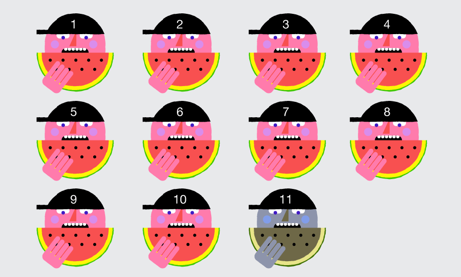
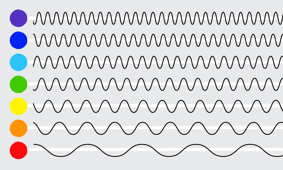
As individuals we perceive color differently. We see color with special cells in our eyes called cones, which are sensitive to certain wavelengths of light (short, medium or long). The cones send signals to the brain, and the brain interprets those wavelengths as colors (blue, green and red). Each cone allows the eye to see approximately 100 shades, so all three cones combined result in 100 to the third power, or about one million different colors. When one or more cones are absent, or altered in their spectral sensitivity, it changes the signal that is sent to the brain, and shifts color perception. This can result in anything from a slight difficulty distinguishing similar hues, to an inability to perceive any color at all.
Take the Challenge and Design Beyond Color
There are many aspects that can affect how users will perceive the colors in our designs—the lighting of the environment where users open a website, the gamut of the display device they use, as well as individual color sensitivity. If color is a matter of perception, the role of the designer should be to find the right color dimensions and make a palette that will work for everyone. Designing for accessibility not only will improve the aesthetic integrity of your website, but will also make it much more comprehensive and not dependent on any circumstances.
While there isn’t a one-size-fits-all solution when designing for users with color deficiency, there still are a few essential design principles to focus on.

CONTRAST: Combine Highly Diverse Color Values to Ensure Good Contrast
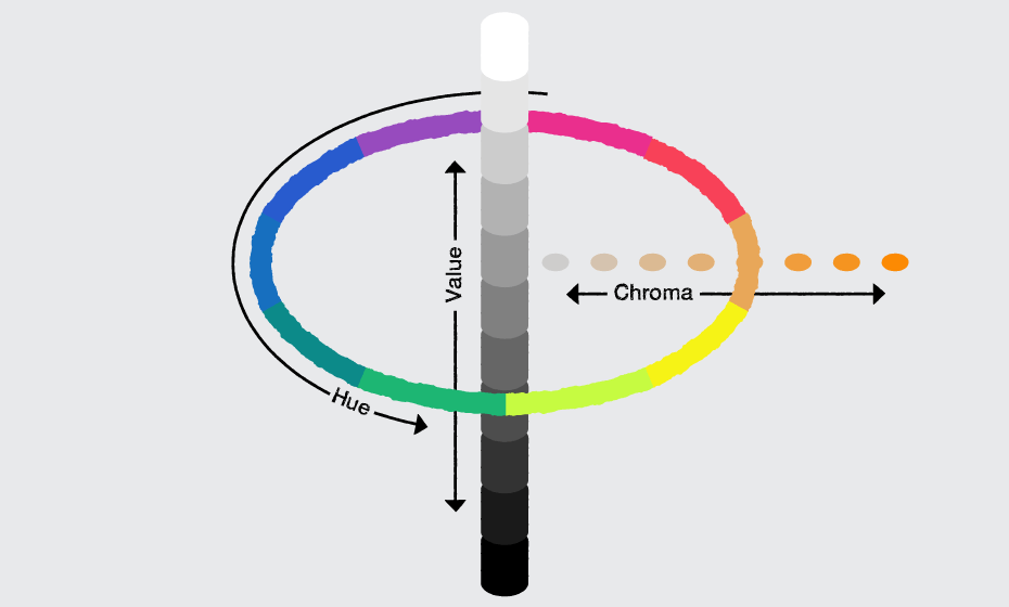
Value is an essential dimension of contrast in a color scheme. It refers to how light or dark a color is. All people with color-deficient vision are able to perceive differences in value, while not many of them see a fairly wide range of hues. To make sure your color palettes are accessible, try to not use hues with similar values next to one another, because they will appear identical. This will make visual elements imperceptible, even if adjacent hues and their chroma (purity) differ greatly from one another. It is particularly important that there is a high value contrast between text or other content elements and their background colors.
COLOR PALETTE: Maximize Contrast by Using Complementary Hues
Having a palette that varies only in value may not be enough. Try to add a couple of complementary hues to your color scheme, especially for the essential elements in the layout. The formula is pretty simple — low value of a cool hue placed next to high value of a warm hue. This will add to the visual interest and will create an extra emphasis on certain parts within your designs. At the same time keep analogous hues for non-essential, purely decorative elements as they create a sense of harmony and continuity in visual design.
TEXTURE: Use Patterns and Textures to Enhance the Contrast
Distinguishing between certain color hues is quite challenging for people with color deficiency. A good approach to enhance the contrast, apart from playing with color value and hues, is to use different patterns or textures, especially when you have a limited color palette or an element you want to emphasize. Patterns and textures can be especially useful when you are creating data visualizations.
FILTERS: Use Descriptive Names for Color in Filters
Without descriptive text it is impossible to differentiate between many of the options available. Mention colors when they are used in filters or a product specification. Also keep in mind, color names such as “Orchid” may sound fancy, but could be pretty confusing for some people. Try to stick to original terms.
READABILITY: Be Skeptical about White Backgrounds and Texts in Pure Black
It may sound obvious that good type contrast is essential for readability. However, the reality is, designers (myself included) are always pushing the boundaries of contrast. It might be that we want a certain section of text to be less prominent, or to create a better visual hierarchy in our design. Yet, we shouldn’t forget that on-screen contrast, especially when it comes to light elements or font weights, may vary greatly from one display device to another.
When you’re using colors in text, be aware that placing two colors with low-value contrast next to each other can make your copy very difficult to read (whether they are complementary or analogous colors). At the same time, try not to use the default white background and text in pure black.
Previous user studies have shown that while this strong contrast helps with readability, it can cause eye strain if the reader is looking at text on the computer screen for a long time (14th IFIP TC13 International Conference on Human-Computer Interaction, INTERACT 2013). It is generally recommended that you work with color values equivalent to about 80% black and about 20% white. This is still a high contrast without being too stark.
LINKS: Indicate Links without Relying on Color Alone
Usability researchers and practitioners generally suggest that underlines are the clearest way to indicate a link that lives within content. The Web Content Accessibility Guidelines (WCAG) recommend we do not rely on color alone to distinguish links and explicitly suggests underlines. At the same time a lot has been written against underlined links over the years. While it’s hard to take a side in this highly controversial topic, there’s one thing we should not forget when designing for color accessibility—to not rely on color alone to make links in our designs identifiable.
Content links should have sufficient contrast from the surrounding text. You can provide emphasis using a contrast ratio of 3:1 with surrounding text as well as other visual cues, along with color—such as different font weights, dominant size, bullets, prominent placement of elements or underlines—whatever best suits your context. Users should be able to recognize links by visual inspection alone—they shouldn’t have to hover over an object to determine if it’s a link.
NAVIGATION: Carefully Choose Color Schemes for Navigation Bars and Menus
There are two main cases in which you can safely eliminate underlines: navigation bars and menus. However, this is true only when the page design clearly indicates the area’s function. Though links set off in navigation bars and menus are easier for users to identify than links within the content, there must be sufficient contrast between links and their background colors to ensure readability. On navigation bars, menus and other control bars, choose hues for labels and links that have high-value contrast with their backgrounds. Otherwise, it will be difficult for users with color-deficient vision to navigate your website and complete their tasks.
FORMS: Use Symbols Along with Colors
Certain types of color deficiency make it difficult to comprehend common red error messages. Users should be able to interpret all information correctly without relying on color. Use both colors and symbols where the user’s attention is required. Be sure to provide a message that indicates the user’s specific errors, and a graphic indicator beside each field that is in error. Users will be able to perceive symbols that are more prominent than text and will find it easier to interact with your website.
Try to avoid color specific instructions and do not indicate required fields with color only. Instead, label them with “required.” Even better, remove optional fields altogether, where possible.
TEST: Make it Look Good in Grayscale
There is a quick and simple way I greatly prefer to test my designs. I switch to greyscale mode in Photoshop to check if all elements are distinctly visible. When some are hard to tell apart, I tweak colors until achieving a good level of contrast, visual hierarchy and readability. The better it looks in greyscale, the more accessible it’ll be for everyone, color-deficient users included.
TOOLS: Experience Seeing Differently
There are a few good tools out there to help you see through different eyes and make your sites color-accessible. Below I’ve listed the three I think are most useful, quick to test and convenient:
Color Oracle is a great tool which allows you to simulate color-deficient vision independently of the app that you’re currently working with. The app changes the colors of everything you see on the screen according to the kind of color blindness you choose.
You might be aware, but if not—Photoshop CC has a built-in feature that allows you to preview designs as one of the two most-common types of color blindness. You can do this easily just by going to View > Proof Setup > Color Blindness Protanopia/Deuteranopia type.
You can test your designs using Colorblinding—a Chrome extension that displays in real time how your website can be seen by people with different color perception.
Conclusion
As designers we constantly worry about readability, visual hierarchy, personas, journeys, conversion funnels, leads, and a thousand other things—while we often forget about the one in eleven people who don’t see the colors the way most of us do. A true digital experience means creativity, usability and accessibility well blended. Users with color deficiency should not struggle to find their way through our color-drenched world, and it’s our role as designers to navigate their choices. Change up the colors of your screen, look through the eyes of the users with different color perception and walk a mile in their shoes. You’ll find a whole new world to discover.
Further reading
Along the way, I found great resources about color deficiency and perception that I’d like to share with you for further reading:
Designing with the Mind in Mind by Jeff Johnson
https://www.amazon.com/Designing-Mind-Understanding-Interface-Guidelines-ebook/dp/B00HLLN0PI/ref=mt_kindle?_encoding=UTF8&me=
The Physics and Chemistry of Color by Kurt Nassau
https://www.amazon.com/Physics-Chemistry-Color-Fifteen-Applied-ebook/dp/B000YIUP5S/ref=mt_kindle?_encoding=UTF8&me=
Fundamental Studies for Color Vision by Deane B. Judd
http://www.pnas.org/content/55/6/1313.full.pdf
Human-Computer Interaction
http://www.springer.com/gp/book/9783642404979?wt_mc=GoogleBooks.GoogleBooks.3.EN&token=gbgen#otherversion=9783642404986
Work with Color
http://www.workwithcolor.com/
Inherited Color Vision Deficiency
http://www.colourblindawareness.org/colour-blindness/inherited-colour-vision-deficiency/
Colblindor Color Blindness Tools
http://www.color-blindness.com/
We Are Color Blind
http://wearecolorblind.com/
Color Palettes for Color Blindness
http://mkweb.bcgsc.ca/colorblind/
Color Oracle
http://www.colororacle.org
Colorblinding
https://chrome.google.com/webstore/detail/colorblinding/dgbgleaofjainknadoffbjkclicbbgaa
Web Content Accessibility Guidelines
https://www.w3.org/WAI/intro/wcag.php
![[954a5046-c9ae-488e-bd4f-e83b5d0c8d47]Sassy_headshot](https://www.progress.com/images/default-source/blogs/blog-authors/-954a5046-c9ae-488e-bd4f-e83b5d0c8d47-sassy_headshot.jpg?sfvrsn=db4ee1ef_6)
Svetoslava Ilieva
Svetoslava, who prefers to go by “Sassy”, is a creative lead at Progress. Sassy has 17 years of experience in visual design and UX, and is passionate about arts and design, technology, human-centered approaches, cognitive and perception theories and design and innovation methodologies. Sassy holds more than 70 awards for design excellence and is a lecturer at the National Academy of Arts.
